Keeping tasks organized is essential for smooth workflows, especially when managing a high volume of items. Task numbering can add clarity and make referencing specific tasks more efficient. But manually numbering tasks? That’s time-consuming and prone to errors.
This is where Auto-Numbering comes in. With this feature, each task card is automatically assigned a unique number as soon as it’s created, ensuring every task is identifiable at a glance.
Let’s dive into how auto-numbering works and how you can enable it to streamline your projects.
What Is Auto-Numbering?

Click here to check out this board
Auto-numbering assigns a sequential number to each new task card on a board. This numbering is unique to the board and helps teams quickly refer to tasks in discussions, reports, or updates without confusion.
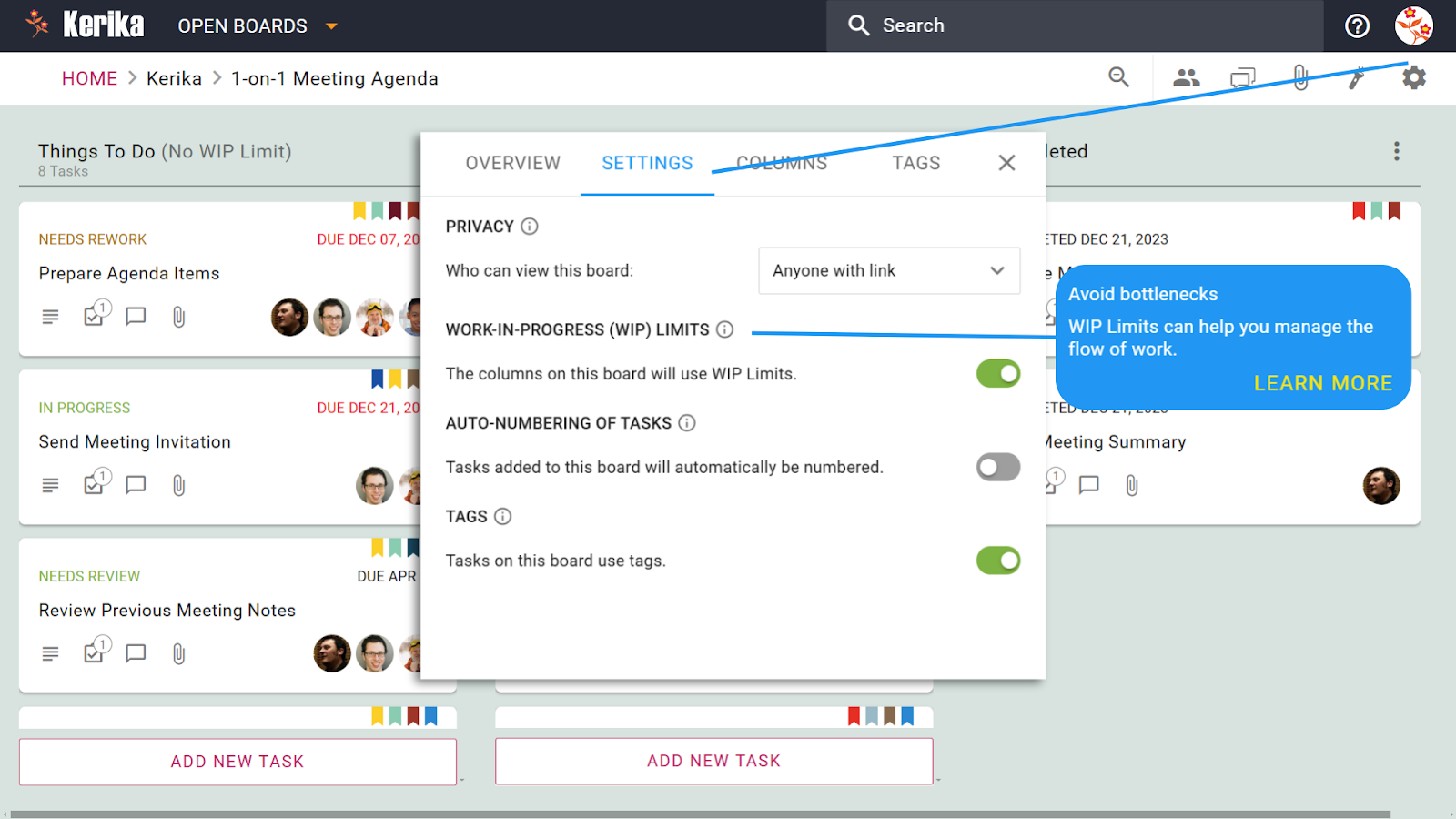
How to Enable Auto-Numbering
- Access Board Settings: Click on the gear icon in the top-right corner of the board to open the settings menu.
- Enable the Option: Under the Settings tab, toggle the Auto-Numbering of Tasks option to activate it.
- See It in Action: From now on, every new task card created on the board will automatically display a unique number in the title area.
Why Auto-Numbering Matters
- Quick Task Reference: Numbers make it easier to reference specific tasks during meetings or while collaborating with teammates.
- Clear Communication: Instead of describing tasks in detail, simply refer to them by their assigned number for faster communication.
- Efficient Organization: Task numbering adds an extra layer of structure to your board, making it easier to track and manage.
Real-Life Applications
- Project Reporting: Quickly list task numbers in updates or documentation for clarity.
- Team Discussions: Refer to tasks by their number during team meetings to avoid confusion.
- Progress Tracking: Easily identify which numbered tasks are completed or still in progress.
Conclusion
Auto-numbering brings simplicity and order to task management, eliminating the hassle of manually keeping track of task identifiers. Whether you’re managing a complex project or a small workflow, this feature ensures every task is easily recognizable and trackable.

