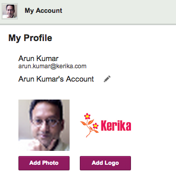
We have always offered all users, including people with the free Standard Accounts, the ability to customize their accounts, and now we are making that a little easier.
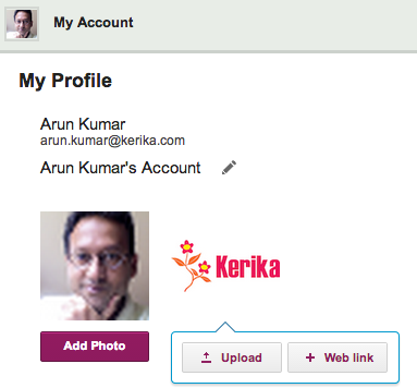
For most people, the most convenient way to grab a photo or company logo is from a Web site, and that’s possible now when you customize your account.
When you click on the Add Photo or Add Logo buttons, you will now have the option to upload an image from your local computer, or grab it from a website:
Along with the hundred styling changes and UI cleanup we are wrapping up, we also took the opportunity to fix around 58 different errors and warnings being reported by our server.
This might sound like a lot, so perhaps a little context is useful:
Kerika is built on top of Google Apps (at least, for now): we use Google’s OAuth service to sign up and sign in people, and we use Google Drive to share files within project teams.
A lot of errors show up as a result of this Google integration, only a fraction of which are solvable from our perspective:
Some errors relate to people from restricted Google Apps domains trying to use Kerika. This happens at least once a week — someone working at a company that has Google Apps for Business tries to sign up for Kerika, but fails because their Google Apps Administrator (typically, someone within their IT department) has prohibited any third-party apps from integrating with their Google Drive.
This is an example of an unsolvable problem — we can’t override the existing protection that this company has set up (and nor would we want to!) so we are going to redirect users to an explanatory page that helps them understand the problem is not with Kerika.
Sometimes Google Apps has outages: when this happens, we can get a cascade of errors on our servers, because these outages are typically intermittent and inconsistent across our user base. Some folks experience problems, others don’t. We are trying to come up with a way to inform people about what’s happening, so they don’t think it’s Kerika that’s busted.
Sometimes Google burps: not have an outage, but experience a fleeting problem with uploading a file. We might get nothing back from Google than a generic “500 error: system not available”.
We have also had problems related to our use of Firefox for the Render Server: Firefox’s latest updates are sometimes less stable than previous ones, and in general Firefox is starting to have a really big footprint in terms of memory usage.
And, finally, we have had our own bugs, just like any other software developer. Some of these have been tricky to find, but as we find them, we squash them.
Kerika is starting to get used in larger organizations more: big global companies, and state and local governments, and as we move into these types of user communities we are finding that people are more likely to create large numbers of projects.
(On average, people create 4-5 projects if they are relatively passive users of Kerika, while more active users — like Project Leaders — might create 30-40 projects over a couple of months.)
To make this smoother, we have been improving the performance of the creation of new projects, as well as the copy-paste function for projects.
It turns out both are closely related, so improving one should help with the other!
A few weeks ago we introduced a new feature: if you included a URL reference in a card’s details, attachments or chat, we would fetch that Web page’s title and show that, instead of just the “raw URL”.
This turned out to be a really helpful feature, and so we are expanding it in our next version by adding logic to handle a wider variety of URLs: the new logic should make it easier to have smart references to URLs show up in your cards even when these URLs are pointing to obscure Web sites, Intranet sites, etc.
One of our oldest features has outlived it’s usefulness…
(No, we didn’t actually shoot this dog. Or any other dog.)
We have something we call the “Render Server”: it’s a separate server from the rest of Kerika, and it’s sole purpose has been to create thumbnail images of Whiteboard projects.
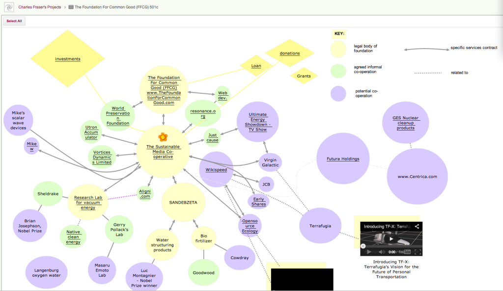
This feature was originally built to make it easier for people who created rich, layered Whiteboards — boards where canvases are contained with other canvases, like the amazing Foundation for Common Good Whiteboard project created by Charles Fraser‘s team (in the UK, and worldwide) which looks something like this:
Foundation for Common Good
This is just a partial view of the top-level of a series of canvases, layered within each other to create a rich, multi-media world.
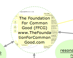
The Render Server helped people understand that some shapes on a canvas contain other canvases within them: for example, if you hovered your mouse over one of the circles on this canvas, you could see — somewhat dimly — a thumbnail of the canvas that was contained within that page:
Showing layered pages
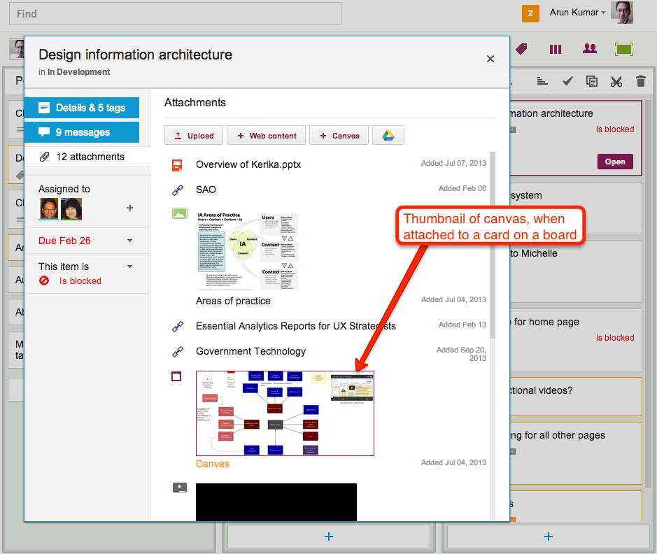
This feature was also used when you added canvases to cards on Task Boards and Scrum Boards: the card details dialog would show a thumbnail of the canvas, like this
Thumbnail image of a canvas attached to a card
This feature was cool, and made for great demos, but it was ultimately not all that useful in a practical sense.
(And that’s true for a lot of cool ideas: things that make for great demos don’t always provide great utility in regular use.)
The thumbnails were too small to be of much use on Whiteboards, and when shown on card details for Task Boards and Scrum Boards they just took up too much space.
So, it’s buh-bye to the Render Server: a cool idea, whose time seems to have passed.
(No, really: we didn’t shoot the dog! We promise!)
Our next update to the Kerika software, scheduled for release this weeekend, will have a bunch of minor styling updates — over a hundred styling changes, in fact.
Most of these are fairly subtle; it’s quite likely you will not notice over 90% of them at all, because this new release is really a UI cleanup effort rather than a big feature release.
Over the past couple of years Kerika had acquired some “UI crud”: little inconsistencies in the fonts, colors, and interactions that had build up over time as you release new features, and we have been releasing new functionality every 4-6 weeks for over 3 years now. It’s like barnacles on an otherwise beautiful wooden boat…
(Not us, but somebody else, polishing somebody else’s boat.)
For example, we found there were minor variations in shades of grey throughout the app: a light-grey shading in one place was off by an octect or two from a light-grey shading in another place. A tooltip was missing from one button here or there, or a tooltip wasn’t phrased as well as it could have been.
Taken individually, these are very trivial indeed — and, unless you examine the entire UI with a magnifying digital color meter, like we did, you wouldn’t have found these tiny inconsistencies, but they can have a cumulative effect that makes the UI seem vaguely fuzzy. (Just like barnacles, if left un-scrapped, can slow down even the most beautiful boat.)
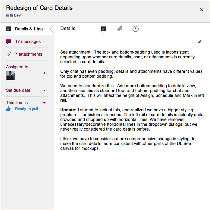
The most visible change we made is the card details display: what you see when you open up a card on a Task Board or Scrum Board
New Card Details dialog
This display is cleaner than what we used to have: it has a more consistent appearance with the rest of the Kerika user interface, and gives equal prominence to all the user interface elements within this dialog — because all of these elements are, in face, equally important to users. Our previous design gave undue prominence to Details, Attachments and Chat, which reflected nothing more than the historical evolution of the Kerika software; now, everything about a card is equally accessible.
The layout is also a lot cleaner: unnecessary decoration has been eliminated, and the overall style is more “flat” (i.e. in keeping with Microsoft’s Metro/Modern design styling, which even Apple has now adopted for iOS 7).