All posts by Arun Kumar

Coming up: a “unified inbox” view of all your projects

We should be wrapping up yet another new version of Kerika in the next few days: we have been focusing on how to make it easier for people to get to all of their projects, across all the accounts they are working in.

Some quick background: Kerika lets you create projects in your own account, of course, but also in the accounts of other people who have added you to their project teams. This means that over time you can end up creating, and working on, projects that are owned by several different accounts. Our users have asked for this to be improved in two ways:

  • Users want to make sure they are creating projects in the right accounts, so people want to get a little reminder of which account is being used, each time they create a new project.
  • Users want fast access to all of their projects, across all of their accounts.

Here’s what we are doing to help: first, make it clear to you which account is being used to create your new project. The dialog for creating a new project will look like this:

New Project dialog

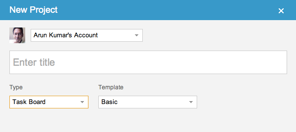
So, right up front you can see the name of the account you will be creating your new project in, and the face of the account owner. If you want to create your project in a different account, you can switch right on this dialog with one easy action.

The second big change is to create what we call a “unified inbox” view of all your projects, similar to how email clients work that let you see all your emails in one place, across all your accounts.

When you are looking at your projects, the “My Projects” link will show you all your projects, across all your accounts:

Unified Inbox

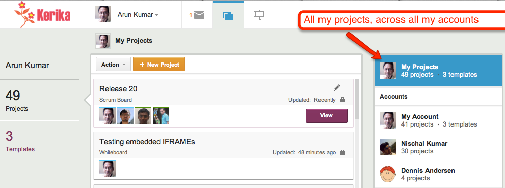
Just below the “My Projects” link are all the accounts that you have access to, starting with your own (which is always called “My Account”), and followed by the accounts that have projects that were updated most recently. This makes it easier for you to access not just all your projects, but also the accounts that are most active.

This improvement, like everything else we have done, has been driven by valuable user feedback! Next up, once we get this version wrapped up, is simpler billing system and integration with the Google Apps Marketplace and the Google Chrome Web Store.

When prosecutorial misconduct lurches from farce to tragedy

Aaron Swartz didn’t have to be driven to suicide by the horrific prospect of spending decades of life in prison for the “crime” of publishing taxpayer-funded research. There’s a petition at the White House to fire Assistant US Attorney Steve Heymann, who proudly put out this press release on July 9, 2011 to pat himself in the back:

If convicted on these charges, SWARTZ faces up to 35 years in prison, to be followed by three years of supervised release, restitution, forfeiture and a fine of up to $1 million.

That’s 35 years in prison for publishing taxpayer-funded research — yes, that’s right: we are talking about research funded with your tax dollars. And the farce that’s wrapped up inside this tragedy is that JSTOR, which housed the research that Aaron downloaded, has already decided to make all these documents available free to the public.

When someone screws up this badly in the private sector, he is fired, fast, and deservedly so. Why not in the public sector as well?

Google+ with a custom URL is useless for businesses

Google is making a huge push to get everyone to create a Google+ account, but it’s hard to see how this is going to succeed when Google+ is missing a very basic feature that every single business needs: the ability to create a custom URL, e.g. plus.google.com/kerika.

We have been updating our website and social media channels recently, and as part of that process we created a Google+ page for Kerika and ended up with the utterly useless URL of https://plus.google.com/110330426240622128664/posts

This isn’t a URL that even we can ever remember, and it certainly offers no incentive for us to publicize it. “Kerika” is a registered trademark and a registered service mark, so obviously it is important for us to use our name in all of our marketing. All other social media offer custom URLs: we have facebook.com/kerika, twitter.com/kerika, linkedin.com/kerika — even youtube.com/kerika! — but not plus.google.com/kerika!

It’s difficult to fathom Google’s foot-dragging in this matter: custom URLs don’t need to be offered to every single user — and its very difficult to manage a namespace if you tried to offer up custom URLs to hundreds of millions of people — but it is an absolute “must-have” feature for every business. All businesses care deeply about their product names: these are valuable intellectual property assets, and we cannot think of any business that would want to publicize a random 24-digit number instead of their own name.

Until Google gets this very basic feature implemented, there is no rational argument to be made for a business to take Google+ seriously…

60 usability improvements (and we are not done yet!)

Kerika got updated today, with around 60 usability improvements based upon feedback from our early adopters. Many of the changes are quite small, but you should notice that now it is even easier to:

  • Add people to projects.
  • See who is part of each project.
  • Chat about cards.
  • Work with templates.
  • Catch up on updates from coworkers.
  • Use Kerika’s unique canvas feature.

There’s also a simpler and easier welcome experience for new users, and improved performance with faster downloads.

And speaking of performance, that’s our next focus: we want to kick that up quite a bit, so it’s even easier to use Kerika with public WiFi networks like coffee shops.

Task management comes to Kerika

At long last, task management comes to Kerika!

We are launching a brand-new version of Kerika this weekend: the fruits of over 8 months of intense research and design of the only taskboard that’s designed specially for distributed teams. There’s a short video that we urge you to watch: it provides a good overview of Kerika’s new capabilities:

  • You can organize your work using cards on a virtual task board: the interface is easy to understand and delightful to use.
  • Each card can contain details of the work, and, of course, you can add content from your laptop or the Web to each card.
  • Each card can be assigned to one or more people from your project team: Kerika lets you see at a glance who is working on what.
  • Chat is integrated directly with your work: you can send messages that are attached to your cards, or the entire taskboard.
  • You can get started with one of our standard project templates, or create your own process templates to reflect your organization’s best practices and proprietary methodologies.
  • Kerika’s unique whiteboard capabilities are integrated with the new task management: you can add a canvas to each card for sharing ideas, and everything updates in real-time as usual.
  • And our special focus continues to be the challenges faced by teams that are distributed over different locations — it could be that you are working with people offshore, or simply working from home: Kerika makes it easy for you to see, at a glance, exactly what’s changed on each work item in each project.

As usual, we look forward to your feedback! (Contact us by email.)

A new user interface, with much improved usability

We are launching a brand-new version of Kerika, with a completely reworked user interface and a ton of new features including support for iPads and other full-sized tablets.

The new UI is different enough that we have put together a 2-minute video that we recommend you watch before you sign in next; it will really help you get the most out of the new software. The interface is new, but all your old projects and data are all intact!

The new interface is part of a larger transformation we are undertaking that will add project management capabilities to our existing collaboration features: we want to provide support for Kanban-style projects, Agile/Scrum projects, and customized workflows. We have finished designing the new features and if you would be willing to take a look at our mockups and give us your opinion, it would be greatly appreciated!

Meanwhile, please enjoy the new version, particularly if you have an iPad or other full-sized tablet. To access Kerika on your tablet, just log into the kerika.com site using your tablet’s browser: there is no need to download any app because we have rebuilt the user interface to work just fine inside your tablet’s browser.

How to tell if a file has been updated

The first version of Kerika was written as a peer-to-peer (p2p) application, so one challenge we faced was detecting when files that are being shared as part of a project were changed by a user, so that we could send the latest version to everyone else on the team.

Our first attempt at a solution was to simply examine the Last Modified time for files. However, this proved to be very unreliable for a rather odd reason: whenever you open a spreadsheet using Microsoft Excel, it automatically updates the Last Modified time to be the current time – even before you had made any changes.

And when you close Excel, without having made any changes, it resets the Last Modified time back to its original value. So, whenever you opened a Excel files for viewing, we would erroneously identify it as an updated file.

We then tried looking at the size of files, to see if these had changed since we last examined them. We knew, of course, that this would be error prone in its own way: if you change some text within a file such that it contains the same number of characters as before, the overall size of that file would not change.

But this approach failed for another reason altogether: Microsoft Word allocates disk space in chunks at a time, rather than as exact amounts. This means that any edits to Word files that do not require Word to grab another chunk, or give up a chunk, would never be reflected in the reported size of the file.

Eventually, we decided to take the MD5 hash of files, which is a more reliable way of detecting if a file has been modified. We were concerned about how much CPU overhead this would take, but it proved to not be a problem after all.

When techies turn libertarian, neither Democrats nor Republicans will win

The Wall Street Journal’s editorial page contains a bemusing article called Keeping the Spirit of Steve Jobs Alive that concludes that

Thanks to Washington, the liberal politics of Silicon Valley may now be tilting toward the libertarian right.

The WSJ is, of course, a Republican mouthpiece, which probably explains the writer’s smug assumption that when techies turn libertarian, they will all start voting Republican, which is absurd on two counts:

  • It is based upon what is essentially “non-news” in the first place: many techies have long tilted libertarian in their political views because of the very nature of their profession: information technology itself is based upon the free flow of information, so respect for the First Amendment runs deep within the tech world, and the business itself is relentlessly meritocratic and brutally disruptive, which supports neither the collective approach of the left, nor the deference to authority of the right.
  • Libertarianism may be to the “right” of liberalism, but in its emphasis on personal liberty, it could just as easily be described as being to the “left” of conservatism. In any case, libertarianism forms a 3-D point with respect to classic liberalism and conservatism, so any mapping of a 3-D topography of political views to a 2-D spectrum will necessarily be misleading.

And because libertarianism confounds the simple soundbites and clear definition of the “enemy” that both Democrats and Republicans find convenient, neither party would really welcome libertarians in their midst.

If the WSJ had understood the difference between Republicans and libertarians (with a small “l”) in the first place, they would have noticed a long time ago that a lot of techies are social liberals and economic conservatives…

Running Java on the Lion operating system

Having gotten a new Mac laptop that came packaged with Apple’s newer Lion operating system, and having successfully moved all files from an older laptop running Snow Leopard, we learned the hard way that Lion doesn’t come with Java bundled in by default!

The problem surfaced when we tried to run the Kerika server software on our new laptop: since we wrote all of the backend/server code in Java, we can run the entire Kerika software on pretty much any computer. So, with our new laptop all set up, apparently configured with everything we need once we got our SuperDuper backup restored, we tried to build the Kerika source code using Maven.

That’s when things went in a surprising direction: running “mvn -install” generated error messages about Java not being found. We followed the symbolic links for the Java executables, which had been copied over to the new laptop along with everything else from the SuperDuper backup, and found that there was nothing there: no Java to be found on the machine.

OK, so we need to get Java installed. No problem, we will just run the Mac Software Update: maybe something got missed along the way.

No good: Mac’s Software Update didn’t pull in Java.

Finally, we talked to Apple and found out that they deliberately don’t include Java (or Flash) with Lion. The ostensible reason is that Java programs (and Flash programs) take up too much battery power. This argument sounds rather dubious: Flash’s excessive power consumption is well known, but Java…?

We think a truer explanation might be that Apple views Java programs as a long-term competitive threat to their App Store, and are therefore starting to subtly discourage its use without actually banning it – which would create a huge stink.

If this sounds like Microsoft’s deliberately crippled support of Java on Windows XP, Apple should perhaps pause and consider how well that strategy worked out for Microsoft…

Meanwhile, here’s the download link to get Java for Lion!

A new version, with more goodies..

We have released yet another version of Kerika, packed with useful features and bug fixes that will improve your experience with the product.

A lot of the improvements we made are “under-the-hood”, but here are a few changes that you can benefit from directly:

  • Snap-to-grid will make it easier for you to lay out shapes, documents, pictures, etc. on your Kerika pages. You can turn this on or off as you like, and adjust the size of the grid spacing, by setting your preferences: while you are using Kerika, click on your picture near the top edge of the browswer window and you can get to your user preferences.
  • Google Docs will always open in a new browser tab: this change makes for a more consistent and better user experience for everyone. Different browsers handle Google Docs differently, so to provide a more consistent experience for everyone your Google Docs will now alway open in a new browser tab rather than inside the Kerika canvas.
  • Easier ways to invite people: based upon very useful feedback from one of our users, we have added an “auto-acceptance” feature to invitations, and also redesigned the emails that get sent when people are invited to join your projects. These changes make it easier for you to invite people, and handle situations where the invitation emails get caught up in spam filters.
  • Custom colors: mix and match colors as you like, if you don’t like the 84 colors that come with the Kerika palette. If you need to use specific colors, e.g. to match your company’s branding, you can use hex codes to get the exact shade you want.
  • Faster tab switching: we improved this in a several ways, and one of them is to make sure your tabs show the page exactly as you had been viewing it previously before you switched to another tab.
  • The old “Magic Plus” button is now split into two: separate buttons to add Web content and to upload files from your computer. These buttons remain as magicky as ever, in terms of figuring out what kind of content you are adding to your Kerika pages and taking care of all the details, but now the buttons are separated out to improve usability.
  • Upload multiple files with the Upload File button: you could always add multiple files to your Kerika pages by dragging and dropping them onto the canvas; now you can grab multiple files using the Upload File button as well.
  • Merging cells in tables: a cool new feature allows you to merge cells within tables that you create. This makes it even easier to create great-looking content on your Kerika pages, with our text formatting tools.
  • Select multiple cells within the same column and apply formatting to all of them: another cool new feature for those of you who like creating formatted tables. You can select multiple cells within a text table by simply dragging your mouse across them. And, then, you can apply formatting (e.g. text color) to all of them with a single action.
  • Removing multiple rows and columns is easier: drag your mouse across several rows and columns of a table and remove them all with a single mouse click.
  • Easier to navigate large Kerika pages: if you want to drag something into a new part of the canvas, away from the current view, the canvas scrolls automatically to give you more space.

Thanks again for all your useful feedback; we have tons of improvements and new features coming up: our next version will include a number of improvements to our integration with Google Docs.