Category Archives: Usability

Posts related to product design, user experience and usability

Consider killing some of your bright ideas

Something that we have learned in the course of making Kerika the best designed tool for work management: don’t rush to implement all of your bright ideas!

When we observe a usability problem, we tend to get riled up rather quickly because we take such pride in our work.

The result is a bunch of really good ideas about how to fix the problem.

And to improve the fix.

And to make the fix even better.

(You can probably see where this is going…)

It’s really easy to over-fix a usability problem, by applying too many fixes, too fast.

Here’s another approach you can try:

  • Collect all your bright ideas.
  • Sort them, so you have only really good ideas.
  • Now, implement the smallest change that you think will fix the problem.
  • And then, eat your dogfood: use the improved product for a week at least, and see if the small change was sufficient.

We have found this is a good remedy to the more common problem of over-designing a solution: rather than build an unnecessarily complex change, or one that creates its own usability problem — often by making a subtle change in the UI metaphors that the user has already learned by mastering other parts of the product.

More fonts for Whiteboards

We have expanded the selection of fonts that are available for Whiteboards and canvases:

New fonts
New fonts

The list of available fonts now includes:

  • Arial
  • Armata
  • Audiowide
  • Calligraffiti Regular
  • Cinzel
  • Dancing Script
  • Indie Flower
  • Josefin Sans
  • Kaushan Script
  • Lato
  • Lobster
  • Montserrat
  • Nothing you could do
  • Oswald
  • Pacifico
  • Permanent Marker
  • Pinyon Script
  • Raleway
  • Rock Salt
  • Shadows into light
  • Times New Roman
  • Verdana


Kerika looks different: horizontal project tabs

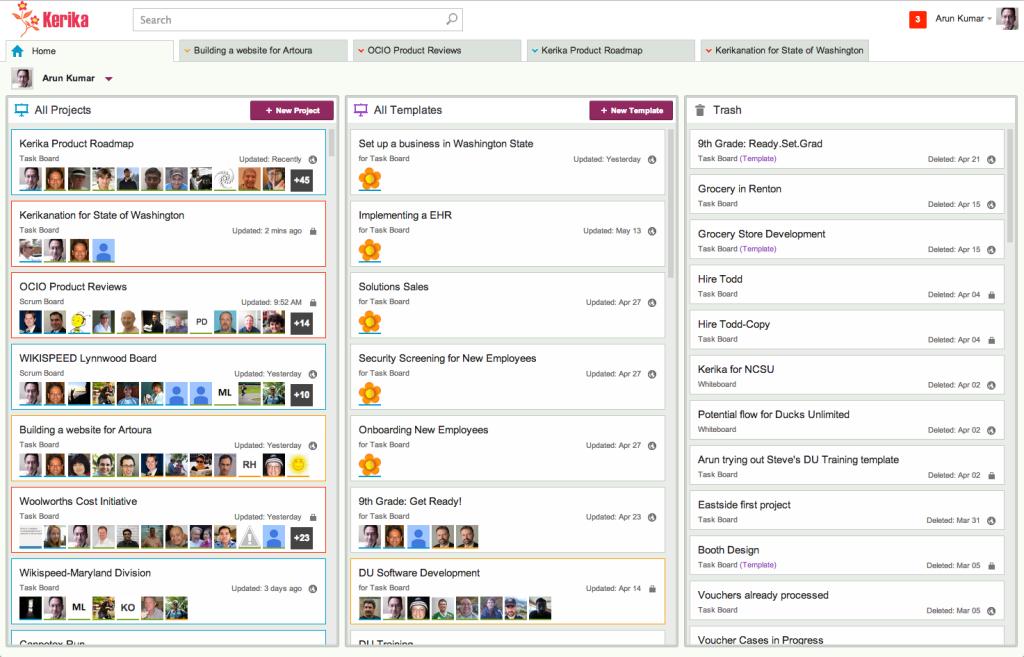
Our latest release makes Kerika’s user interface look even cleaner and easier to use: we have switched to horizontal tabs to hold all your open projects. (The old version had vertical tabs, running along the left side of the application.)

This makes for more efficient use of space, and provides a user experience that’s more familiar to browser users: the project tabs work like your browser tabs @ndash; you can close each one individually, and drag them across the screen to rearrange them.

It also makes it easier to use Kerika on a tablet: the new horizontal tabs provides a better use of screen real estate.

Task summary emails got a little smarter

One cool feature of Kerika is that you can get a 6AM email @ndash; local time, no matter where you are @ndash; that summarizes all the tasks that are overdue for you, due today, and due tomorrow.

And, if you are a Project Leader on any team, your task summary email can also include all the items that are overdue, due today and due tomorrow across the entire team @ndash; even if you are not assigned to those cards. (It’s an easy way for Project Leaders to plan their day.)

Now, these emails got a little smarter: if you move a project to Trash that still has outstanding due dates on cards, these are no longer included in your task summary email.

Fixing 58 server bugs and warnings (Why so many?)

Along with the hundred styling changes and UI cleanup we are wrapping up, we also took the opportunity to fix around 58 different errors and warnings being reported by our server.

This might sound like a lot, so perhaps a little context is useful:

  • Kerika is built on top of Google Apps (at least, for now): we use Google’s OAuth service to sign up and sign in people, and we use Google Drive to share files within project teams.
  • A lot of errors show up as a result of this Google integration, only a fraction of which are solvable from our perspective:
    • Some errors relate to people from restricted Google Apps domains trying to use Kerika. This happens at least once a week — someone working at a company that has Google Apps for Business tries to sign up for Kerika, but fails because their Google Apps Administrator (typically, someone within their IT department) has prohibited any third-party apps from integrating with their Google Drive.
      This is an example of an unsolvable problem — we can’t override the existing protection that this company has set up (and nor would we want to!) so we are going to redirect users to an explanatory page that helps them understand the problem is not with Kerika.
    • Sometimes Google Apps has outages: when this happens, we can get a cascade of errors on our servers, because these outages are typically intermittent and inconsistent across our user base. Some folks experience problems, others don’t. We are trying to come up with a way to inform people about what’s happening, so they don’t think it’s Kerika that’s busted.
    • Sometimes Google burps: not have an outage, but experience a fleeting problem with uploading a file. We might get nothing back from Google than a generic “500 error: system not available”.
  • We have also had problems related to our use of Firefox for the Render Server: Firefox’s latest updates are sometimes less stable than previous ones, and in general Firefox is starting to have a really big footprint in terms of memory usage.
  • And, finally, we have had our own bugs, just like any other software developer. Some of these have been tricky to find, but as we find them, we squash them.


Making it faster to create new projects, and to copy/paste them

Kerika is starting to get used in larger organizations more: big global companies, and state and local governments, and as we move into these types of user communities we are finding that people are more likely to create large numbers of projects.

(On average, people create 4-5 projects if they are relatively passive users of Kerika, while more active users — like Project Leaders — might create 30-40 projects over a couple of months.)

To make this smoother, we have been improving the performance of the creation of new projects, as well as the copy-paste function for projects.

It turns out both are closely related, so improving one should help with the other!

Adding URL references got a lot better!

A few weeks ago we introduced a new feature: if you included a URL reference in a card’s details, attachments or chat, we would fetch that Web page’s title and show that, instead of just the “raw URL”.

This turned out to be a really helpful feature, and so we are expanding it in our next version by adding logic to handle a wider variety of URLs: the new logic should make it easier to have smart references to URLs show up in your cards even when these URLs are pointing to obscure Web sites, Intranet sites, etc.


Dropping the “Render Server” feature

One of our oldest features has outlived it’s usefulness…

(No, we didn't shoot this dog. Or any other dog.)
(No, we didn’t actually shoot this dog. Or any other dog.)

We have something we call the “Render Server”: it’s a separate server from the rest of Kerika, and it’s sole purpose has been to create thumbnail images of Whiteboard projects.

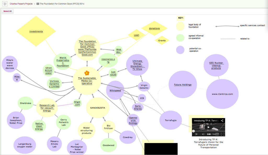
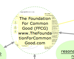
This feature was originally built to make it easier for people who created rich, layered Whiteboards — boards where canvases are contained with other canvases, like the amazing Foundation for Common Good Whiteboard project created by Charles Fraser‘s team (in the UK, and worldwide) which looks something like this:

Foundation for Common Good

This is just a partial view of the top-level of a series of canvases, layered within each other to create a rich, multi-media world.

The Render Server helped people understand that some shapes on a canvas contain other canvases within them: for example, if you hovered your mouse over one of the circles on this canvas, you could see — somewhat dimly — a thumbnail of the canvas that was contained within that page:

Showing layered pages

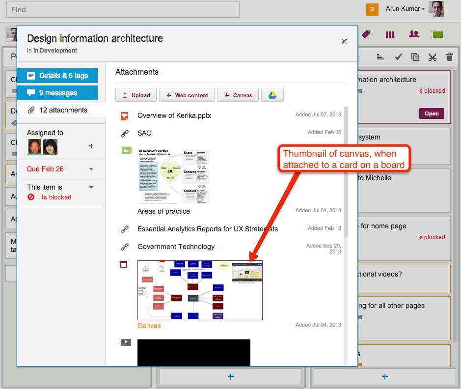
This feature was also used when you added canvases to cards on Task Boards and Scrum Boards: the card details dialog would show a thumbnail of the canvas, like this

Thumbnail image of a canvas attached to a card

This feature was cool, and made for great demos, but it was ultimately not all that useful in a practical sense.

(And that’s true for a lot of cool ideas: things that make for great demos don’t always provide great utility in regular use.)

The thumbnails were too small to be of much use on Whiteboards, and when shown on card details for Task Boards and Scrum Boards they just took up too much space.

So, it’s buh-bye to the Render Server: a cool idea, whose time seems to have passed.

(No, really: we didn’t shoot the dog! We promise!)