Tag Archives: Usability

About software usability in general.

Using animation to help users understand canvases can be attached to cards

We have been cautiously adding animation to the Kerika app — as noted previously — where we think it helps people understand the results of their actions, and why a visual context just changed as a result of something they did.

One such place is when you add a canvas to a card: we added a “blow-up” animation effect to help users understand that they are opening up a new canvas.

To complement this, we added a “collapse” animation when you navigate up from a canvas to the card that contains it, whether you do that by clicking on your browser’s Back button or by using the Kerika breadcrumbs that appear just above the canvas:

Using breadcrumbs to navigate

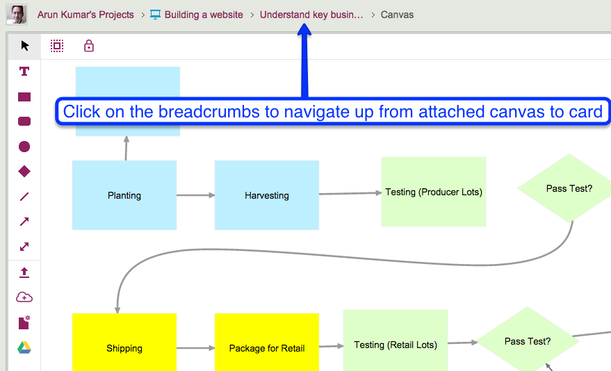
This collapsing animation effect helps reinforce the idea that the canvas you just left was attached to a particular card, and now you are back up a level and viewing all the attachments on that card, including the canvas you were just viewing.

Adding a Google Map to your Kerika canvas

Did you know that you can embed a Google Map in your Kerika Whiteboards? It’s easy: just copy the Google Map’s URL:

Adding a Google Map to Canvas

And paste it into the dialog box that appears when you click on the “Add Web Content” button on your canvas toolbar:

Add Web Content
Add Web Content

Kerika automatically figures out the URL refers to a Google Map, and shows you an embedded map on your canvas:

Example of embedded Google Map

You can do the same thing with card attachments, for your Task Boards and Scrum Boards: Kerika shows a small thumbnail of the map in the list of attachments on your card:

Example of attached Google Map


UI tweak: removing the “Add member” button from card details

As part of our work on combining tags and colors, we have been cleaning up parts of the Kerika user interface that had minor inconsistencies.

One such inconsistency — in our view — was that you were able to add people to a project team from within the card details dialog itself:

Adding people to a team

This button has been there in Kerika for a very long time, but it doesn’t really make sense to have this capability within the card details dialog: it just isn’t the best place to decide to add someone to a project team.

Instead, in our new layout the Project Settings dialog consolidates all the board management in one place, including adding people to a team, changing someone’s role within a team, and removing someone from a team:


UI tweak: showing attachments in chronological order

It used to be that when you added content to a card — files from your laptop or Web content from your Intranet or the Internet, or a canvas — the newest content was added at the top of the list.

Of course, you could always rearrange them, by grabbing and dragging them up or down the list, but this it not a feature that many users discovered on their own 🙁

Rearranging attachments on a card

Well, for greater consistency with how the chat and history are shown within a card’s details, we are now going to show attachments in chronological order as well — the latest files and URLs that you added to a card will appear at the bottom of the list, and the view of these will be automatically scrolled to show the latest items:


Using animation to provide a “sense of place”

Animation often gets a bad reputation, and often this reputation is well deserved because too many designers and developers use animation gratuitously: just because they can, or just because they want to show off their technical skills.

At Kerika we have been very cautious about using animation, and have generally restricted its use to scenarios where it can help give users a “sense of place”: providing transitions from one display to another, so that a user has a sense of having journeyed from one part of the system to another.

Animations are particular useful when returning to where you come from: an effective animation can help users understand that they have returned from their journey.

Using animation to unfold drop-down dialogs helps the user understand that the dialogs are literally unfurling on top of the Task Board or Scrum Board: in other words, the user isn’t going anywhere different, just unfolding another display for temporary use.

With our latest version, we added some more animation: now, when you open a card on your Task Board or Scrum Board, it will appear to literally open in front of your eyes.

Animation is also used when you close a card: it appears to collapse in front of you in a way that draws your eye to its position within a crowded column.

This kind of animation, we believe, is useful rather than gratuitous: it helps the user understand what is happening when she opens or closes a card.

(We may consider some other touches of animation where we think it could help provide useful transitions, but we have to be mindful of the performance hit of animations as well…)

An easy way of keeping track of sub-tasks

With our latest update, it’s become easy to keep track of sub-tasks for cards on a Task Board or Scrum Board; here’s an example:

Using strikethroughs to keep track of sub-tasks

In the example shown above, the second item in the numbered list has been been taken care of, and so it has been struck-through, making it clear to the rest of the team that it isn’t an issue any more.

We have added the capability of marking text within card details with a strike-through, and this, combined with the easy way in which you can create numbered lists, makes it easy to track sub-tasks!

UI tweaks: new icons to allow for a future feature

At the time we added “In Progress” as a new status value, we also removed the “Done” status, mostly because the drop-down list of status choices was becoming rather long — and “Done” was not quite like all the other choices that we were presenting for marking a card’s status.

This is what the old choices looked like:

Old status values
Old status values

And this is what the new status choices look like:

New icons for status settings

There are two small UI tweaks here that we made:

  • A purple color is now used for “Needs review” — this previously was green, but green was really the best choice for “In Progress”, and we didn’t want to use the same color for two different states.
  • The icon for “Critical” has been changed to look like a fire: that’s because we want to reuse the old triangle icon in the future for a great new feature that we are still brainstorming — a way to mark certain cards as “troubled”.

UI tweaks: avoiding errors in the right-click menu

Building a great user experience is rarely the result of big, bold actions: more often it is the cumulative gain of a large number of very small tweaks we make to our user interface design.

Here’s an example: the right-click menu, when you click on a card on a Task Board or Scrum Board, used to look like this…

Old right click menu

This menu is a little crowded, and one irritating source of errors was that people would sometimes click on one of the Move choices (Move to Done, Move to Trash or Move to Backlog) when they intended to do click on one of the others choices instead.

The irritation came from the fact that these Move operations had a much bigger impact than the others: for example, if you accidentally cut a card, you can reverse that operation by selecting the cut cards once more, which would effectively “undo” the cut.

But, if you move a card to Trash or Backlog, it was a lot more hassle to get it back: you had to make sure the Trash or Backlog was currently being displayed — and in many large boards these columns are routinely hidden from view by the user — and then find and drag that card back to where it was.

So, here’s our small UI tweak to reduce the chances of this error:

Right-click menu has new styling

A simple visual cue, in the form of grey horizontal separator lines, helps remind the user that some of these right-click mouse operations are “more significant” than others, by creating a visual segregation of these options from others.

A simple UI tweak that helps reduce errors by our users, and one that adds up to a great user experience!


UI tweaks: Making it easier to restore Archived Projects

In a long, endless series of UI tweaks that are each small in themselves, but which we hope will collectively add up to a great user experience…

We made it easier for Account Owners to restore archived projects and templates:

Restoring from Archive

This button is shown only to Account Owners, since the power to archive a project or template, or to restore an archived item, is restricted to the Account Owner.