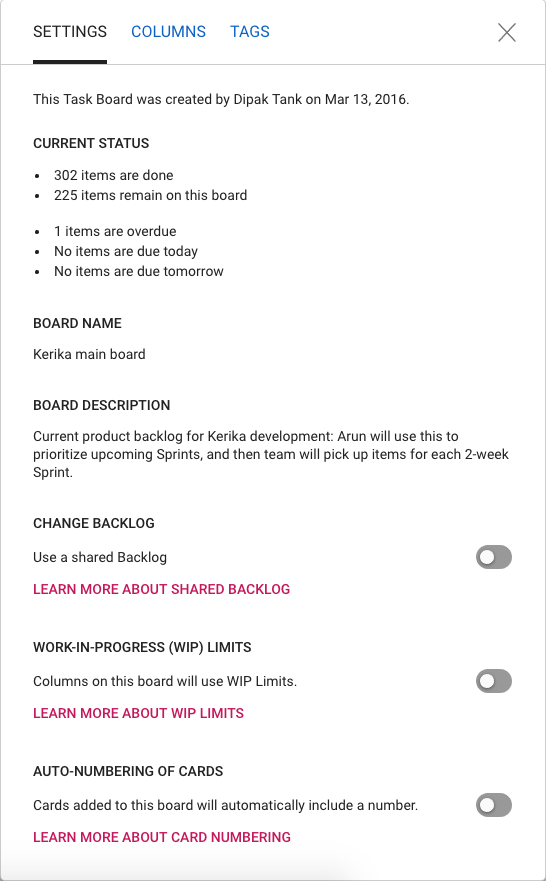
One final (?) bit of restyling, to make all of Kerika consistent with our new look-and-feel, has been updating the Board Settings dialogs.

The functionality is essentially the same, but the appearance is cleaner, lighter and more in keeping with the Material Design standards we have (mostly) adopted.
(We say “mostly”, because there are some elements of Material Design that we find unattractive. For example, for the on/off toggle switches we prefer the iOS style buttons.)

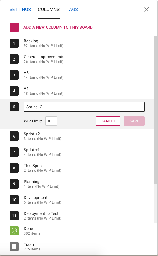
The Column Settings dialog has also been restyled, and looks nicer and cleaner. The example above shows a board that uses Work-In-Progress Limits.

And the same with Tag Settings: we have a restyled color picker, and better messages for warnings when tag names or colors might clash.
Enjoy.