While fast access to actions is generally a good thing in user interfaces, we think there are some circumstances where it might be a good idea to deliberately slow down users, if they are likely to rush into making a mistake.
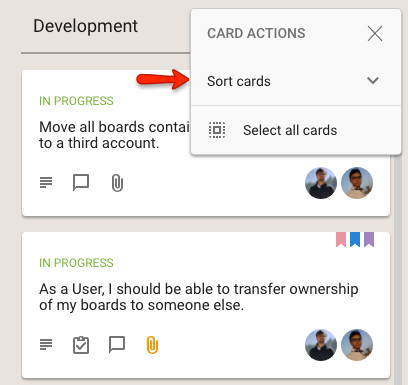
One such tweak we have introduced is to collapse the Move and Sort options for arranging cards within a column into sub-menus:

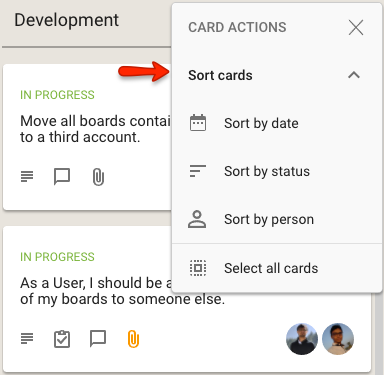
When clicked, the Sort cards option expands to show the different sorts that are available:

Effectively, this use of a sub-menu within a an already short menu is a deliberate decision on our part to slow you down from rushing into a sorting action.
An inadvertent sort can cause some havoc if the team had previously spent many hours, or even days, carefully grooming the cards on a column (like the Backlog, for example) to arrange them in a precise order.
One rushed sort could wreck all that, so perhaps access to Sort needs to be a little harder?
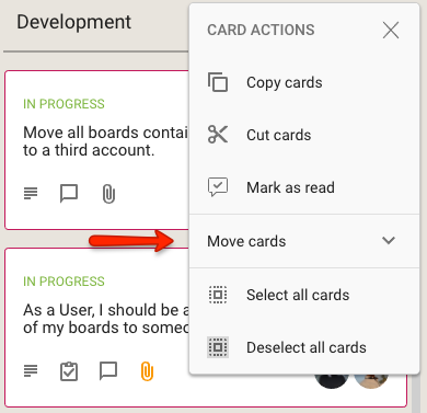
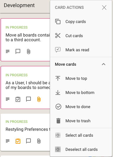
We have done something similar for the Move actions that are available on cards:


What do you think? Smart move on our part, or dumb? Let us know.