With the new version you will notice that Kerika has become much faster on the desktop than previously: now any board, regardless of size, should load in under 3 seconds if you have a fast Internet connection.
With the old version this wasn’t true: the time to load a board was proportional to the number of cards (tasks) that were on the board, and while most users didn’t notice any lag, people who were using Kerika at a large scale, e.g. with boards of a thousand cards, would have to wait a while for the largest board to full open.
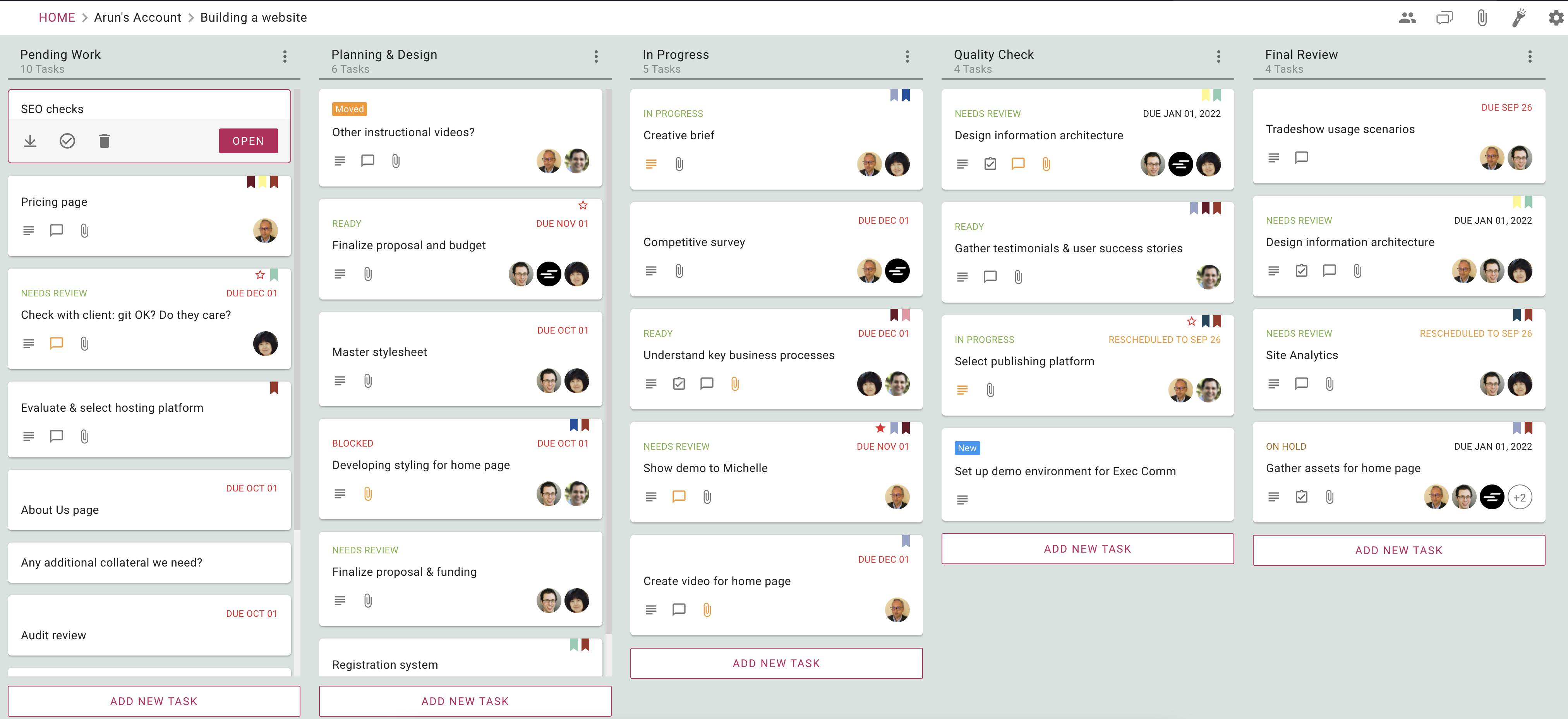
With our old code, every board was loaded sequentially column by column, starting with the leftmost column, and within each column every card was loaded before another column’s loading started. This approach didn’t scale well, and the flaw of this approach became all to obvious when we built our mobile apps, which used a “lazy loading” approach.
To fix this, we rewrote the desktop app from scratch, an effort that took nearly nine months for our small team to complete, from design, implementation, testing and endless refinement.
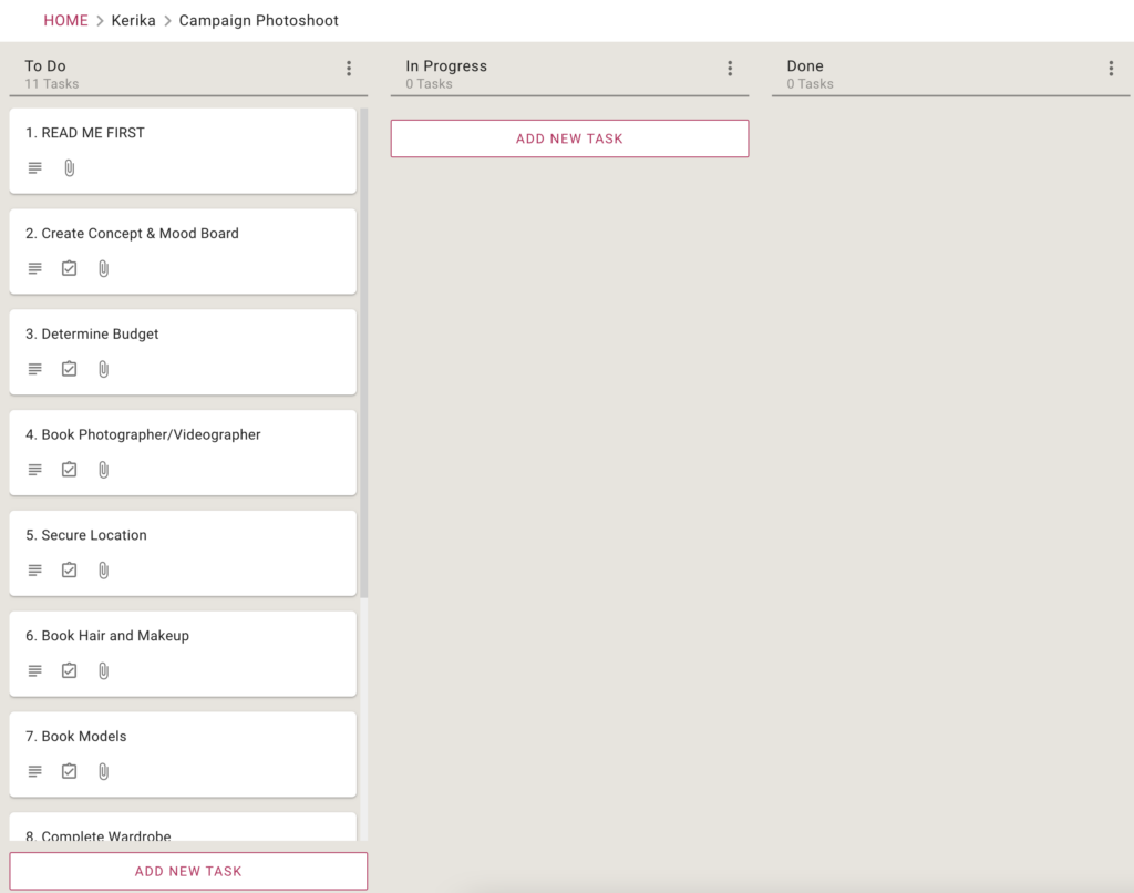
With lazy loading the system prioritizes which cards to load, rather than trying to load all of them one by one. If your board has 15 columns, for example, not all of these can be viewed at the same time: most displays will show just 5-6 columns at a time. Kerika keeps track of which part of the board you were last viewing, and then intelligently loads the board from that point of view.
All the other columns are loaded only as the system senses you are going to need them: as you scroll to the left or right, for example, the system automatically (and quickly) fetches more columns into view. If the system does this fast enough, the user never realizes that her entire board wasn’t loaded at the very beginning, because no matter where she is looking, everything she needs is always in view.
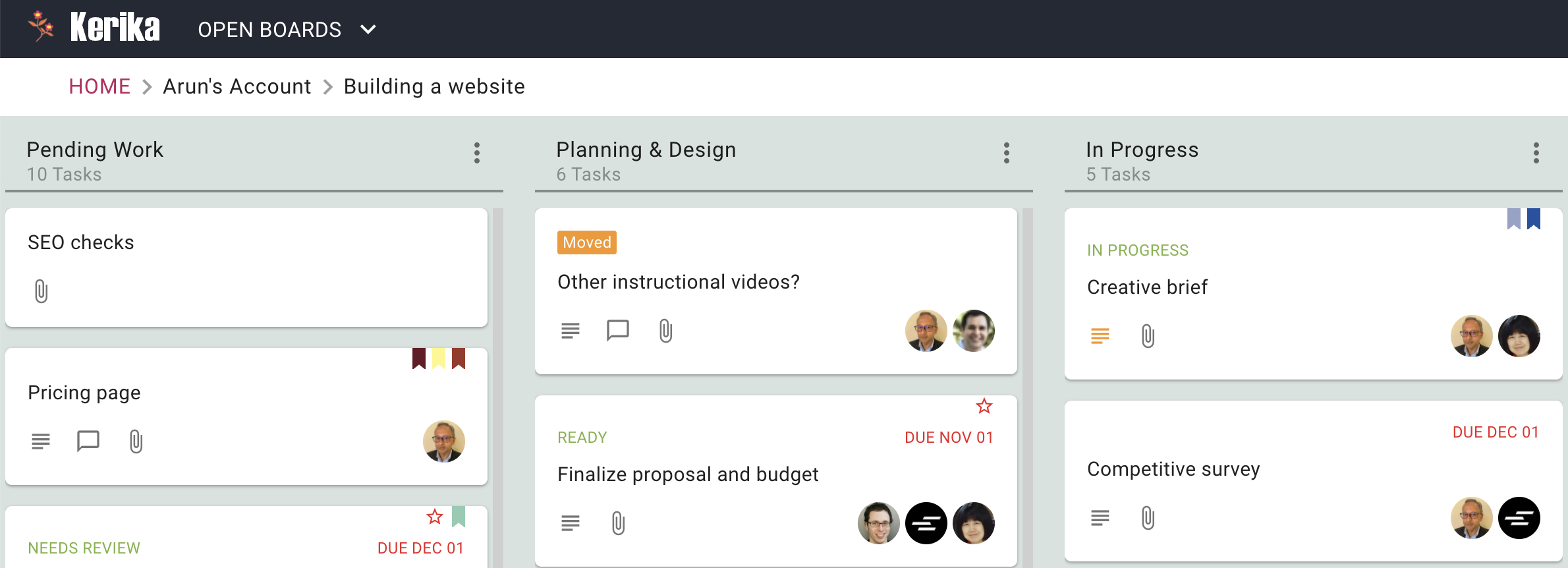
We took a similar approach to loading columns with a lot of cards (tasks). Instead of loading all the cards that exist within a column — and these can number hundreds, for large boards — the system considers how many can be displayed at a time given the user’s particular device: laptop, desktop, tablet, or phone.
Having calculated how much of a column can be actually viewed by a user, the system loads just those many — and a few more in anticipation of the user scrolling her view of a column. As the user continues scrolling down a column, the system races to fetch more cards from the server so there’s never a gap in the user’s view.
But lazy loading alone wasn’t enough, we also had to deal with the speed at which a browser can display a bunch of cards. This speed varies by browser type, as well as device. A low-powered computer, perhaps running an older browser, can’t render cards as fast as we need for the user to have a true real-time experience.