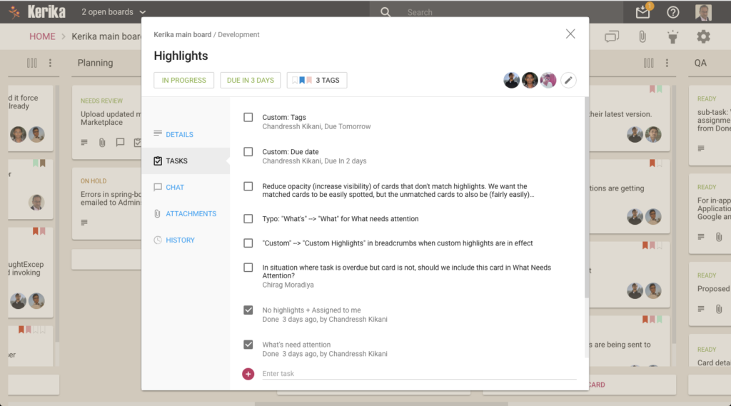
We have added a new feature to our Task Boards and Scrum Boards: you can now manage a list of tasks for each card on a board, like this:
Example of tasks in a card
Every card can have as many tasks as you like, organized in a simple, smart checklist.
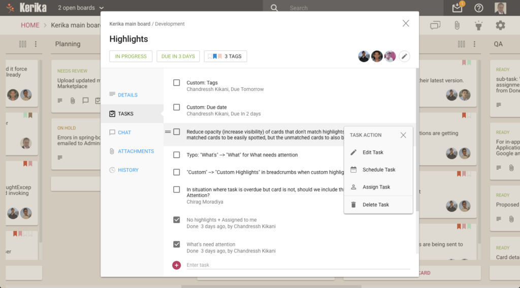
Individual tasks can be assigned (to one person at a time) and scheduled, and Kerika is smart about rolling up these assignments and due dates to reflect them on the card as well:
Managing tasks in a card
As you mark off tasks as Done, they slide to the bottom of the list to make it easy to see what remains to be done.
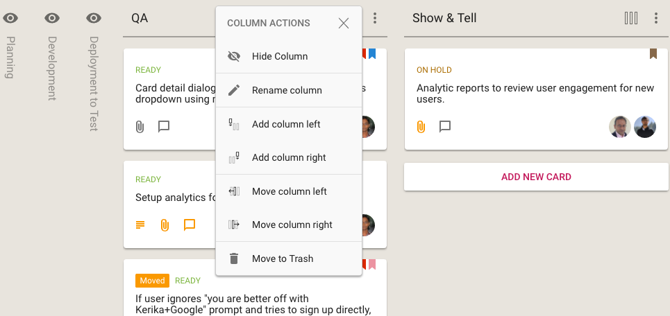
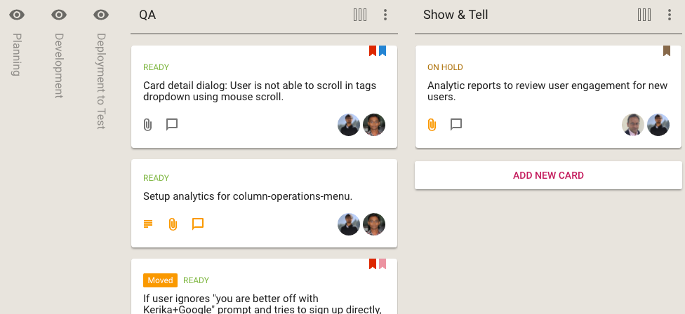
We are extending the Column Actions menu (featured in a previous post) to provide a quicker, easier way to hide (or show) individual columns on your Kerika Task Boards and Scrum Boards:
Option to hide column
When a column is hidden, it’s name is shown vertically, so you can easily remember which columns you have hidden at this time.
Hidden columns
Revealing columns that are hidden is easy: just click on the “eye” button and the column immediately comes back into view.
Every Team Member can decide whether to show or hide individual columns: their choices won’t affect the way other Team Members choose to view the same board.
We have added a new feature to our Kerika Task Boards and Scrum Boards, to make it easier for Board Admins to customize the layout of their boards (i.e. to customize the workflow of their projects).
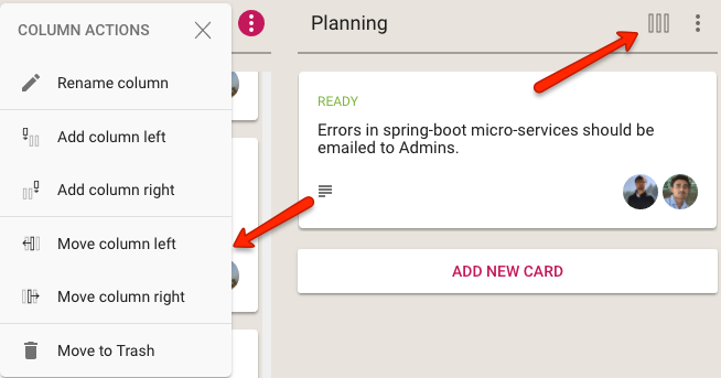
This Column Actions menu appears the top of each column, as shown below:
Column Actions menu
When clicked, the button shows the following actions that can be performed on the column:
Rename the column
Add a new column, to the left
Add a new column, to the right
Move the column one position over to the left
Move the column one position over to the right
Delete the column, which means move all its contents to the Trash
This new button and menu makes it easy to access the most common actions that Board Admins need to organize their project’s workflow.
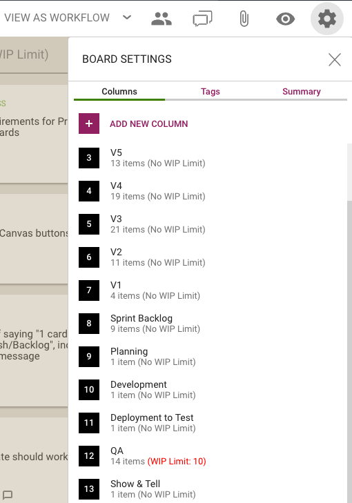
The Board Settings dialog will continue to support this feature, as well as handle more advanced scenarios such as boards that use Work-In-Progress limits on columns:
Column Operations
Note: only Board Admins can customize the columns on a board; not Team Members or Visitors.
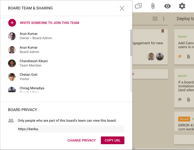
We have added a new feature in the Board Team dialog, to make it easier to share your board’s URL:
Board URL (masked in this example)
This will be useful if your board’s privacy is set to Anyone can view this board, like in the example shown below:
Public board
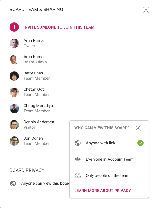
You can now copy the Board’s URL to your browser clipboard, and send that to someone else as an email or instant message.
If you change your mind about making the board accessible to anyone who has the URL, you can always set your board’s privacy to Everyone in Account Team or Only people on the team.
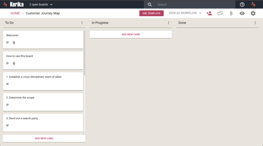
This template contains all the step you need to create your own Customer Journey Map, along with links to articles on the subject from the Nielsen Norman Group.
It’s part of our “Creative Stuff” category of process templates, which includes the Google Design Sprints as well.
When you schedule cards on a Kerika Task Board or Scrum Board, we offer a simple way to pick a date:
Setting due date
We don’t support setting a specific time (e.g. 5:00PM) along with the time: these times are generally useless in most work settings and add unnecessary complexity to the user experience.
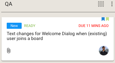
And, yet, it’s possible that Kerika reports a specific time for a due date, like in this example:
A specific time for a due date
So, how did happen?
Well, Kerika took note of the fact that person making that time commitment (“I will get it done today”) was based in India.
And midnight in India is 11:30AM in Seattle — at least now, with Daylight Savings Time in effect.
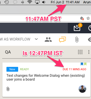
So Kerika shows the Indian team member’s commitment of “I will get it done today” in terms that make sense to a colleague in Seattle:
Handling timezone differences
11:47 AM Pacific Standard Time with Daylight Savings Time in force is 12:47PM Indian Standard Time; something that Kerika figures out automatically.
This simple, elegant way of handling timezones eliminates the frequent disagreements over “I meant my today, not your today…”
An example of the incredible attention to detail that Kerika brings to the needs of distributed teams.
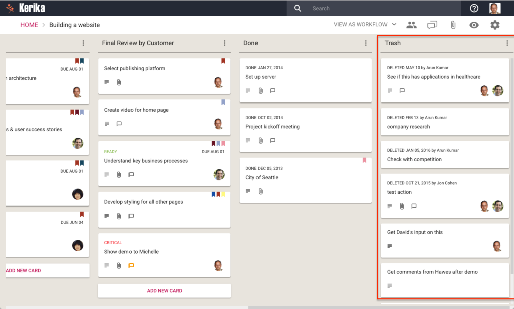
With our latest release we have made a change to all Task Boards and Scrum Boards: the Trash column will now show automatically if it contains anything:
Showing the Trash column
We made this change because the old design was too subtle: most of our users never even discovered the Trash feature, which was a really pity.
Now, the Trash column will automatically display whenever it has anything in it. We are using lazy loading for the Trash, so performance is not affected for people who have very large Trashes. (Some people, who have been using the same board for years, have hundreds or even thousands of items in their Trash.)
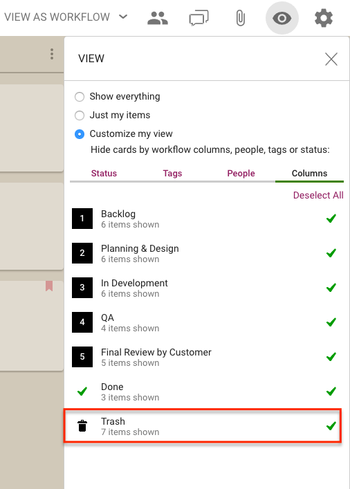
If you don’t want to see the Trash, you can hide it using the Filter button that appears on the top right of each board:
If you are still using Windows 7, please use Chrome or Firefox instead of Internet Explorer 11 (or, worse yet, an even older version of Internet Explorer).
We are not in a position to support Internet Explorer on Windows 7 anymore: for one thing, we don’t have any PCs running Windows 7 anymore. And Microsoft itself has stopped selling Windows 7 several years ago, and mainstream support ended two years ago.
We realize that some of our enterprise customers are forced to stay with Windows 7 because of legacy systems that don’t work well with newer versions of Windows, but supporting Windows 7 is not something we are in a position do, or have any interest in pursuing.