Tag Archives: Website

About Kerika’s website.

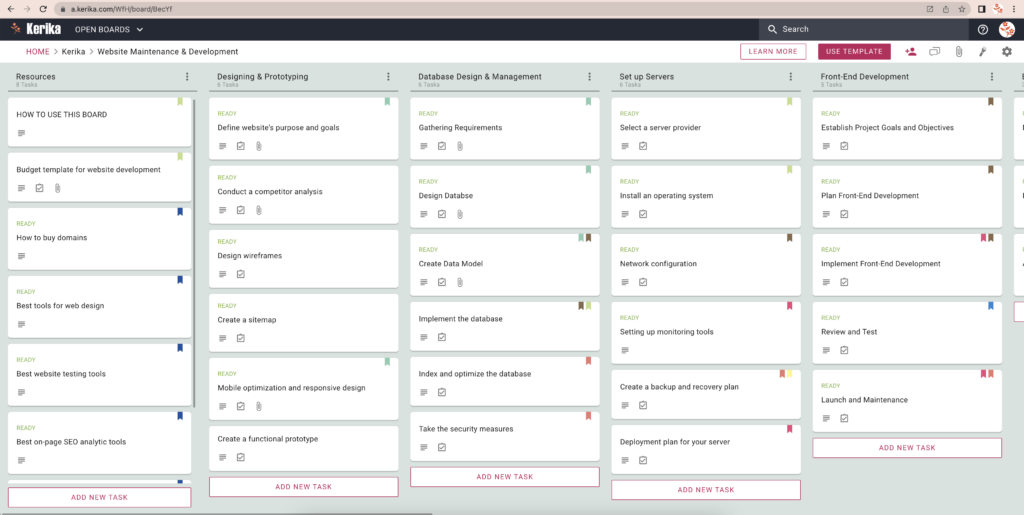
Kerika has a free Template for Website Development & Maintenance

Template for Website Maintenance & Development
This template can be used by software and IT teams to handle website development and maintenance projects.
It comes with helpful resources and suggestions, and all the tasks that are typically needed in such projects.
How to use this template:
  • The first column on this board is Resources: the cards in here are not tasks, but instead contain helpful resources.
  • Start with the Resources column and open the cards. If the card’s suggestions and tips seem helpful, leave the card here for future reference; otherwise move the card to the Trash column.
  • Next, start with the Design column and open the cards one-by-one, starting with the topmost.
  • Cards can be assigned to people and scheduled; as work gets underway, make sure the tasks are properly assigned so everyone knows who is doing what, and when to expect deliverables.
  • While work is underway mark the card as IN PROGRESS (using the Task Status): this will let everyone on the team know that someone is working on the task.
  • If a card needs to be reviewed by someone, assign the card to that person (or persons), and mark the Task Status as NEEDS REVIEW. This will make it easy for everyone on this board’s team to know what’s going on. The people who were assigned the task will get notified.
  • Sometimes tasks will need rework; in that case use the NEEDS REWORK task status to indicate that. When someone discovers that a task needs rework, it’s a good practice for that person to document their concerns using the task’s chat tab before assigning it to the people who need to rework it.
Other useful task status are:
  • ON HOLD: this conveys to the team that work has been temporarily been stopped on a particular task, usually because the people involved got pulled away to work on something more urgent.
  • BLOCKED: this conveys that work on the task is blocked. It’s best practice for the team to unblock cards as soon as possible. When marking a card as BLOCKED, make sure you document the reason why, using the task’s Chat tab.

Bug, fixed: Confirmation emails were not working correctly

Our thanks to Larry Smith from EduTone who initially alerted us to a bug in the process of signing up as a Kerika user: the confirmation email sent by Kerika wasn’t working well, particularly if the user used any browser other than Chrome.

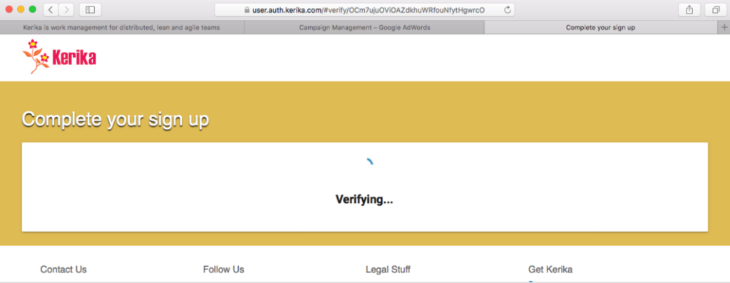
For example, clicking on the confirmation email and having Kerika open that link using Firefox or Chrome produced this kind of behavior:

Safari problem

The problem was related to a recent decision we made to use Polymer for parts of our website.

It turns out that Chrome had a different sequence for loading the Polymer components than other browsers.

In Chrome the sequence is

  1. webcomponent-lite.js
  2. element.vulcanized.html
  3. build.min.js
While in browsers like Firefox the sequence is
  1. webcomponent-lite.js
  2. build.min.js
  3. element.vulcanized.html

Our build.min.js file needed components that were loaded only when element.vulcanized.html was loaded, which meant that the sequence in which these files were loaded by the browser was important, and  different browsers were loading these files in different sequences.

We fixed this bug: Polymer has a method to ensure that all imports are ready before the page is rendered.

This has been part of the learning process for us as we adopt Polymer more for our website redesign (which is underway, and should be unveiled by Christmas), and also consider using Polymer to rebuild the Kerika app itself!

Vimeo makes for better embedding (than YouTube)

We post our tutorial videos on both YouTube and Vimeo, and get far more traffic on YouTube than we do on Vimeo.

But, as we go through a review/refresh of our website, we are switching over to Vimeo for embedding these tutorials, because Vimeo provides a cleaner look that seems to be less intrusive within our own design.

Here’s the same video, embedded from YouTube (on top) and Vimeo (on bottom):

The YouTube video has a weird grey shadow on the top part of the thumbnail, like it was deliberately trying to provide a retro, cathode-ray-tube (CRT) look.

(We are not fans of CRTs; don’t own vinyl any more…)

The same video on Vimeo has a cleaner framing:


Removing the “Embed as IFRAME” feature for canvases

For a very long time we had a feature which was kind of cool (although we don’t know how many people actually used it!) — you could embed another website on a Kerika canvas, using a technique known as IFRAME.

IFRAMEs were common a few years ago, but have steadily dropped out of favor as browsers have increasingly become more secure.

By running another website inside your own, you can be vulnerable to various cross-scripting errors if you cannot fully trust that third-party website you have embedded.  And, at the same time, people who run websites have become less keen on having their sites embedded into other sites — a practice known as “clickjacking”.

(You can read more about this on Mozilla’s website, if you are interested in the technical details.)

Since it became impossible for us to provide a consistently good experience across all modern browsers, particularly as the number of websites that allow themselves to be IFRAMEd dropped drastically, we decided to drop this feature.  If you were using this feature in the past, you will find your old IFRAME is now just a simple bookmark…

Viewing your Kerika canvas like a regular Web page

Did you know that any Kerika canvas, whether on a standalone Whiteboard or attached to a card on a Task Board or Scrum Board, can be viewed as a regular Web page by folks who have been given access to the board?

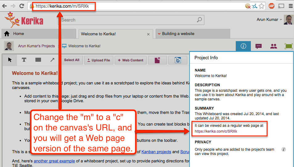
Kerika automatically creates a version of your canvas that can be viewed without the Kerika application: you can get this version by using the Project Info dialog, or, more simply, by just changing the “m” in the canvas’s URL to a “c”:

Web page version of Canvas

Every Kerika page has a URL of the form “https://kerika.com/m/…”

The URLs are randomly generated and unique: every card, every canvas, every board has a unique URL.

The first part of the URL is always of the form kerika.com/m/… There’s no special reason for using the “m”; it’s just part of Kerika’s history.

But if you change the “m” to a “c”, like in the example above where “https://kerika.com/m/SRXk” becomes “https://kerika.com/c/SRXk”, then you can view the Web page version of the canvas.

In the Web page version there are no buttons or other indications of the Kerika software: it looks and works just like a regular Web page.

Of course, security is not compromised: you cannot view the Web page version of a canvas if you aren’t permitted to access the Kerika canvas itself.

A new look to our website and blog

(Finally!) we are updating our blog and website to use a “responsive” design, which will make it easier to view on mobile devices.

Note: this doesn’t affect the Kerika application itself, only this blog and the kerika.com website.

This work had been pending a long time, but it kept getting pushed off while we devoted all our time to the Box integration.

Now that Kerika+Box is almost done, we are ready to update the website as well: a nice new format that works well on mobile devices — we used custom Bootstrap code for this — as well as new content that helps users understand that there is now a Kerika+Google product and a Kerika+Box product!

Our website updates tend to be in the same release cycle as our software updates, so we probably do fewer website updates than some other companies.

That’s because we use git for managing all the software assets: not just the code for the Kerika application, but also the website pages.

When we expect to do a lot of website updates, we put all those changes in a separate git branch, but that’s rare, since website updates are generally tied to software updates.

Updating the look-and-feel of this blog was much easier: we just switched from a custom WordPress template that we had built about a while ago — that was nice, but unfortunately not responsive — to the standard Twenty Fourteen template that comes with WordPress.

A few tweaks, and it works!