Category Archives: Usability

Posts related to product design, user experience and usability

Getting rid of UI crud

Our next update to the Kerika software, scheduled for release this weeekend, will have a bunch of minor styling updates — over a hundred styling changes, in fact.

Most of these are fairly subtle; it’s quite likely you will not notice over 90% of them at all, because this new release is really a UI cleanup effort rather than a big feature release.

Over the past couple of years Kerika had acquired some “UI crud”: little inconsistencies in the fonts, colors, and interactions that had build up over time as you release new features, and we have been releasing new functionality every 4-6 weeks for over 3 years now. It’s like barnacles on an otherwise beautiful wooden boat…

Polishing the boat
(Not us, but somebody else, polishing somebody else’s boat.)

For example, we found there were minor variations in shades of grey throughout the app: a light-grey shading in one place was off by an octect or two from a light-grey shading in another place. A tooltip was missing from one button here or there, or a tooltip wasn’t phrased as well as it could have been.

Taken individually, these are very trivial indeed — and, unless you examine the entire UI with a magnifying digital color meter, like we did, you wouldn’t have found these tiny inconsistencies, but they can have a cumulative effect that makes the UI seem vaguely fuzzy. (Just like barnacles, if left un-scrapped, can slow down even the most beautiful boat.)

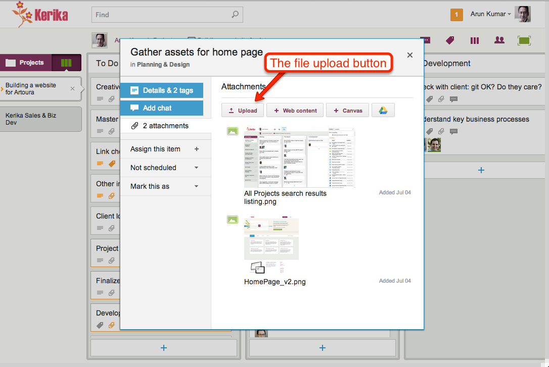
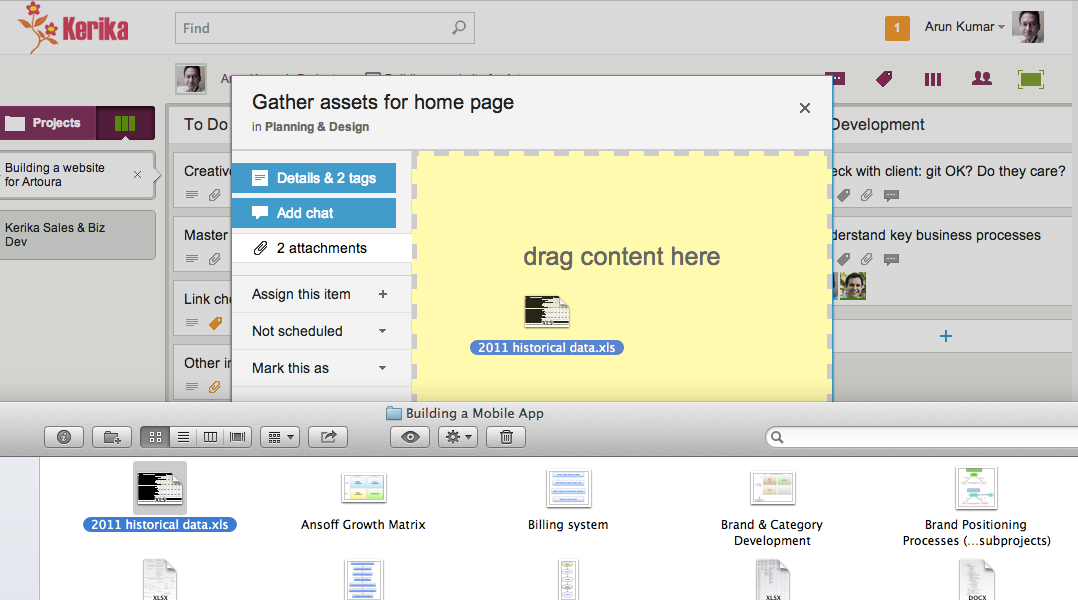
The most visible change we made is the card details display: what you see when you open up a card on a Task Board or Scrum Board

New Card Details dialog

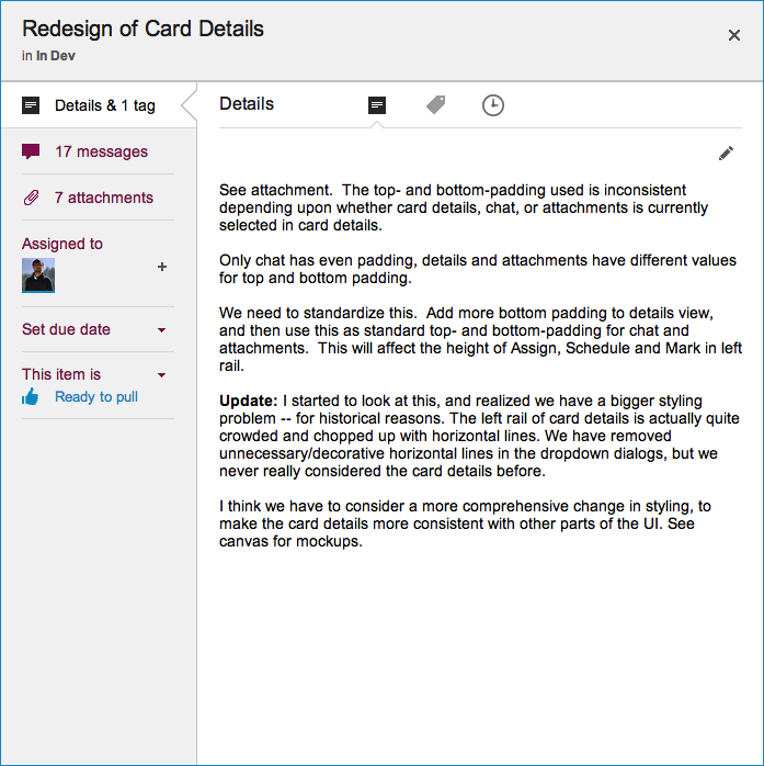
This display is cleaner than what we used to have: it has a more consistent appearance with the rest of the Kerika user interface, and gives equal prominence to all the user interface elements within this dialog — because all of these elements are, in face, equally important to users. Our previous design gave undue prominence to Details, Attachments and Chat, which reflected nothing more than the historical evolution of the Kerika software; now, everything about a card is equally accessible.

The layout is also a lot cleaner: unnecessary decoration has been eliminated, and the overall style is more “flat” (i.e. in keeping with Microsoft’s Metro/Modern design styling, which even Apple has now adopted for iOS 7).

A shift towards short-lived cookies

In an earlier blog post we noted that Google is making it increasingly hard for people to create and maintain distinct Google IDs, and this is creating more problems for Kerika users, forcing us to rethink our “cookie strategy”. Here’s the background:

Long-lived and short-lived cookies

When you sign in to Kerika, you do so using your Google ID: the Kerika server gets an authorization token from Google and places a cookie on your local computer so that you don’t have to sign in again, if you close and then reopen your browser.

We had been using what’s known as a “long-lived cookie”: one that doesn’t automatically expire when you close your browser. That made Kerika more like a news site than a banking site: when you login to a news site as a registered user, you get a long-lived cookie so that you don’t have to login again, even after you have closed your browser (or even restarted your computer).

Banking sites, on the other hand, use “short-lived cookies”: if you close your browser tab, open a new one and try to access your bank account again, you will be asked to re-login.

Short-lived cookies are generally used for more sensitive websites, like banking, because there is a big tradeoff in terms of user convenience. Kerika had previously opted for long-lived cookies because we wanted to make it really convenient for people to get back to their Kerika boards after having closed their browser.

The problem we face

The problem we are facing now is that it is increasingly more likely that your Kerika login is out of sync with your Google login. There are at least two ways in which this could happen, one of which was always a risk, and the other a new risk resulting in the shift in Google’s approach to user IDs:

  • The old problem: people with multiple Google IDs would frequently switch between them, without logging out of Kerika. For example, someone has two Google IDs: A and B. She may have signed up with Kerika while she was logged in as User A. Since we were using long-lived cookies, a Kerika cookie identifying her as “User A” will stay on her machine until she logs out of Kerika.
    But, in the interim she may have separately logged out of Google as User A and logged in as User B (perhaps to check her Gmail on a different ID). This would result in a situation where she is known to Kerika as User A, and currently logged into Google as User B. In this scenario, she would be unable to open any files attached to her projects because of the mismatch in IDs.
  • The new problem: Google is making it easier for people to be logged in as two different IDs, using the same Chrome browser. (Note: this is true only with the Chrome browser; not true with Safari, Firefox or IE as far as we know.) This considerably increases the odds that a user is currently logged into Kerika as User A, and simultaneously logged into Google as User B.
    Because the user never consciously logged out from Google – just switched IDs while on YouTube or Gmail or somewhere – she may be unaware that she isn’t who she thinks she is…

The short-term solution

We can mitigate this problem by switching over to short-lived cookies. This makes the user experience a little more annoying, in our opinion (because you have to login more frequently to Kerika, or remember to keep your browser alive), but it should help reduce the odds that your Kerika ID is out of sync with your Google ID.

The long-term solution

Allow users to sign up directly at Kerika, without using their Google IDs!

It’s now easier to work with Microsoft Office files

Although Kerika is built on top of Google Drive, you can still share files in Microsoft Office format.

Here’s how it works:

  • By default, your files are converted to Google Docs format when you add them to a card or canvas in Kerika, but if you prefer, you can keep them in their original Microsoft Office (or other program, like Adobe) format.
  • Go you personal preferences page, at https://kerika.com/preferences, and you will see this preference switch:
Setting your Kerika preferences

Toggle the “Use Google Docs for projects in my account” to OFF, and your Microsoft Office files will remain in their original format even as they get shared using Google Drive.

To make this preference even more useful, we have added a “smart download” feature: if you are storing your files in Microsoft Office format, clicking on a file attached to that card will automatically download that file for you, so that you can open it in Microsoft Office.

For example, if you have added a Microsoft Word file to a card, and are storing it in the original MS Office format, clicking on the attachment will download the file and launch Microsoft Word so that you can immediately start editing the file.

In some cases you might see a “403 Access Denied” message appear: if you do, there is a simple workaround for this problem – just open docs.google.com in a separate browser tab, and try again. It will work this time.

A very important point to note: if you download and edit a file, make sure you attach the modified document as a new attachment to your card (or canvas); otherwise your team members won’t see the latest version!

Sorting by Date

We have added a couple of new features related to dates:

  • Every card in the Done column, of a Task Board or Scrum Board, will show the date on which the card was marked as done: this makes it easy to see, at a glance, when work was completed on a project.
  • Cards that have dates assigned to them can get sorted by date.

If a column contains any cards with dates assigned to them, a “Sort by Date” button appears at the top of the column:

Sort by Date button
Sort by Date button

Clicking on this button will sort the cards that have dates:

  • Only cards with dates are affected: if a column contains some cards that don’t have dates, these are not affected.
  • You can sort in ascending or descending order.

This is a useful feature for date-driven projects, but if you are working in a pure Kanban or Scrum team, you might want to stick with (manually) sorting dates by priority, which the highest priority items at the top of the column.

Usability testing is surprising cheap (revisiting Jakob Nielsen)

Jakob Nielsen, of the Nielsen-Norman group, is an old hand at Web usability – a very old hand, indeed, and one whose popularity and influence has waxed and waned over the last two decades.

(Yes, that’s right: Mr. Nielsen has been doing Web usability for 2 decades!)

Kerika founder, Arun Kumar, had the good fortune of meeting Mr. Nielsen in the mid-90s, when he was just embarking upon his career as an independent consultant. The career choice seemed to have come from necessity: Mr. Nielsen has been working in the Advanced Technology Group at Sun Microsystems, and they had recently, with their usual prescience, decided to disband this group entirely leaving Mr. Nielsen unexpected unemployed.

(This was before Sun concluded there was money to be made by re-branding themselves as the “dot in dot com“. As with so many opportunities in their later years, Sun was late to arrive and late to depart that particular party.)

It must have seemed a treacherous time for Mr. Nielsen to embark upon a consulting career in Web usability, back in the mid-90s, when despite Mosaic/Netscape’s success a very large number of big companies still viewed the Internet as a passing fad. And Mr. Nielsen, from the very outset, opposed many of the faddish gimmickry that Web designers, particular Flash designers, indulged in: rotating globes on every page (“we are a global company”, see?) and sliding, flying menus that made for a schizophrenic user experience.

Despite the animus that Flash designers and their ilk have directed towards Mr. Nielsen over the past decade – an animus that is surely ironic given how Flash has been crumbling before HTML5 – his basic research and their accompanying articles have stood the test of time, and are well worth re-reading today.

Here’s one that directly matches our own experience:

Elaborate usability tests are a waste of resources. The best results come from testing no more than 5 users and running as many small tests as you can afford.

And here’s the graph that sums is up:

Diminishing returns in usability testing

iOS 7 Maps: more beautiful than before, still slightly insane.

Here’s a simple screenshot that shows why Apples iOS 7 Maps is more beautiful than ever, but still slightly insane… Here’s what happens if you search for “Ups klahanie”, while standing on Klahanie Boulevard in Issaquah, Washington: Apple suggests you go to a UPS store in Vancouver, British Columbia. In other words, it finds a suitable destination for you that’s in another country altogether.

Searching for the nearest UPS store


The basic flaw with iOS Maps, as we have noted before, is that it makes no effective use of GPS data even though the software was created for use only with iPhones, all of which, always, have had GPS capabilities. This has been

But this particular search provides a clue to what’s actually going in Apple’s servers: the word “Klahanie” means “outdoors” in the Chinook language, and the Chinook people can be found across several places in the Pacific Northwest region, beyond their origins in the lower Columbia River region (where Washington State borders Oregon).

So, somewhere in Vancouver the Chinook influence has also resulted in a local street being named Klahanie, and that’s triggered Apple’s Maps to serve up that absurd result (instead of the UPS store that was less than a mile away from where the search was being done).

Adding files to cards and canvases: in Internet Explorer 9, and other browsers

Adding files from your desktop to a card or canvas in Kerika is now easier than before: providing you are using Firefox, Chrome or Safari…

Internet Explorer 9, however, remains less elegant. And that won’t change until folks start moving off IE9 to IE10 (or, at a minimum, stop running IE9 in the dreaded “compatibility mode” which Kerika won’t support at all!)

There are several ways you can add files to your cards or canvas, all of which result in the files being uploaded to your Google Drive and shared automatically, seamlessly with your project team members:

Use the upload button inside the card details display, like this:

Adding files using the File Upload button

Drag and drop a file onto a card details display, like this:

Dragging and dropping onto card details

Drag and drop a file onto a canvas, like this:

Files dragged and dropped onto canvases

Drag and drop a file onto a card on the task board itself, like this:

Dragging and dropping a file onto a task board

All of these work on Firefox, Chrome and Safari, but with Internet Explorer 9 only the first method works: you have to click on Upload button.

There isn’t much we can do about it, since Internet Explorer’s implementation of the HTML5 standard was so erratic… Sorry.