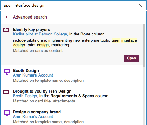
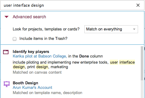
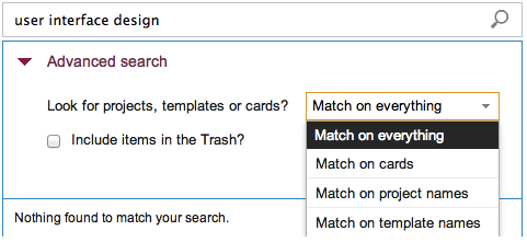
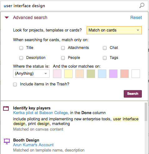
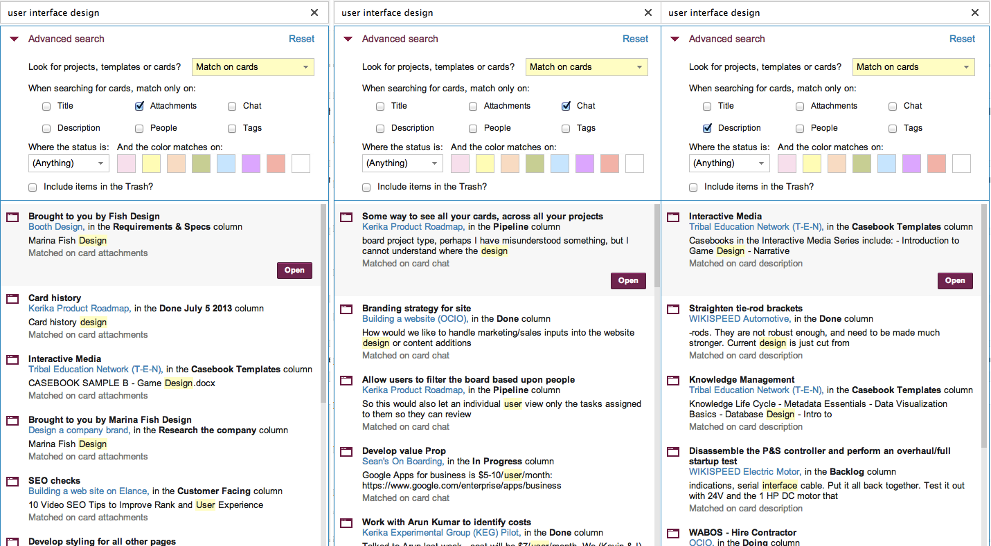
We have been busy building a great new Search function: the old search worked only with whiteboards, but the new search indexes absolutely everything inside Kerika: cards, chat, attachments – the whole lot.
We will talk about Search in a separate blog post; this article is about the detour we made into Amazon Web Services (AWS) along the way…
Now, we have always used AWS: the Kerika server runs on an EC2 machine (with Linux, MySQL and Jetty as part of our core infrastructure), and we also use Amazon’s Dynamo Database for storing card history – and our use of various databases, too, deserves its own blog post.
We also use Amazon’s S3 cloud storage, but in a limited way: today, only some static data, like account logos and user photos are stored there.
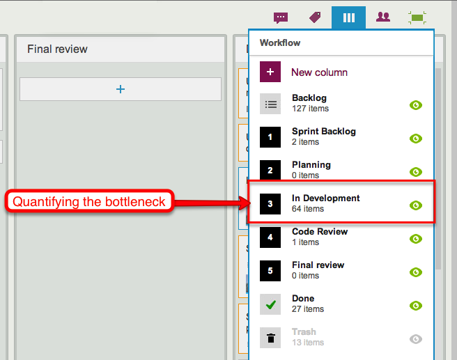
The new Search feature, like our old one, is built using the marvelous Solr platform, which is, in our view, one of the best enterprise search engines available. And, as is standard for all new features that we build, the first thing we did with our new Search function was use it extensively in-house as part of our final usability testing. We do this for absolutely every single thing we build: we use Kerika to build Kerika, and we function as a high-performing distributed, agile team!
Sometimes we build stuff that we don’t like, and we throw it away… That happens every so often: we hate it when it does, because it means a week or so of wasted effort, but we also really like the fact that we killed off a sub-standard feature instead of foisting crapware on our users. (Yes, that, too, deserves its own blog post…)
But our new Search is different: we absolutely loved it! And that got us worried about what might happen if others liked it as much: search can be a CPU and memory intensive operation, and we became worried that if our Search was so good that people started using it too much, it might kill the performance of the main server.
So, we decided to put our Solr engine on a separate server, still within AWS. To make this secure, however, we needed to create a Virtual Private Cloud (VPC) so that all the communications between our Jetty server and our Solr server takes place on a subnet, using local IP references like 10.0.0.1 which cannot be accessed by people outside the VPC. This makes it impossible for anyone outside the VPC to directly access the Solr server, adding an important layer of security.
To communicate between the Jetty server and the Solr server, we have started using Amazon’s Simple Queue Service (SQS).
OK, that means we add VPC to our suite of AWS services, but this started triggering a wider review of whether we should use more AWS services than we currently do. One sore point of late had been our monitoring of the main server: our homemade monitoring software had failed to detect a brief outage (15 minutes total, which apparently no one except our CEO noticed :0) and it was clear that we needed something more robust.
That got us looking at Amazon’s CloudWatch which can be used with Amazon’s Elastic Load Balancer (EBS) to get more reliable monitoring of CPU thresholds and other critical alerts. (And, along the way, we found and fixed the bug which caused the brief outage: our custom Jetty configuration files were buggy, so we dumped them in favor of a standard configuration which immediately brought CPU utilization down from a stratospheric level to something more normal.)
We didn’t stop there: we also decided to use Amazon’s Route 53 DNS service, which provides greater flexibility for managing subnets than our old DNS.
In summary, we have greatly expanded our Amazon footprint:
- EC2 for our main Web servers, running Linux, Jetty, MySQL, with separate servers for Solr.
- S3 for basic storage.
- Dynamo for history storage.
- VPC for creating a subnet.
- SQS for monitoring.
- CloudWatch for monitoring.
- Elastic Load Balancer for connecting to servers.
- Route 53 for DNS.
Something from Amazon that we did abandon: we had been using their version of Linux; we are switching in favor of Ubuntu since that matches our development environment. When we were trying to debug the outage caused by the high CPU utilization, one unknown factor was how Amazon’s Linux works, and we decided it was an unknown that we could live without:
- First of all, why is there an Amazon Linux in the first place, as in: why did Amazon feel they need to make their own Linux distribution? Presumably, this dates back to the very early days of AWS. But is there any good reason to have a vendor-specific Linux distribution today? Not as far as we can tell…
- It just adds unnecessary complexity: we are not Linux experts, and have no interest in examining the fine print to determine how exactly Amazon’s Linux might vary from Ubuntu.
Unless you have in-house Linux experts, you, too, would be better off going with a well-regarded, “industry-standard” (yes, we know there’s no such thing in absolute terms but Ubuntu comes pretty close) version of Linux than dealing with any quirks that might exist within Amazon’s variant. When you are trying to chase down mysterious problems like high CPU utilization, the last thing you want is to have to examine the operating system itself!
What we continue to use from Google:
- Google login and restriction, based upon OAuth 2.0,
- Google Drive for storing user’s local files.
All the pieces are coming in place now, and we should be able to release our new Search feature in a day or two!