Tag Archives: Tablet

About using Kerika on tablets.

Tablet support

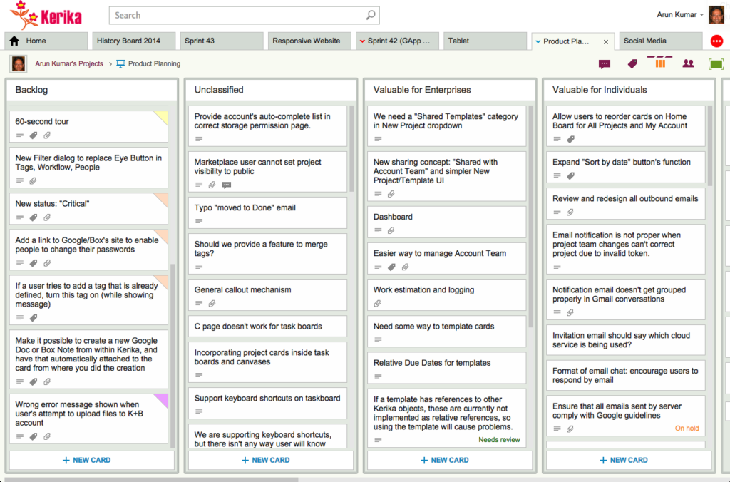
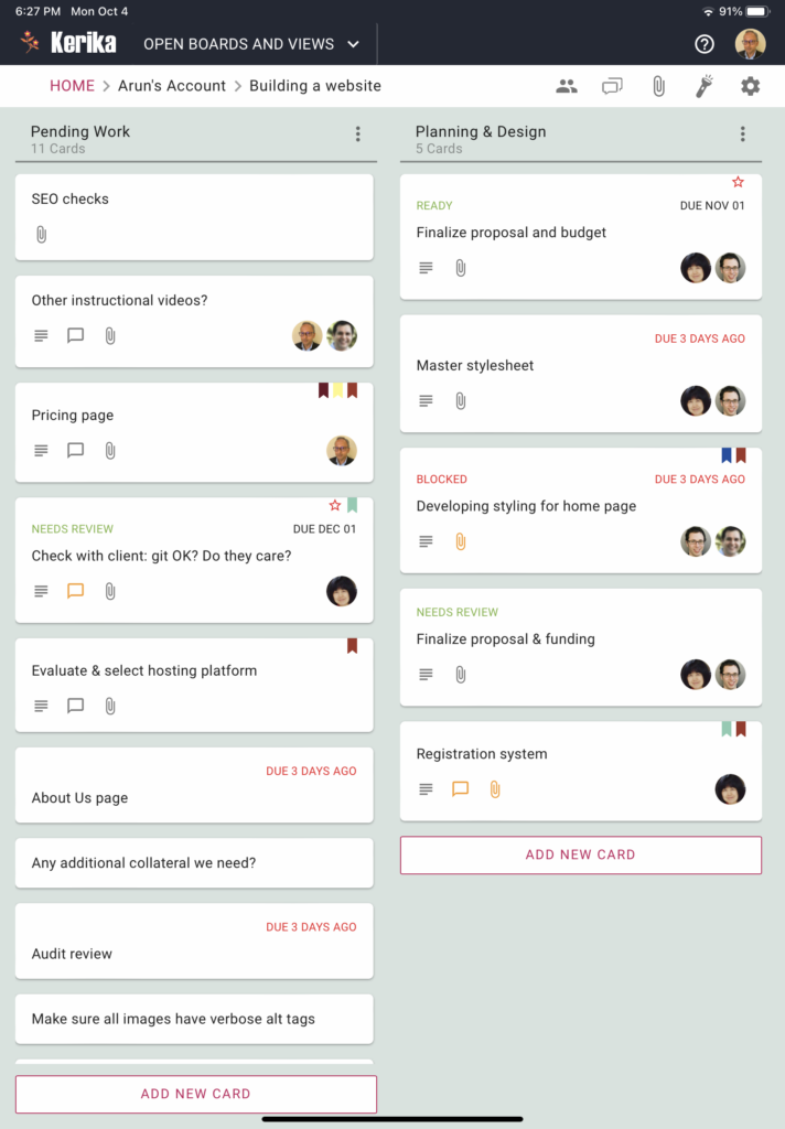
We have added tablet support for iOS and Android devices, as you can see:

The tablet experience is like that of the desktop, not the phone.

For the phone app we had to redesign a lot of the user interface to accommodate the limited screen space, but with most tablets today there is enough screen resolution to support the more extensive desktop experience.

Easier to preview documents on mobile devices

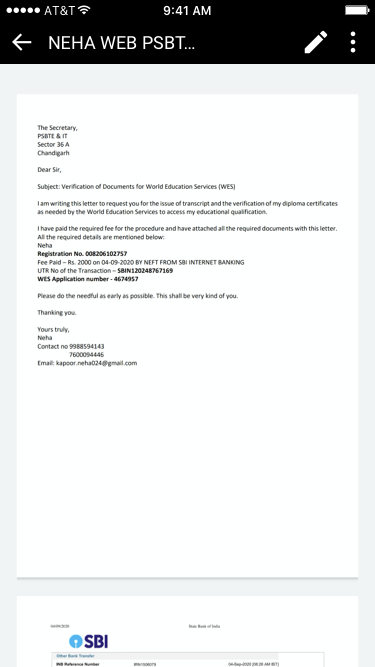
We have made it easy for you to preview documents that are attached to cards or whiteboards, regardless of how you sign up for Kerika.

Screenshot showing a preview of an attached document on an iPhone
Previewing docs on an iPhone

You could have signed up using a Google ID, a Box ID, or just your email: it doesn’t matter how you signed up, nor how other members of your team signed up.

Previewing documents just became really easy.

Windows tablet experience improved

As with Android tablets, we have been doing a bunch of testing and bug fixing related to using Kerika on Windows tablets and touch devices generally (i.e. the many combinationss of touch and keyboard that make up the Windows computer ecosystem)

And, as with iPads and Android tablets, you don’t need to install a special app in order to run Kerika: you can just use the Internet Explorer browser (or any other browser you have installed) to access Kerika, and use your finger to move stuff around just as you would with a mouse.

There were some problems with the touch interface that we have fixed; the overall experience should be a lot better than it was before!

Amazon Fire tablet experience: surprisingly good

We were trying out Kerika using Amazon’s Silk browser on one of their Fire (color) tablets, and found that Kerika worked surprisingly well.

On standard (un-forked) Android tablets, the Chrome browser works better than the standard browser that comes with all tablets, mainly because Google has been improving Chrome with a lot more enthusiasm than they have been improving “stock Android“.

So, we weren’t sure how good the Silk browser would behave with Kerika, given that Silk is a relatively old fork of the standard Android browser.

It turns out that you can use Kerika on Amazon’s Fire tablets quite well: just open the Silk browser, go to kerika.com, and login like you would on a laptop or desktop. Just let your finger do the dragging-and-dropping…
Android tablet experience improved

We have been doing a bunch of testing and bug fixing related to using Kerika on Android tablets.

As with iPads, you don’t need to install a special app in order to run Kerika: you can just use the Chrome browser on an Android tablet to access Kerika, and use your finger to move stuff around just as you would with a mouse.

We found an fixed some problems with the Chrome touch interface; the overall experience should be a lot better than it was before!

Note: you are almost always better off using the Chrome browser rather than the standard browser that comes with all Android tablets; that’s because Google has a lot more enthusiasm for improving their proprietary (non open-source) products than “stock Android“.

Our newest version: tablet improvements, Google Apps Marketplace upgrade

Our newest update to Kerika serves up a rather long list of changes; the two big areas for improvement were:

  • We have updated our integration with Google Apps Marketplace to use OAuth 2.0, since Google is retiring its OAuth 1.0 implementation.
  • We have made a bunch of improvements for using Kerika on iPads, with the Safari or Chrome browsers.  (We still need to work on Android tablets, which, unfortunately, present too much variety…)

The OAuth 2.0 upgrade and iPad improvements are described in previous posts; here we want to highlight some of the other changes and improvements we made with this new version:

In addition to being less distracting, this new design will enable us to expand the palette of colors we can offer: the old design restricted us to only the lighter pastel colors.

New styling for colored cards


  • We have redesigned our “Max Canvas” view so that it provides the most useful display, when you need the most space available to view a large board. In particular, you can now access Search even when you are in the Max Canvas view.We have improved security, by implementing secure cookies.
  • We added some subtle animation effects to improve usability. (So subtle, in fact, that you might not even notice them if you are an existing Kerika user, which is just what we want.)

In terms of infrastructure and other under-the-hood improvements, we have expanded our use of JUnit automated tests and done a bunch of bugs fixes, as usual.

There’s a lot of improvements being done on Kerika, and at a very fast rate. Make sure you subscribe to our blog to keep up!