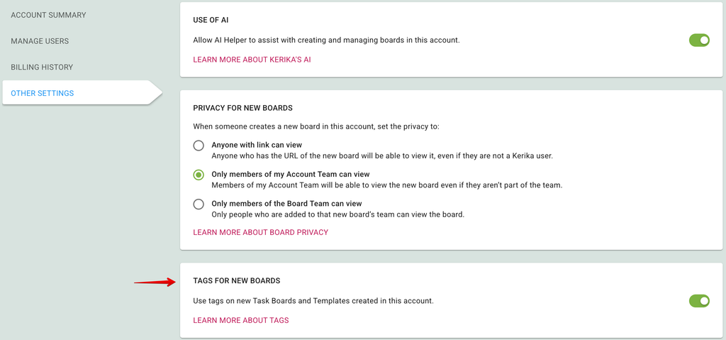
We have made a small change to how Tag preferences are handled: previously they were set at the Board level, by individual Board Admins, but now they are set at the Account level by Account Owners and Account Admins.
This can be done by going to your Manage Account page and selecting the OTHER SETTINGS tab:
Views are unique to Kerika: no other work management system provides such an easy way to see what matters, across all the boards you are working on.
These Views make it easy for organizations to really scale up their use of Kerika across multiple projects and many ongoing projects at the same time.
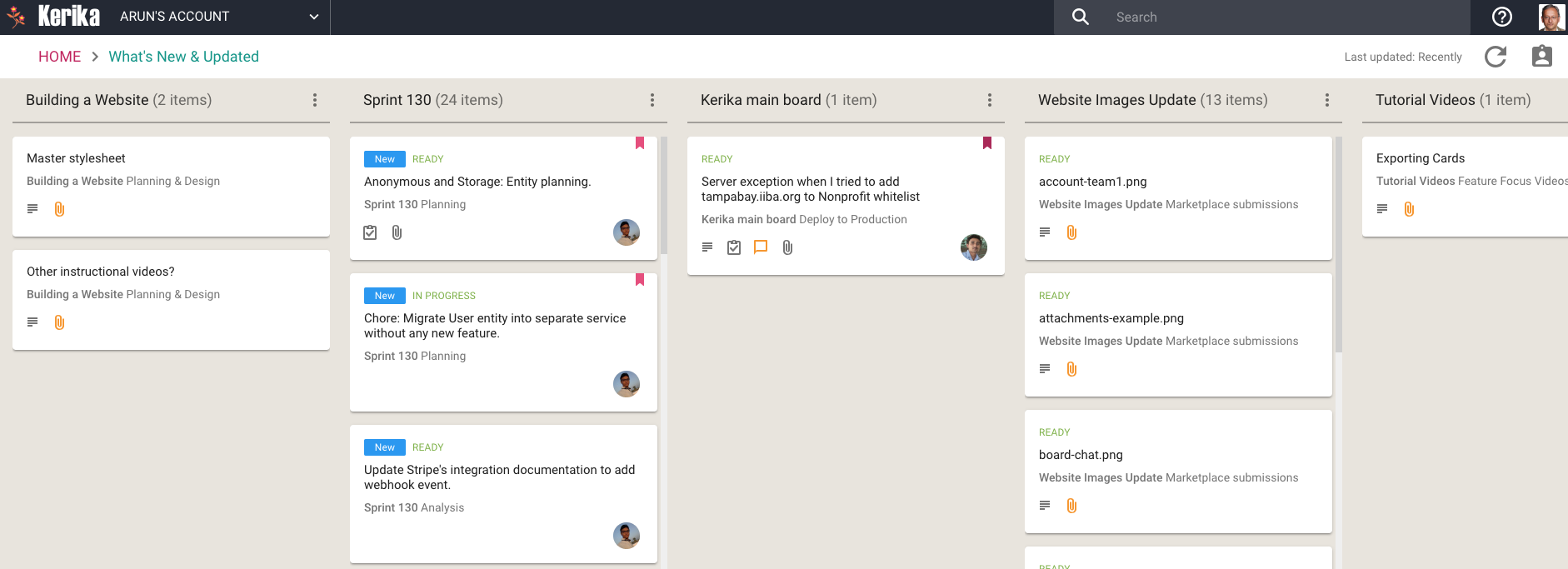
We have now added a very useful new View: What’s New and Updated. As you might guess from the name, this View lets you catch up on everything that’s new and changed, across all the boards you are working on — as a Board Admin, Team Member or Visitor.
What’s New and Updated (click for a larger image)
This View can work very effectively as a Dashboard for managers who need to keep track of many different boards, all working at the same time: instead of constantly revisiting each board one-by-one, this View is a simple, comprehensive way to see everything that’s changing across all your boards.
The updates are shown in Kerika’s unique “heads-up” notification style: the blue New tags highlight cards that have been newly added to your boards (that you haven’t opened yet), and the orange highlights show you precisely what’s changed on your old cards.
The new and changed cards are sorted into columns, with each column containing all the new and changed items within a particular board. The newest changes appear at the top of a column, and if a board has nothing new to report, the corresponding column is not shown (so your View doesn’t get cluttered up.)
(Cards that are moved to the Done or Trash columns on a board are not included in the View, to help avoid getting the View cluttered.)
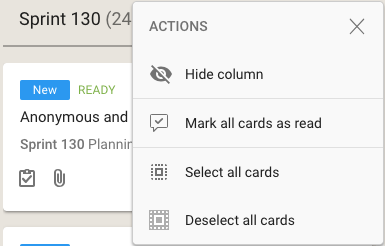
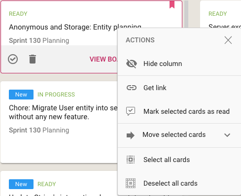
As with all Views, it’s easy to operate on all the cards within a column, by selecting the Column Actions button that appears on the top of each column:
View options
The Mark All Cards As Read action is useful if you want to ignore everything that’s going on in a particular board, e.g. when you have just returned from a status meeting where you got fully briefed on what’s happening on a particular board.
Another way to temporarily ignore individual boards is to Hide Column: this collapses the column from the View, and let’s you focus more intently on the handful of boards you care most about.
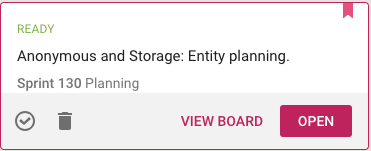
Selecting a card in this View lets you open the card within the View itself, or to open it on the board where the card actually sits:
View card
(Sometimes it’s easy to deal with cards just by themselves; sometimes the View Board action is more helpful, if you want to be sure you understand the full context in which a card changed.)
Using your mouse’s right-click action will also bring up a bunch of useful actions for that card:
Mouse actions
In addition to all the other actions you can perform on cards, you also have the option to get the URL (address) of card using the Get Link action. Every cards, every canvas and every board in Kerika has a unique address, and using these URLs anywhere on a board, e.g. in the board’s details or chat, will automatically set up a link between the two cards.
When you mark a card as “read” on this View, it remains on the View until you click on the Refresh button (shown at the top-right corner of the View).
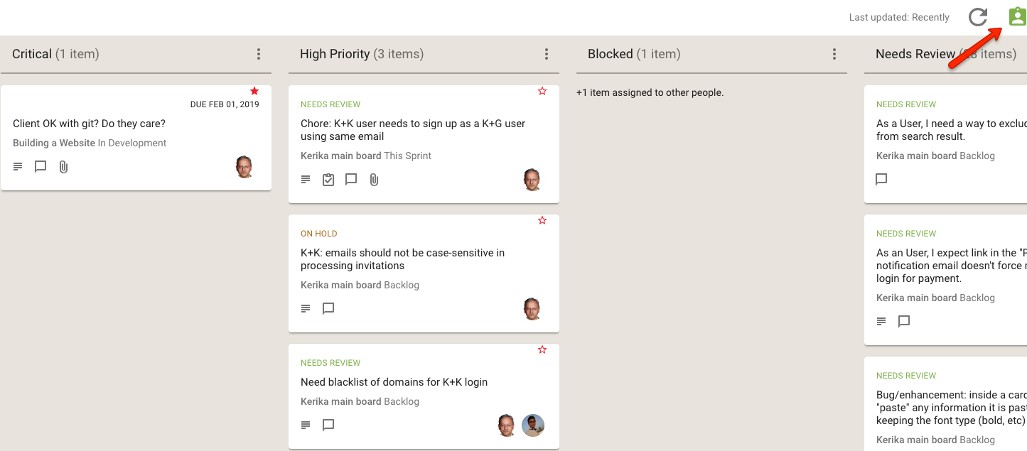
And, as with all Views in Kerika, the What’s New and Updated View includes the “For Me” toggle button on the top-right corner: clicking this will quickly filter the View to show you just those items that are personally assigned to you.
For Me toggle (click for larger image)
This feature is available to all our users, just like every other feature in Kerika: it doesn’t matter whether you are still in your 30-day free trial, you are working on the free Individual Plan, or are benefiting from Kerika’s free Academic and Nonprofits Accounts. Everyone always get the same Kerika goodies :-)
For users of Kerika’s Task Boards and Scrum Boards, we have made it easier to prioritize your work.
Background:
Traditionally, in a Kanban or Scrum board the priority is denoted by the position of the card within a column: cards that are higher priority are placed higher within a column, and the card at the top of the column is the highest priority at that stage of the workflow.
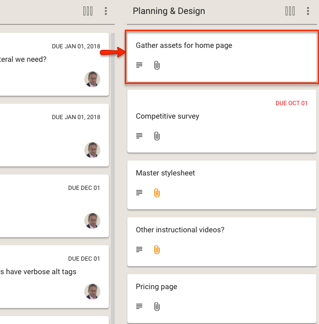
For example, in this view of a board the highest priority item for Planning & Design is the card on top of that column:
Highest priority item in Planning and Design
This method has the advantage of simplicity and clarity: there is no ambiguity about what is the most important work item at any stage of the workflow.
The disadvantage of this method is that as many cards start to move across the board, especially on boards where the workflow is complex (i.e. the board has many columns), it becomes harder to track all the cards that are especially important.
In other words: the simple method doesn’t scale well, and our goal with Kerika is to provide the simplest user interface on top of the most capable work management system, so we realized we needed to do something more.
Flagging cards
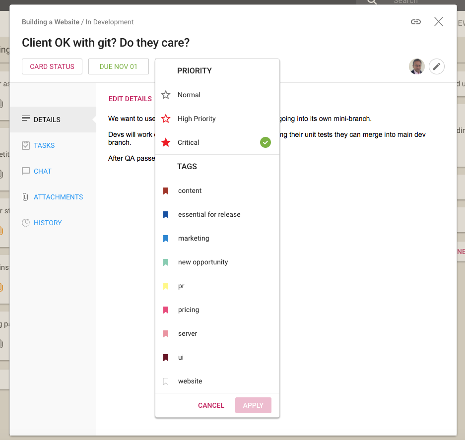
With our latest version, Kerika makes it easier to explicitly tag each card with a priority of Normal, High or Critical:
Setting Priority
Along with assigning tags to a card, you can now set the priority of the card as well: by default all cards are Normal, but they can alternatively be flagged as High Priority or Critical.
Viewing all the High Priority and Critical Cards
We have also extended the Highlights function for Task Boards and Scrum Boards to make it easy to quickly see all the High Priority and Critical cards on a crowded board:
Highlighting high priority and critical items
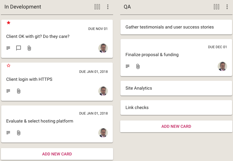
When you are looking at a board, the High Priority and Critical cards are also highlighted with small stars: a solid red star for Critical, and a hollow red star for High Priority:
High Priority and Critical cards
The Normal Priority cards don’t have any star; we didn’t want to crowd the design which would have made it harder to spot the more important High Priority and Critical cards at a glance.
High Priority and Critical Cards across all your Boards
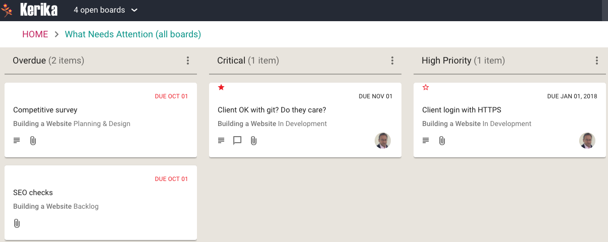
And, finally, we have enhanced the What Needs Attention View to include columns for the High Priority and Critical cards across all the boards where you are a Board Admin, or where you have been assigned the card as a Team Member:
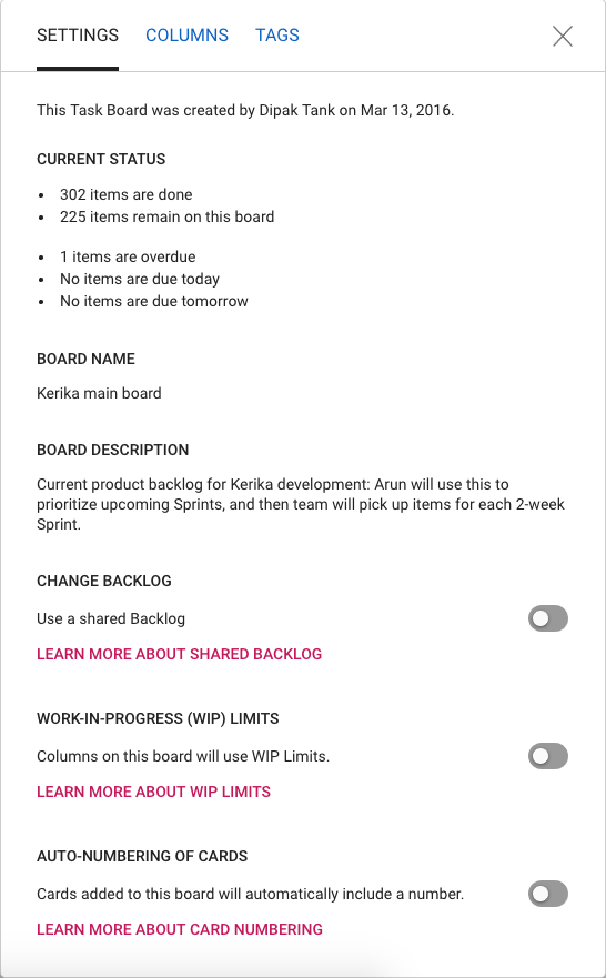
One final (?) bit of restyling, to make all of Kerika consistent with our new look-and-feel, has been updating the Board Settings dialogs.
Board Settings
The functionality is essentially the same, but the appearance is cleaner, lighter and more in keeping with the Material Design standards we have (mostly) adopted.
(We say “mostly”, because there are some elements of Material Design that we find unattractive. For example, for the on/off toggle switches we prefer the iOS style buttons.)
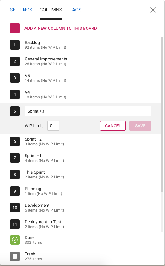
Column Settings
The Column Settings dialog has also been restyled, and looks nicer and cleaner. The example above shows a board that uses Work-In-Progress Limits.
Tag Settings
And the same with Tag Settings: we have a restyled color picker, and better messages for warnings when tag names or colors might clash.
We have replaced the old Filters feature for our Task Boards and Scrum Boards with a new Highlights feature that we think is better in every way!
Click on the Flashlight icon on the top right corner of the Kerika app:
Highlights button
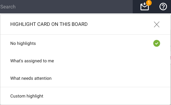
And you will see this menu of actions:
Highlight options
The default is No highlights. We have a couple of built-in highlights that we know you will find useful right away:
What’s assigned to me: very useful if you are working on a large board, or with a large team, and you focus on just what you need to get done.
What needs attention: this highlights all the cards on the board that we think need to pay attention too — items that are overdue, on hold, or flagged as needing review.
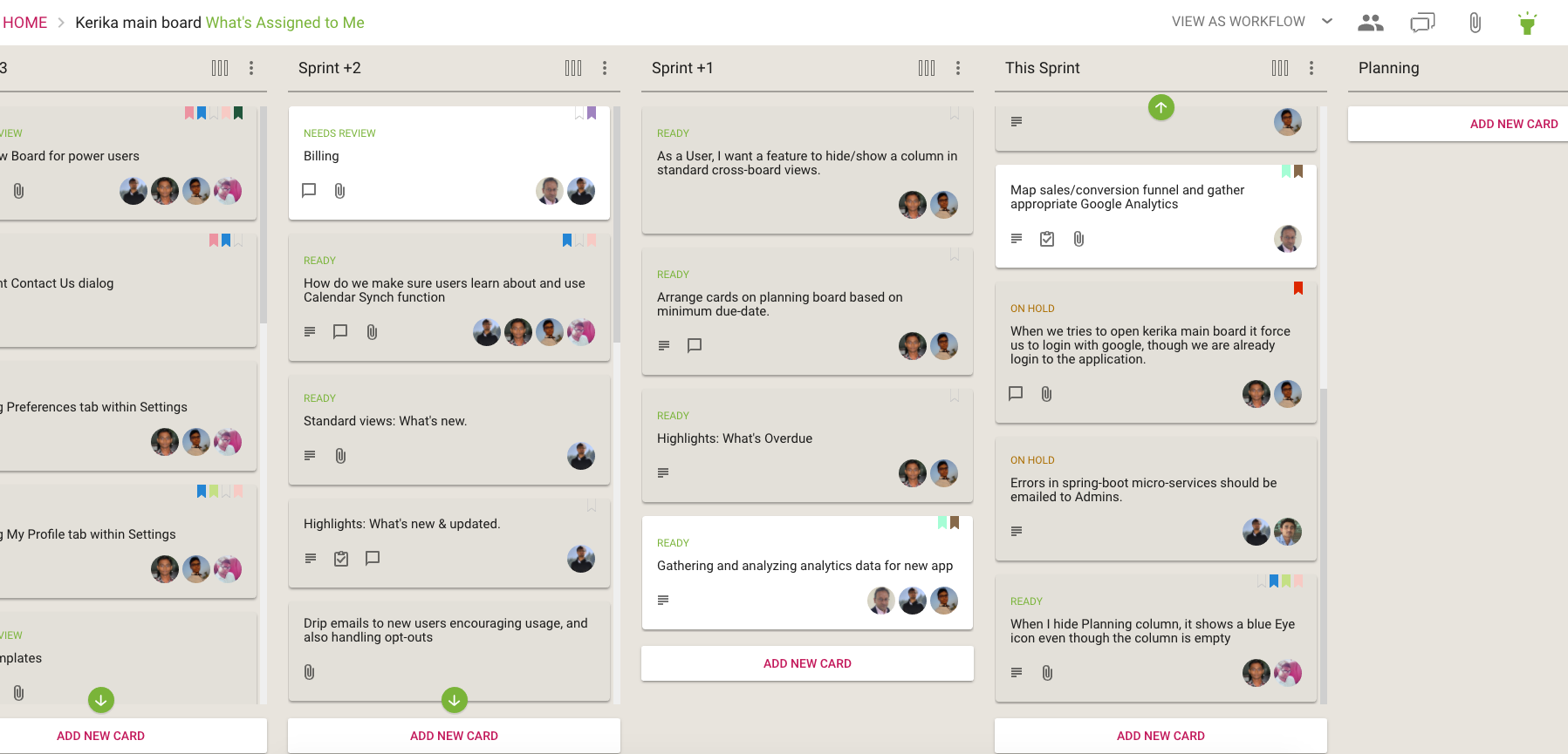
Here’s how the Highlights work:
What’s Assigned to Me
A shadow effect helps spotlight all the cards that match the highlight, making them literally pop out of the screen!
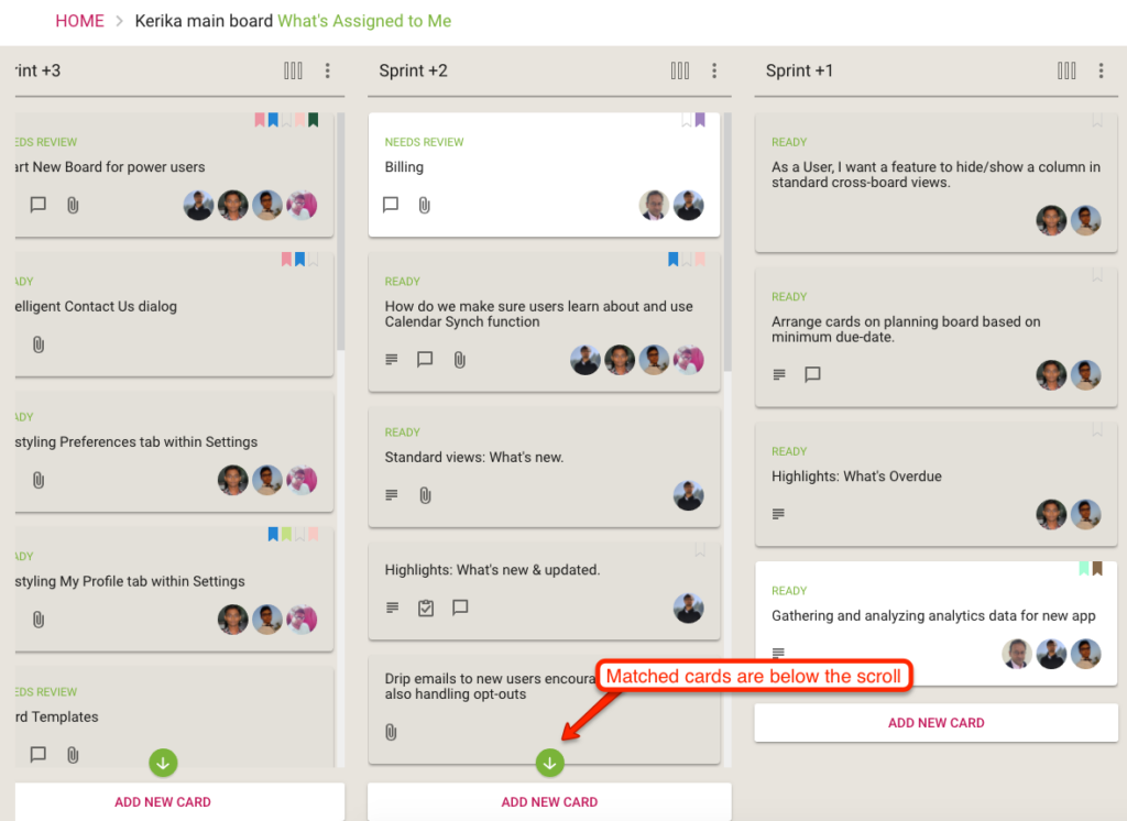
If you are working on a board with a lot of columns, there’s always a chance that something that is being highlighted is currently out of view — if, for example, it is near the bottom of a long column.
Kerika takes care of that as well: if a card that matches your highlight choice is currently out of view, a green button appears at the top or bottom, as needed, of each column to indicate that there are cards out of view that match your highlight.
When matched cards are below the scroll
The green arrow acts as more than just an indication that you need to scroll: it is also a button that will scroll the column to show you the next card that you need to see.
(Pretty cool, huh?)
We will be adding more smart highlights in the coming weeks, but in the meantime you can also create your own custom highlights:
Custom Highlights
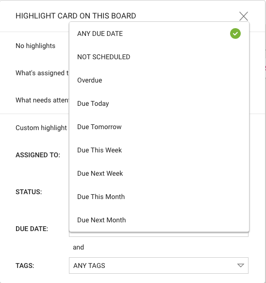
A Custom Highlight can include any combination of people assigned to cards, status, due dates and tags.
For the due dates, we have offered several smart options that are a lot easier to use than standard date pickers:
Smart choices for Due Dates
These ways of specifying due dates — like “Due Next Week” or “Next Month” — make it even easier to set up a custom highlight.
We have had both tags and color coding of cards on Task Boards and Scrum Boards for a very long time, but, unfortunately, these operated independently of each other.
There’s no good reason for them to have been separate aspects of working with cards other than simple history: we added color coding many months after we added tags.
Originally we expected color coding to be used in a limited way only: to highlight a few cards on a crowded board that needed special attention.
We had a limited set of 7 light pastels that were chosen to be “color-safe”, i.e. appropriate for use by color-blind people.
Over time, however, we found that people were using color coding a lot more than we had anticipated, and that in fact they were using colors as an alternative to regular tags.
And that was true for the Kerika team as well: we have a “bug” tag that we use to track all work related to defects, but some of us also like to use the red color to highlight cards related to bugs.
And while we could readily agree on the symbolic meaning of a few colors, e.g. Red as indicating something critical or broken, we couldn’t agree on the names or meanings of all the colors.
So, this obviously wasn’t a sustainable path for us: if colors and labels were simply alternative ways of managing your view of a large board, and for collating work across multiple boards, then clearly colors and tags needed to come together as a single concept.
And that’s what we have done with our latest release: colors and tags are now the same thing — all colors have names, all tags can have colors.
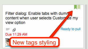
Here’s what your Kerika boards will look like, with the new way of showing tags:
New tags styling
A couple of points to note:
All your old tags are preserved with this change, so you don’t have to go back and fiddle with any of your old boards.
We will show more than one tag on a card at a time; this will make it easier to visually scan a large board.
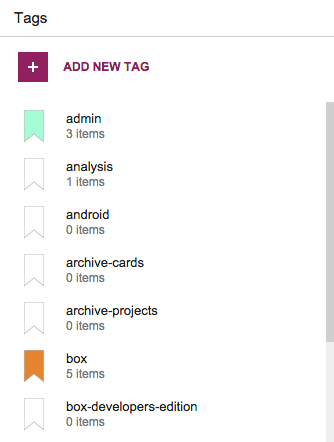
The dialog for managing your board’s tags has also been updated, to reflect the new merger of tags and colors:
Tags dialog
When you add a new tag, you have to use a different label from the ones you are currently using: as before, duplicate tags are not allowed.
And the same goes for colors: when you add a new tag, you can’t use a color that is already associated with a label, which means tags have unique colors.
One unique benefit we have added, along with this merger of tags and colors, is the ability to merge tags together.
Let’s say you had been using a tag called “bug” (if you are working on a software project). Some of your colleagues have been using a different tag called “defect”.
You decide that these two tags really reflect the same underlying concept — they are both being used to highlight problems with your software project — so it makes sense to merge these two tags together.
There used to be no easy way of doing this in the past, but now there is:
You can merge tags by renaming one of them, e.g. renaming “bug” to “defect” will cause the system the ask if you want to merge “bug” and “defect” together to be same tag.
You can also merge tags by recoloring on of them, e.g. by changing the color of the “bug” tag to be the same color as the “defect” tag will cause the system to ask if you want to merge these two tags.
A new tutorial video that shows you how Kerika’s powerful Filter feature lets you customize your view of any Task Board or Scrum Board: just see those cards that are assigned to you, or create more custom views of a board by selecting cards based upon their status, tags, or the people assigned to work on them.
You can even hide entire columns on the board if you like :-)
Kerika’s Scrum Boards look a lot like regular Task Boards (which you can use for Kanban-style) work; the main difference is that each Scrum Board can share a backlog with other Scrum Board.
We were doing some fairly complicated bookkeeping when people added tags to their Scrum Boards, and we decided it was getting messy both for the system and probably the users as well.
So, we are simplifying tags for Scrum Boards:
Every Scrum Board is connected to a shared Backlog. (And, if there was no backlog to connect to, Kerika will automatically start a new backlog for you.)
Cards on the Backlog may use a certain taxonomy for their tags, while each Scrum Board could add to this taxonomy, e.g. by adding a new tag that makes sense for a particular Scrum cycle (Sprint).
Now, whenever you add a new tag to a Scrum Board, this will automatically get added to the Backlog’s taxonomy as well, and to all the Scrum Boards that share that Backlog.
The effect of all this is to ensure consistency of your tags taxonomy across all Scrum Boards that share the same Backlog: this will make it easier to pull cards from that Backlog into any Scrum Board and know that you will automatically get all the right tags set up for you by the system.
We found a scenario where your Scrum Board could end up with duplicate tags. Let’s say you had a Shared Backlog which had some tags, and you also had a Scrum Board Template that had some similar tags.
If you created a new Scrum Board using that Backlog and that Template, you could have ended up with some duplicate tags, which is not at all helpful.
One of the coolest features in Kerika is how well the system alerts you to changes made on your Task Boards and Scrum Boards that you haven’t seen — i.e. because you were working on another board at the time your coworkers made changes, or maybe because you were fast asleep in a different timezone!
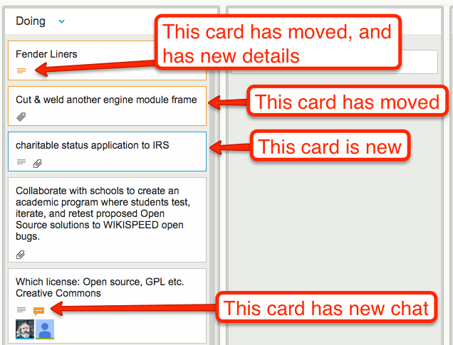
Whenever a coworker makes any change to a card that you haven’t seen — moving the card to a different column, changing its description, changing its tags, leaving some chat, etc., the change is highlighted on the card using orange.
Smart highlights
And when you catch up on that change, e.g. open the card and read the new chat, the orange highlight gets turned off automatically.
(You can also mark a card’s changes as “read”, using the right-mouse-click menu.)
These smart highlights are great for distributed teams, and indeed for any person who is involved with multiple projects because it lets you catch up on what’s changed while you weren’t looking.
Now, these smart higlights are even smarter: if a card has multiple changes to it that you haven’t seen, e.g. it has a new attachment and it has new chat, Kerika keeps track of which changes you have caught up with, and which ones you haven’t.
In this example, if you read the chat, the orange highlight of the chat icon will go away, but the orange highlight of the attachments icon will remain until you catch up on the new attachments as well.