Tag Archives: Usability

About software usability in general.

Simplifying the use of Tags with Scrum Boards

Kerika’s Scrum Boards look a lot like regular Task Boards (which you can use for Kanban-style) work; the main difference is that each Scrum Board can share a backlog with other Scrum Board.

(And switching between a Task Board and a Scrum Board takes just one mouse click!)

We were doing some fairly complicated bookkeeping when people added tags to their Scrum Boards, and we decided it was getting messy both for the system and probably the users as well.

So, we are simplifying tags for Scrum Boards:

  • Every Scrum Board is connected to a shared Backlog. (And, if there was no backlog to connect to, Kerika will automatically start a new backlog for you.)
  • Cards on the Backlog may use a certain taxonomy for their tags, while each Scrum Board could add to this taxonomy, e.g. by adding a new tag that makes sense for a particular Scrum cycle (Sprint).
  • Now, whenever you add a new tag to a Scrum Board, this will automatically get added to the Backlog’s taxonomy as well, and to all the Scrum Boards that share that Backlog.

The effect of all this is to ensure consistency of your tags taxonomy across all Scrum Boards that share the same Backlog: this will make it easier to pull cards from that Backlog into any Scrum Board and know that you will automatically get all the right tags set up for you by the system.

Yes, there is a “Kerika Blue”

We try to be consistent in our use of colors and shades throughout the application, although it is easy to slip up from version to version, particularly since we do so many releases a year.

One recent diversion we corrected was in the use of the color blue: we have a specific shade we call Kerika Blue (#0099CC) which is used to indicate the concept of “new”:
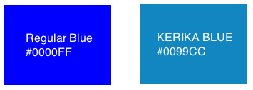
Kerika Blue
Kerika Blue

Kerika Blue is  more muted than the regular blue that you might find elsewhere: we generally try to keep our color scheme muted, so that the decoration of the Kerika app doesn’t compete with your data — after all, your data are far more important to you than anything we do in terms of decorating your screen 😉

Showing Due Dates in local times

Many of our users work in globally dispersed teams; our own team is spread out between Seattle and India.

With multiple timezones, particularly when they are widely spaced apart, commitments like “I will get this done today” become a little tricky to understand.

If someone in India says “I will get this done today”, is that India time or Seattle time? Well, that depends upon where you are, when you log into Kerika.

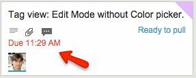
Kerika automatically factors in differences in timezones when showing due dates: someone who commits to getting something done “today” in India is actually committing to get it done by 11:30AM Pacific Standard Time, now that the US is in Daylight Savings Mode.

So, the due date is shown in a way that’s relevant to the user’s local time: our Seattle folks see an Indian’s commitment like this

Local time due date
Local time due date

These timezone differences automatically adjust for Daylight Savings Time: there’s nothing you need to do to see when a commitment is actually due.

Except, perhaps, notice that the item is now overdue, as indicated in red in the example above…

Finding the next unread update in a long column

When working with a crowded Task Board or Scrum Board, you want to be sure that you haven’t missed any updates on cards that are out of view: for example, updates that are out of the scroll area because a particular column of cards is very crowded.

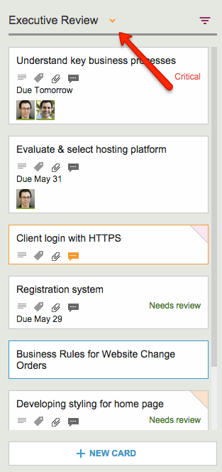
Kerika makes sure you don’t miss anything, and it does this will a handy little button in the form of a downward pointing caret that appears at the top of every column where there is at least one card that needs your attention:

Finding all the changed items in a long column

Clicking on this button will help you quickly find the next updated card in the column, and then the next, and so on.

The color of this caret (button) depends upon what sort of updates are present in a column:

  • If the column contains any overdue cards, the button is red, to alert you to the overdue problem. (We figured this is the most important information we could show you, particularly if the overdue card is out of sight.)
  • If the column contains any new cards, the button is blue. Unless, of course, the column also contains overdue cards, in which case the overdue condition is considered more critical than the fact that you have new cards, and so we show the red button.
  • If the column simply contains updated cards, and nothing that is new or overdue, the button shows in orange.

Regardless of the color, the button works the same way: clicking on it will help you find the next card of interest within that column, and then the next, and so on. The column will automatically scroll as necessary to show you updates that would normally be out of sight.

And when you have caught up on all the updates, the button goes away automatically. Neat, huh?

Getting titles of Google Docs you attach to cards and chat

When you reference a URL in a Task Board or Scrum Board’s cards or chat, Kerika fetches the title for that page and shows that instead of the URL.

This makes the URL references a lot easier for people to understand, because a “naked URL” would be difficult to comprehend.

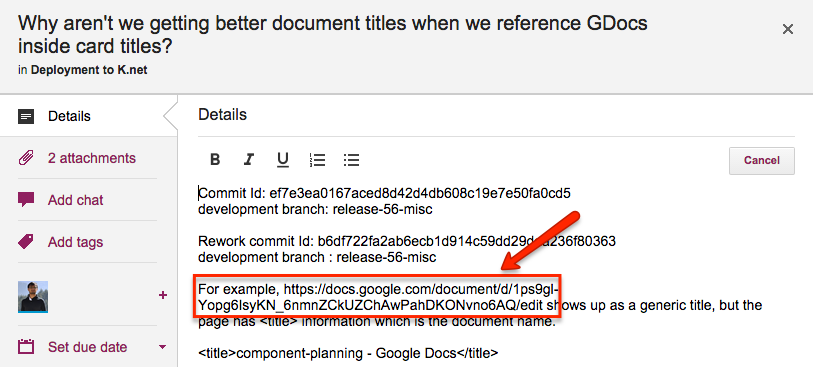
But this wasn’t working great for Google Docs URLs: we were showing the same generic title from Google each time. Here’s an example of the problem:

Google Docs URL
Google Docs URL

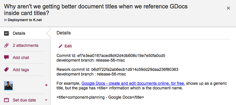
Simply showing the URL reference in it’s “naked” form as https://docs.google.com/document/d/1ps9gl-Yopg6IsyKN_6nmnZCkUZChAwPahDKONvno6AQ/edit would make it pretty incomprehensible, but showing the generic Google Docs page title wasn’t a huge improvement either because the page title is the same for all Google Docs URLs:

Generic Google Docs titles

What we need to do is get the actual Google Doc title, which would make for a useful reference because it would be (presumably) unique and meaningful in the context.


Windows tablet experience improved

As with Android tablets, we have been doing a bunch of testing and bug fixing related to using Kerika on Windows tablets and touch devices generally (i.e. the many combinationss of touch and keyboard that make up the Windows computer ecosystem)

And, as with iPads and Android tablets, you don’t need to install a special app in order to run Kerika: you can just use the Internet Explorer browser (or any other browser you have installed) to access Kerika, and use your finger to move stuff around just as you would with a mouse.

There were some problems with the touch interface that we have fixed; the overall experience should be a lot better than it was before!

Dealing with new top-level domains

The growing number of new top-level domains (in addition to the old familiar .com, .org, etc.) that are available is finally starting to have an impact upon us…

While we haven’t seen a lot of use of these new domains yet, a few useful websites are starting to pop-up, e.g. using the .guide top-level domain, and this has required us to abandon an old feature of Kerika that is not going to work any more.

We used to have some validation code that checked that people were entering URLs correctly, e.g when they wanted to add a Web link to a card or to a canvas.

This validation is pretty much impossible to do in the old form, because of the rapid proliferation of new top-level domains, so we are dropping that validation feature which was kind of nice to have…

Removing the “Embed as IFRAME” feature for canvases

For a very long time we had a feature which was kind of cool (although we don’t know how many people actually used it!) — you could embed another website on a Kerika canvas, using a technique known as IFRAME.

IFRAMEs were common a few years ago, but have steadily dropped out of favor as browsers have increasingly become more secure.

By running another website inside your own, you can be vulnerable to various cross-scripting errors if you cannot fully trust that third-party website you have embedded.  And, at the same time, people who run websites have become less keen on having their sites embedded into other sites — a practice known as “clickjacking”.

(You can read more about this on Mozilla’s website, if you are interested in the technical details.)

Since it became impossible for us to provide a consistently good experience across all modern browsers, particularly as the number of websites that allow themselves to be IFRAMEd dropped drastically, we decided to drop this feature.  If you were using this feature in the past, you will find your old IFRAME is now just a simple bookmark…