We did an update to the toolbar shown on Whiteboards (and canvases attached to cards on Task Boards and Scrum Boards), and while that modernized the look of the toolbar — and removed some usability problems with the old design — in retrospect it didn’t do a good enough job of simplifying the interface :-(

The problem with this design was that it mixed together two different functions:
- Providing drawing function, e.g. drawing a rectangle on the canvas.
- Providing context-specific functions, e.g. linking an image to an external URL.
To improve this design, we are reverting to a very old style: having the drawing buttons appear on the left side of the Kerika canvas:
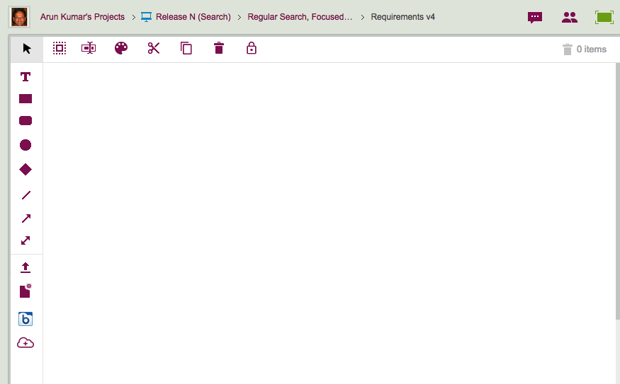
Now, all the functions that put content on the canvas: shapes, lines, files, Web content, etc. are shown on the left edge of the canvas, and the context-specific items — e.g. changing the color of a selected shape on the canvas — are shown on the top.
Using a left-edge toolbar goes back to the very first version of Kerika, although back then we had rather embarrassing styling :-)