When you have expanded your view of a Kerika board to fill up the browser, using the “Max View” button on the top-right corner of the Kerika app
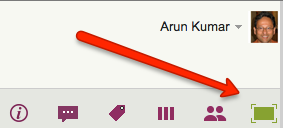
Another button appears on the top-right, to help you quickly switch between all your open project tabs, as well as get to your Home Page:
 This button is color coded to help you understand, at a glance, what’s going on in all your open projects:
- If any of your open projects has an overdue card, then the button appears in red.
- If any of your open projects has updates that you haven’t seen yet, the button appears in orange.
- If any of your open projects has new cards that you haven’t seen yet, the button appears in blue.
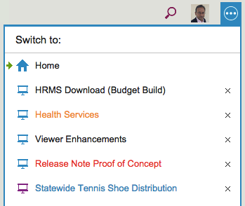
Clicking on the button shows a list of all your open projects, along with your Home Page:
The little green arrow (shown above at the top) points to the currently open tab, the one that you are viewing right now.
Projects have a blue icon; templates have a purple icon: in the example above, Statewide Tennis Shoe Distribution is a template, while all the others are projects.
- Boards with unread updates have orange titles, like Health Services above.
- Boards with overdue cards have red titles, like Release Note Proof of Concept above.
- Boards with new (unseen) cards have blue titles, like Statewide Tennis Shoe Distribution above.
You can reorganize your list of open tabs by simply dragging them up or down this list.
(But, the Home Page is always on the top; that can’t be moved.)
You can also close an open project tab that you are no longer interested in by clicking on the “X” to the right edge of the entry.
So, there’s a simple visual consistency in Kerika’s design:
- Blue = New
- Orange = Changed
- Red = Overdue