Tag Archives: Bug

About bugs we found and fixed.

Windows tablet experience improved

As with Android tablets, we have been doing a bunch of testing and bug fixing related to using Kerika on Windows tablets and touch devices generally (i.e. the many combinationss of touch and keyboard that make up the Windows computer ecosystem)

And, as with iPads and Android tablets, you don’t need to install a special app in order to run Kerika: you can just use the Internet Explorer browser (or any other browser you have installed) to access Kerika, and use your finger to move stuff around just as you would with a mouse.

There were some problems with the touch interface that we have fixed; the overall experience should be a lot better than it was before!

Android tablet experience improved

We have been doing a bunch of testing and bug fixing related to using Kerika on Android tablets.

As with iPads, you don’t need to install a special app in order to run Kerika: you can just use the Chrome browser on an Android tablet to access Kerika, and use your finger to move stuff around just as you would with a mouse.

We found an fixed some problems with the Chrome touch interface; the overall experience should be a lot better than it was before!

Note: you are almost always better off using the Chrome browser rather than the standard browser that comes with all Android tablets; that’s because Google has a lot more enthusiasm for improving their proprietary (non open-source) products than “stock Android“.

Reaching the edges of a diamond

When you are drawing on a canvas, either for a Whiteboard project or a canvas that you have attached to card on a Task Board or Scrum Board, Kerika gives you some basic shapes you can use to sketch out your workflow, process diagrams and other ideas:

Drawing shapes on canvas

You can connect shapes using lines and arrows (single- and double-headed), and as you move the shapes around, the lines and arrows automatically adjust so that they terminate properly on the edge of the shape.

It turns out we had a bug where the lines didn’t properly connect to the very edges of diamond (rhombus) shapes:

Problem with lines on edges of diamonds

This was quite literally an “edge case” (sorry about the pun): when the line travels along the edge of the diamond shape, as the shape is moved by the user, a function is used to calculate the exact intersection of the line and the shape.

(This function is the only proof we have ever seen that anyone actually needs to use trigonometry in real life.)

When the line travels right up to the corner of the diamond shape, because the line is connecting the diamond to another shape that is of precisely the same height and width, and the two shapes are aligned perfectly (either vertically or horizontally), the function returned two possible intersection points.

We have fixed this problem in our latest release. It should make for neater looking flowcharts!

Getting rid of a pesky “Mixed Content” warning

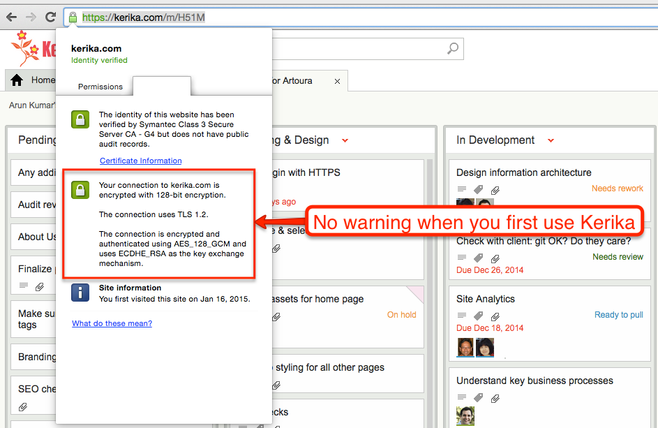
When you first use Kerika, your browser has a reassuring sign that your connection to our servers is being encrypted:

No warning when you first use Kerika

But as soon as you open a card that contains any attachments, e.g. files stored in your Box account if you are using Kerika+Box, this reassurance would disappear, and instead you would see a warning about “Mixed Content”, which basically means that some of the data shown on your Kerika page was coming from a source that wasn’t using HTTPS.

Why there is a mixed content warning

This was because of a small bug in how we were dealing with the thumbnails we got for files stored in your Google or Box account: for faster performance we were caching these on our own Amazon S3 cloud storage (so we wouldn’t have to keep getting them from Google/Box every time you open the same card.)

It turns out that we weren’t fetching the thumbnails from S3 using HTTPS, which meant that as soon as you switched to the Attachment view of a card, your browser’s address bar would show the “mixed content” warning.

There was no real vulnerability resulting from this, but it did interfere with the user experience for that minority of users who like to keep a sharp eye on their browser’s address bar so we have fixed that with our latest release.

Now you should always have the warm reassurance of seeing the green secure site symbol on your browser when you open a card!

A mysterious grey dot

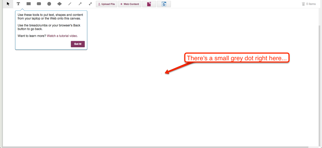
Here’s one of the weirder bugs we ever fixed: it turns out that there is a tiny grey dot in the middle of every canvas on a Whiteboard.

Grey dot in the middle of the canvas

It’s been there for a while, ever since we introduced some animation to make it easier for people to understand that canvases can be embedded inside cards on Task Boards and Scrum Boards, as well as being used independently on Whiteboards.

But the funny thing is that none of our users, nor anyone on our team, noticed it because too many of us, it seems, eat in front of our computers all too often, so our screens are flecked with little bits of food debris most of the time 🙂

One of our team members finally noticed it after assiduously cleaning his computer screen, and that’s how we discovered there was an HTML element there, with a zero size and absolute position at the center of the canvas (to help with the “exploding” animation effect when a canvas is opened).

Although this element has a height and width of zero, it also has a 1 pixel wide solid grey border, which is used in the animation.

And that’s what appeared as the tiny grey dot in the middle of the screen: one pixel of grey border, not any debris from our lunch.

Another round of bug bashing…

Our current release (Sprint No. 37 since we moved to a Scrum methodology!) is focused on bug bashing: mostly server-related bugs, and a few that users might have observed themselves.

This is fairly typical of our development cycles: while we fix major bugs in every release, every once in a while we spend an entire release on just general bug bashing and cleanup.  These offer opportunities to catch up on infrastructure improvements, getting our test cases in better shape and other administrative work.

Release 37 should be done, with testing, by the end of the week: it will have about 65 work items completed, with another 21 items that were trashed.

Trashed items are usually duplicates of bugs: different symptoms with the same underlying cause.

Fixing 58 server bugs and warnings (Why so many?)

Along with the hundred styling changes and UI cleanup we are wrapping up, we also took the opportunity to fix around 58 different errors and warnings being reported by our server.

This might sound like a lot, so perhaps a little context is useful:

  • Kerika is built on top of Google Apps (at least, for now): we use Google’s OAuth service to sign up and sign in people, and we use Google Drive to share files within project teams.
  • A lot of errors show up as a result of this Google integration, only a fraction of which are solvable from our perspective:
    • Some errors relate to people from restricted Google Apps domains trying to use Kerika. This happens at least once a week — someone working at a company that has Google Apps for Business tries to sign up for Kerika, but fails because their Google Apps Administrator (typically, someone within their IT department) has prohibited any third-party apps from integrating with their Google Drive.
      This is an example of an unsolvable problem — we can’t override the existing protection that this company has set up (and nor would we want to!) so we are going to redirect users to an explanatory page that helps them understand the problem is not with Kerika.
    • Sometimes Google Apps has outages: when this happens, we can get a cascade of errors on our servers, because these outages are typically intermittent and inconsistent across our user base. Some folks experience problems, others don’t. We are trying to come up with a way to inform people about what’s happening, so they don’t think it’s Kerika that’s busted.
    • Sometimes Google burps: not have an outage, but experience a fleeting problem with uploading a file. We might get nothing back from Google than a generic “500 error: system not available”.
  • We have also had problems related to our use of Firefox for the Render Server: Firefox’s latest updates are sometimes less stable than previous ones, and in general Firefox is starting to have a really big footprint in terms of memory usage.
  • And, finally, we have had our own bugs, just like any other software developer. Some of these have been tricky to find, but as we find them, we squash them.


Bug, fixed: a scheduler job that was killing performance on the Kerika server

Our apologies to anyone who was affected by this bug: the email scheduler we built (about a month ago) had a bug that caused CPU utilization to periodically spike all the way up to 100%, and this in turn caused the server to temporarily freeze. We have fixed this bug, thanks in part to a couple of intrepid users, from Poland and the UK, who gave us some important clues.

By way of background: we have a scheduler program that runs periodically on the Kerika server doing various daily tasks. One such task is resending invitations that have not yet been accepted (or rejected, as the case may be); another task is providing a daily summary of each user’s outstanding tasks.

The resending of invitations takes place at a fixed time, but the creation of the daily summary is more complex, since the system sends each user his/her daily summary at 6AM based upon that user’s last known location. This means, for example, that a user based in Seattle would get his daily summary sent at 6AM Pacific Time, and a user based in India would get her summary sent at 6AM Indian Standard Time.

The bug: there was some overly complex SQL queries being used by the scheduler that was causing the server’s CPU consumption to spike all the way up to 100%. In effect, when the scheduler did one of these complex queries, nothing else could move on the server, and the result was an erratic user experience. Not good.

Why it wasn’t found before: because the scheduler ran at different times during the day, based upon the geo-location/distribution of our users, the behavior was not observed in a consistent manner. As our user base grew, the spikes occurred at different times during the day, and we didn’t make the connection.

How it was fixed: the old, complex SQL queries were taking 3-4 seconds to execute; replacing them with a couple of simple queries cut the time down to 1-2 milliseconds. That’s a 2,000X improvement!

Lessons learned: avoid complacency, even for what look like simple, routine programming. Use a profiler. And always respond to user complaints within 24 hours or less, like we always have.