Tag Archives: Mobile

What’s in our latest release

A ton of bug fixes, most of them so obscure that no end-users ever spotted them, but since we track our error codes seriously we make sure we fix stuff that no one even knew fixing.  Some of the bug fixes are truly obscure, here’s a few from our latest version that’s easier to explain:

  • There were some problems related to how our iOS app was updating that were a result of Apple deciding not to support Progressive Web Apps anymore.  (Thanks for nothing, Apple.)
  • When a person renamed a file attached to a task or board, the file was appearing as having unread updates (orange highlight) to the user who made the change.
  • For our Kerika+Microsoft users, we needed to make sure the correct OneDrive icons were appearing where files were attached to tasks and boards.
  • Also for our Kerika+Microsoft users: OneDrive files are better support for users of our Whiteboards feature.
  • When a text field could potentially be auto-filled using the browser’s saved values, if a user selected a saved value it wasn’t displaying properly.  (Thanks to a breaking change in one of Chrome’s many, many updates — seriously, why are they releasing new versions every week?)
  • Dates shown for non-English users will now appear in the locally selected languages.
  • If a user opened a task on the mobile apps that had been found by doing a search, editing the task’s title was showing HTML characters.
  • Handling situations better where two people were making changes to the same task at the same time: users are warned if someone else has made changes that would get overwritten if they saved their own changes.
  • Improvements in the new user experience: this is, frankly speaking, a never-ending quest for us!
  • Fixed a situation where a new user who didn’t complete their signup returned later to Kerika: the language selection that’s the first thing that a new user does wasn’t working properly.
  • We made it easier for people to stop getting their 6AM task summary emails; we really should have done this a long time ago.
  • Fixed a long-existing bug that finally surfaced that omitted some tasks from the 6AM emails.
 

Tablet support

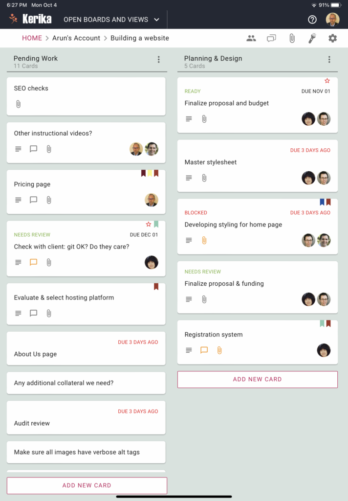
We have added tablet support for iOS and Android devices, as you can see:

The tablet experience is like that of the desktop, not the phone.

For the phone app we had to redesign a lot of the user interface to accommodate the limited screen space, but with most tablets today there is enough screen resolution to support the more extensive desktop experience.

Easier to preview documents on mobile devices

We have made it easy for you to preview documents that are attached to cards or whiteboards, regardless of how you sign up for Kerika.

Screenshot showing a preview of an attached document on an iPhone
Previewing docs on an iPhone

You could have signed up using a Google ID, a Box ID, or just your email: it doesn’t matter how you signed up, nor how other members of your team signed up.

Previewing documents just became really easy.

A recent update to our mobile App

When you click on a link to a Kerika board or card in an email, that link will now automatically open in the Kerika Mobile App instead of opening in a browser tab.

This makes it a lot easier to respond to emails sent when your team members do chat on boards that concerns you: you can either do a quick reply as email itself, or, if you need more context, click on the link to open the card inside the Kerika app and see all it’s details before deciding upon your reply.

Actions buttons added to cards in mobile app

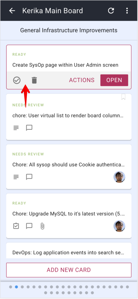
We have added action buttons for the two most common actions that users perform with cards, especially when they are viewing them using one of the mobile views: Move to Done and Move to Trash:

Screenshot of mobile app showing buttons

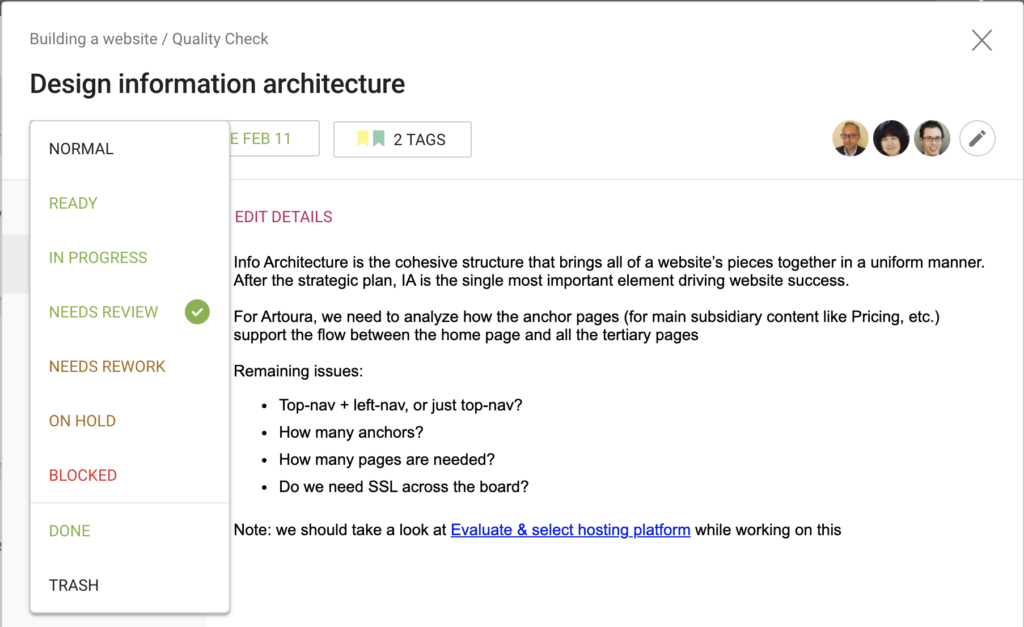
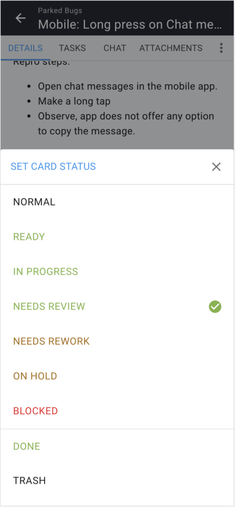
We have also added Done and Trash to the set of Status Values you can assign a card when viewing it’s details, on desktop and mobile:

Screenshot of card details on desktop

Screenshot of card details on mobile

Our mobile apps improve every 2 weeks, whether you notice it or not.

Because of the way we developed our mobile apps for Android and iOS, it’s possible for us to make back-end and front-end improvements without necessarily requiring you to update the app that you have already installed.

A lot of these improvements are bug fixes and performance increases, and they have been going out steadily since the official launch of our apps.  So don’t be surprised if it seems the Kerika mobile app doesn’t ever need to be updated; it’s possible for us to improve Kerika without requiring to download anything.

Enjoy the app.

Update on our mobile apps

User adoption of our mobile apps for Android and iOS has been moving along nicely; so far we have heard only positive feedback but of course please let us know what we could do better.

A small pocket of users are having trouble: those who are using Kerika with Box and have 2FA (two-factor authentication enabled).  There is a bug with Box’s mobile API that we are still waiting for them to finish (it’s been a couple of weeks now).  Hopefully that will get sorted out soon.

Why our new mobile app is taking so long to build

We have been working for months now on our new mobile app, and it has been a tough slog! We are building it entirely using React (a Javascript framework) to make it possible to have a single code base across both desktop and mobile devices, and across all operating systems.

We took some time learning to be good with React: previously we had used Polymer, and before that we used JQuery, so there was some learning curve to traverse while we figured out the right way to code in React. But we are beyond that now.

For the past couple of months, it is really performance that has been our bugbear. In the spirit of “eat your own dogfood before trying to sell it”, we are using the emerging mobile app for our own work on a daily basis.

The trouble is: our main Kerika board is huge: it has usually around 600 cards, and 26 columns. This isn’t best practice, by the way, and we are not recommending you create boards like this, but we are talking here about our main board that tracks many different ideas and initiatives, not just product development.

So, when using our mobile app for our own board, we hit performance problems that few of our users are likely to encounter. We could, of course, have written us off as an edge case and ignored the performance issues, because for smaller boards (e.g. with around 20-30 cards), these performance problems completely disappear.

But, we decided to bite the bullet and get our mobile app to be good even with boards that are as wide and deep as our main board. And we have learned a lot from that experience: for example, it wasn’t the number of cards, but the number of columns that had the bigger performance impact.

We have another board with over 2,500 cards in just 2 columns (essentially a historical record of old work items) and we didn’t experience performance problems in the same way as we did with 500-600 cards over 26 columns. In fact, we found that 2,500 cards in 2 columns was much easier to handle than the latter case!

So, a lot of our efforts over the past few months have been trying to handle performance for scenarios that are out of the norm.

We are doing our testing on both iOS and Android at the same time, to catch browser-specific issues early. (We have been less diligent about Firefox testing, to be frank, but we expect clearing iOS and Android issues will effectively cover Firefox as well, making our final testing easier.)

Our end goal is a single code base that runs on any device. Right now that’s not true: our desktop experience is still using (mostly) Polymer, while our mobile is entirely in React, but we are trying to make sure we design all of the new code to work well on the desktop as well, so that we can slowly replace parts of the desktop code as we build the new mobile app.

(It’s not that our desktop code has any problems today — we are very confident about the quality of our desktop user experience — it’s just that we are too small a team to be able to split ourselves into multiple sub-teams to support every platform.)

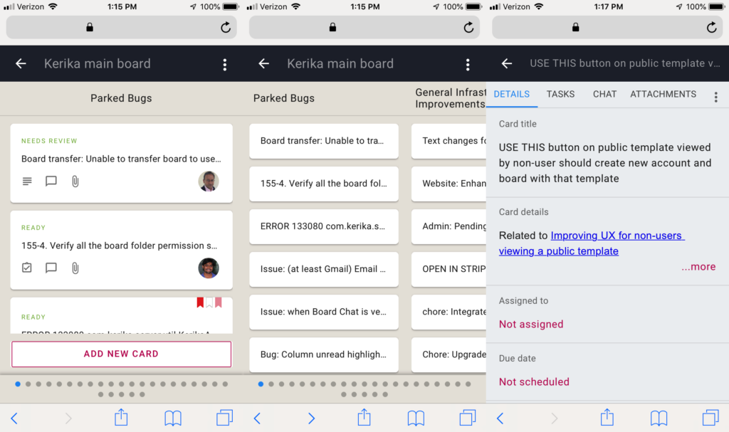
Here’s a composite view of what our mobile app looks like now: in “zoomed-in” view, in “zoomed-out” view, and card details:

Kerika's upcoming mobile app

Onwards!