Kerika+Google, our integration with Google Drive, and Kerika+Box, our integration with Box, are very similar in terms of user interface, but the underlying cloud storage platforms are different in some subtle ways.
One of these has to do with the way images that are added to a canvas are named: when you add an image to a canvas, either by using the Upload button or simply by dragging and dropping the image from your desktop onto the canvas, Kerika will show a small thumbnail of the image on your canvas.
The thumbnails provided to Kerika by Google are better than those provided by Box in a couple of ways:
Box’s thumbnails are square, which can result in a cropped view of the image; Google’s thumbnails show the entire image.
Google’s thumbnails can be resized nicely on the Kerika canvas, simply by selecting it and then dragging on one of the corners; Box’s can’t.
If you rename a Google thumbnail and take off the original file extension, e.g. you rename “picture.jpg” to be just “picture”, the thumbnail still renders correctly, but Box’s doesn’t. (Because Box relies on the file extensions to detect the file’s MIME-type.)
There are some other quirks with the way Box and Google work, but most of them are going to be invisible to most Kerika users.
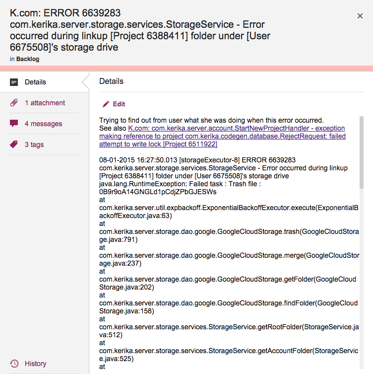
Cards shouldn’t really have very long titles, most of the time, since the details of the task are better described within the card itself, but sometimes having a really long card title is unavoidable.
This is a problem that we have encountered ourselves, for example when we want to track bugs: if our Java-based server software records an exception (error), we need to track at least the top-level of the stack trace that we get from the Java virtual machine that’s running the server software, and this can get pretty long because it includes a bunch of critical information like the time stamp, process ID, etc.
Cards with really long titles
Previously, Kerika’s UI wasn’t super-friendly when it came to long card titles: the entire card title would be displayed when you were viewing a Task Board or Scrum Board, but when you opened the card to view its details, the UI would only show the two lines of card title at a time.
(And this was by design: when we first designed Kerika, we really did think that 2 lines of text would be plenty for most people!)
With our latest release we have eased up on this: when you open a card, you can see the entire title, even if it is pretty long.
(Not that we want to encourage you to write really long cards!)
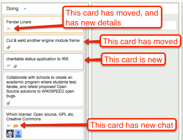
One of the coolest features in Kerika is how well the system alerts you to changes made on your Task Boards and Scrum Boards that you haven’t seen — i.e. because you were working on another board at the time your coworkers made changes, or maybe because you were fast asleep in a different timezone!
Whenever a coworker makes any change to a card that you haven’t seen — moving the card to a different column, changing its description, changing its tags, leaving some chat, etc., the change is highlighted on the card using orange.
Smart highlights
And when you catch up on that change, e.g. open the card and read the new chat, the orange highlight gets turned off automatically.
(You can also mark a card’s changes as “read”, using the right-mouse-click menu.)
These smart highlights are great for distributed teams, and indeed for any person who is involved with multiple projects because it lets you catch up on what’s changed while you weren’t looking.
Now, these smart higlights are even smarter: if a card has multiple changes to it that you haven’t seen, e.g. it has a new attachment and it has new chat, Kerika keeps track of which changes you have caught up with, and which ones you haven’t.
In this example, if you read the chat, the orange highlight of the chat icon will go away, but the orange highlight of the attachments icon will remain until you catch up on the new attachments as well.
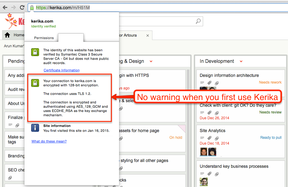
When you first use Kerika, your browser has a reassuring sign that your connection to our servers is being encrypted:
No warning when you first use Kerika
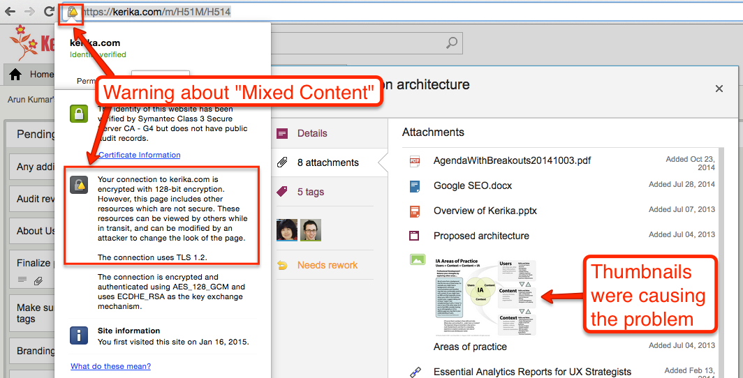
But as soon as you open a card that contains any attachments, e.g. files stored in your Box account if you are using Kerika+Box, this reassurance would disappear, and instead you would see a warning about “Mixed Content”, which basically means that some of the data shown on your Kerika page was coming from a source that wasn’t using HTTPS.
Why there is a mixed content warning
This was because of a small bug in how we were dealing with the thumbnails we got for files stored in your Google or Box account: for faster performance we were caching these on our own Amazon S3 cloud storage (so we wouldn’t have to keep getting them from Google/Box every time you open the same card.)
It turns out that we weren’t fetching the thumbnails from S3 using HTTPS, which meant that as soon as you switched to the Attachment view of a card, your browser’s address bar would show the “mixed content” warning.
There was no real vulnerability resulting from this, but it did interfere with the user experience for that minority of users who like to keep a sharp eye on their browser’s address bar so we have fixed that with our latest release.
Now you should always have the warm reassurance of seeing the green secure site symbol on your browser when you open a card!
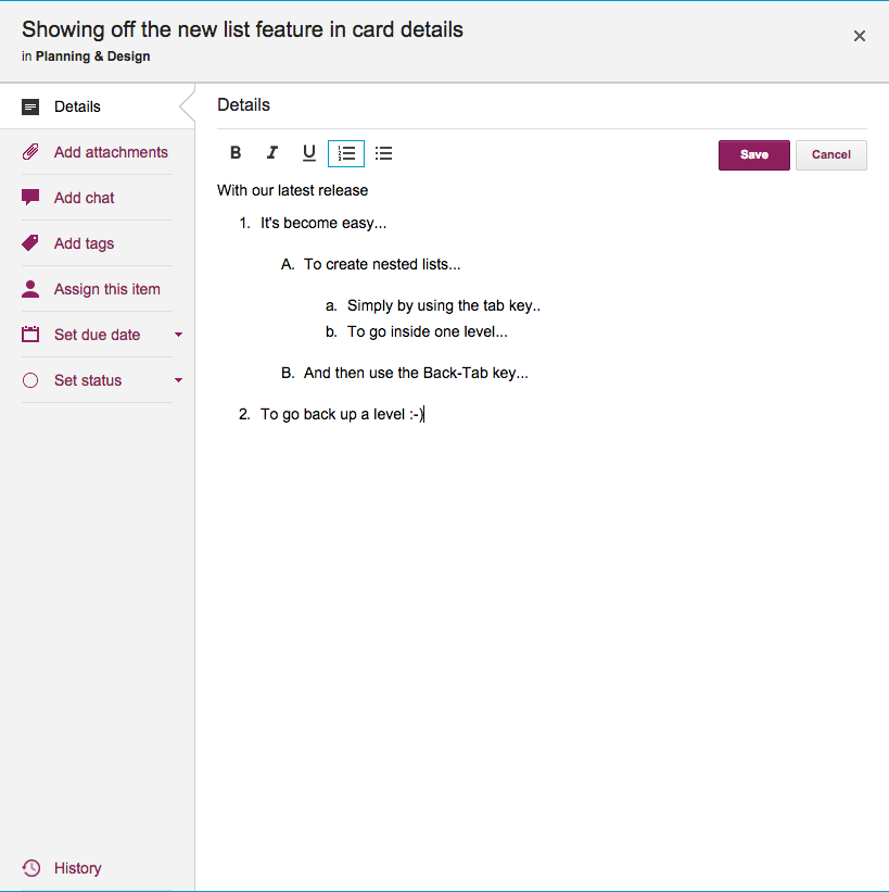
With our newest update to Kerika, it’s become easier to organize the details of each card (i.e. the card’s description), in multilevel lists, like this:
This is done simply by using the Tab key to create an indented sub-list within an existing numbered list, and using the Back-Tab to “outdent” the list.
Where dates are shown on Kerika’s boards and cards, we try to show them in relative terms rather than absolute terms.
For example, if something was updated today, we use the word “Today” instead of the actual date.
There’s a simple reason for that: relative times and dates are much easier for people to comprehend than absolute values. In other words, it’s much easier for someone to comprehend “5 minutes ago” than “Dec 30 2014 3:58PM PST”.
Absolute dates and times may be more accurate, but relative values are a whole lot easier to process for regular humans.
One problem we had with our display of relative times, however, was that they were not continuously updating — instead, they relied upon the page being refreshed in order to show the most accurate relative time description.
For example, if something was updated “2 minutes ago”, the phrase would remain displayed on the screen for a long time, if the page was never refreshed. This obviously can lead to confusion, since users are not going to be aware of when they last refreshed a page.
With our newest release, we have fixed that problem: relative times will still be in use, but they will update themselves automatically, so that “5 minutes ago” will soon become “10 minutes ago” and then “1 hour ago” without the user having to do anything.
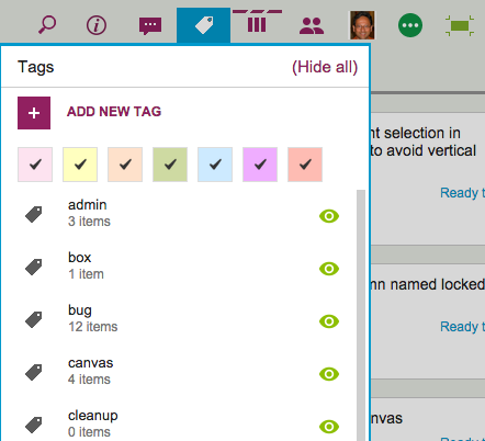
The Tags filter button, which appears on the top-right corner of your Task Boards and Scrum Boards, lets you filter your view of a crowded board by showing just those cards that match a particular tag that you are using (or a particular color coding):
Tags button
It used to be that when you were filtering your view of the board, you couldn’t add any new cards.
The reason made sense from a technical, geeky perspective, but it proved confusing and frustrating for our users, so we have added more flexibility by letting you add new cards even while you are using filtering.
The new cards will appear as you add them to the board, and stay there until you refresh your view of the board. At that point, whether the new cards continue to appear or not will depend upon whether they meet your tags filtering criteria or not.
That sounds complicated, we know, so let’s take a look at the original logic behind not letting users add cards while using tags filtering…
In the example screen shown above, the board has a bunch of tags defined, like admin, box, bug, canvas, and cleanup.
Suppose we were using filtering, to only show those cards that are tagged bug and box. With this filtering in effect, you are going to see only a small subset of all the cards that exist on the board — only those cards that have either bug or box as a tag. (Or both.)
So, what should happen if you add a new card to the board, which isn’t tagged bug or box?
From a strictly logical perspective, this new card shouldn’t be displayed, because it doesn’t match the filter criteria you are currently using — it should be displayed only if the new card had bug or box as one of its tags.
We originally dealt with this problem by saying that you couldn’t add new cards while using tags filtering, because the new cards would disappear immediately after you had added them, which we felt would make for a very confusing user experience.
(People would likely think they failed in their attempt to add a new card, and keep trying. Eventually they might turn off tags filtering, and then find they had added many copies of the same new card.)
So, that was one solution to the problem, but it still presented a user experience challenge because many folks would forget that they had turned on tags filtering, especially if they were bouncing around between multiple boards. (Yes, Barb, we are looking at you!)
If a user returned to a board and didn’t realize that they had tags filtering turned on, they would get confused as to why they were unable to add new cards.
We thought of a couple of different solutions to this problem, including the use of callouts (those balloon-like bubbles that appear to give you hints about how a page works) but we aren’t generally a fan of callouts — too many apps misuse them to excess these days.
So we have come up with what we think is a better solution: if you are using tags filtering, go ahead and add new cards. They will show up, but if you refresh your page, your tags filtering will be re-applied, and the new cards will be displayed only if they match the tags you want to show.
We have been hacking away at the application chrome within Kerika, removing some of the purely decorative elements that were starting to crowd out the user’s critical view of data.
Application chrome is like Kudzu: if you are not careful, what seemed like a nice-looking decoration on one part of the screen can quickly grow to overwhelm the application.
Kudzu
Here’s a before-and-after view of Kerika:
Kerika with column chrome
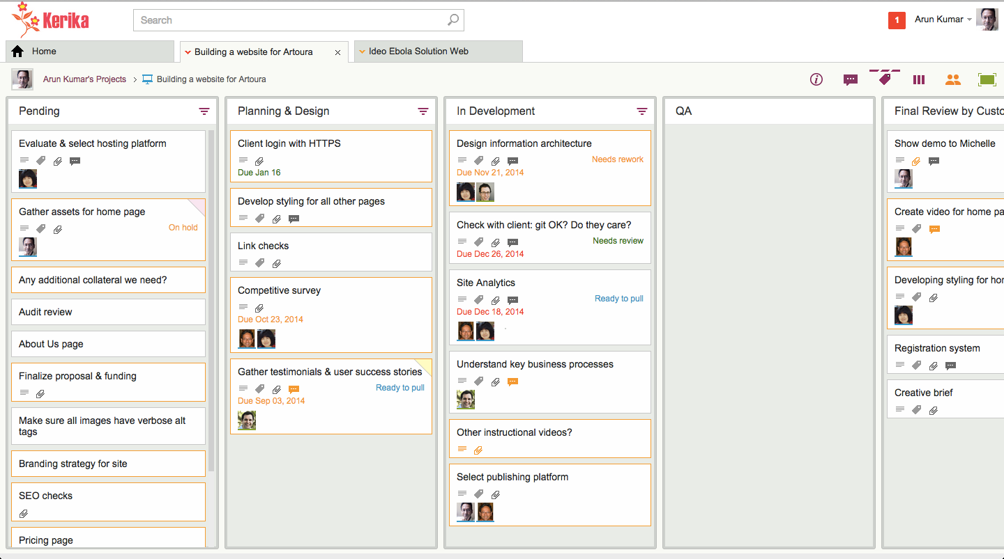
And here’s the same board, viewed with less application chrome, which allows the cards on the boards to stand out more:
Kerika with less chrome
This wasn’t just an aesthetic decision, although we are pleased with the new, cleaner appearance of Kerika: it was actually essential for our development of the new Planning View in Kerika, which lets you easily view a Task Board or Scrum Board from the perspective of Due Dates.
For the Planning View to work with workdays, it became essential to show more columns at a time, more of the time: showing at least 5 columns on most laptops became an essential requirement, and we could not achieve that solely by shrinking the width of cards — we also needed to remove the column chrome so that the board would not appear so crowded.
Did you know that any Kerika canvas, whether on a standalone Whiteboard or attached to a card on a Task Board or Scrum Board, can be viewed as a regular Web page by folks who have been given access to the board?
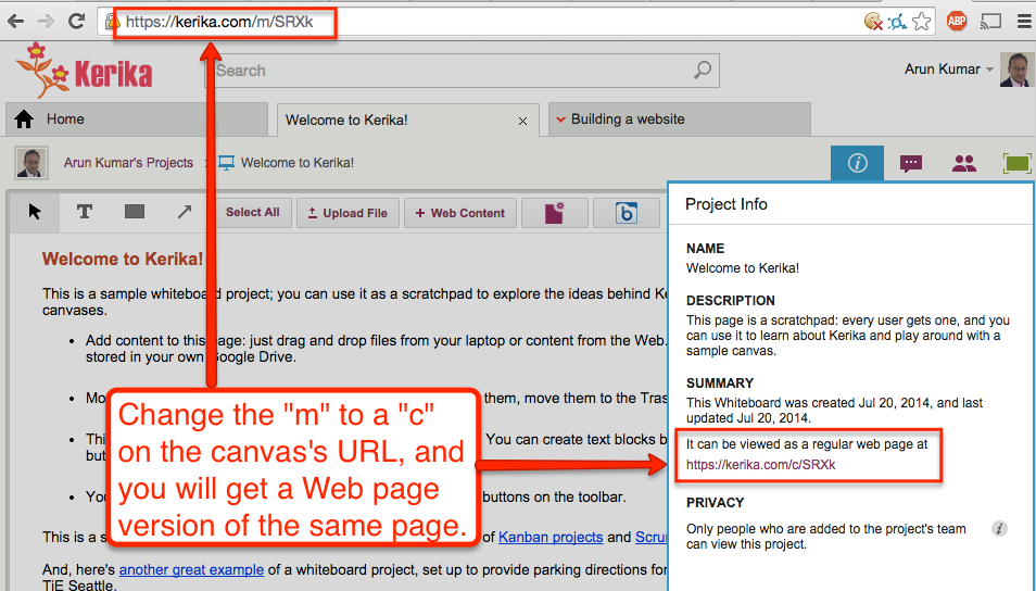
Kerika automatically creates a version of your canvas that can be viewed without the Kerika application: you can get this version by using the Project Info dialog, or, more simply, by just changing the “m” in the canvas’s URL to a “c”:
Web page version of Canvas
Every Kerika page has a URL of the form “https://kerika.com/m/…”
The URLs are randomly generated and unique: every card, every canvas, every board has a unique URL.
The first part of the URL is always of the form kerika.com/m/… There’s no special reason for using the “m”; it’s just part of Kerika’s history.
But if you change the “m” to a “c”, like in the example above where “https://kerika.com/m/SRXk” becomes “https://kerika.com/c/SRXk”, then you can view the Web page version of the canvas.
In the Web page version there are no buttons or other indications of the Kerika software: it looks and works just like a regular Web page.
Of course, security is not compromised: you cannot view the Web page version of a canvas if you aren’t permitted to access the Kerika canvas itself.
When you copy or cut an item on a Kerika board — a set of cards, or may be some things sitting on a Canvas — these objects are placed in a special Clipboard that sits on the Kerika server, not in your browser.
This is important to note for several reasons:
Because the Clipboard is on the server, you won’t lose the items if your network connection breaks before you have a chance to paste whatever you cut.
The Clipboard will hold on to the items for 20 minutes, to give you time to think about where you want to put them. (And, to recover from any network problems you may have experienced.)
If you don’t paste something that you had previously cut, the Clipboard “releases” it back to where it was originally, after waiting 20 minutes to go by while you ponder. But, if you are impatient, you can reverse your cut action sooner simply by clicking on the cut items, which continue to appear in a faded (greyed-out) appearance on your board.
Because the Clipboard is on the Kerika Server, other team members won’t see the change until you actually do the paste. So, for example, if you have cut some cards from a Task Board or Scrum Board and haven’t pasted them yet, your project team members will continue to see the items on the old board until you complete the paste.
And, finally, here’s a great feature, thanks to the Server Clipboard: one of your team members can be making changes to a card while you are in the process of cutting-and-pasting it, and those changes aren’t lost. That’s because the object is stored on the server rather than your browser, making it possible for your team members to make changes even as you are in the process of doing a cut-and-paste.