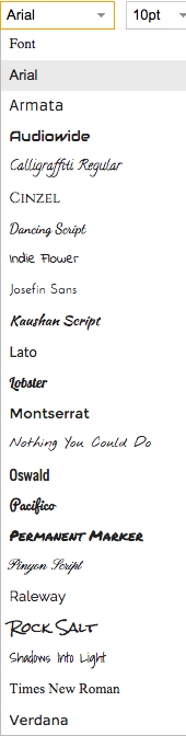
When you are creating blocks of text on your Whiteboard canvases, we have a pretty nice selection of fonts you can use, from the serious to the playful.
A small tweak to the UI makes it easier for you to view this full selection, which we hope will encourage folks to personalize their canvases even more :-)
We used to have a feature where you could add a URL to a canvas or Whiteboard, and then choose to show that either as a regular bookmark, or as an embedded IFRAME.
We are dropping the embedded IFRAME feature, because most of the time it doesn’t work, and even when it does work, it’s not a great feature to have:
You can only IFRAME a website if that site lets you. And, increasingly, most sites don’t.
IFRAMEing a third-party website on a Kerika page is a potential cause for worry, from a security perspective, because we are letting that third-party website right into the Kerika page.
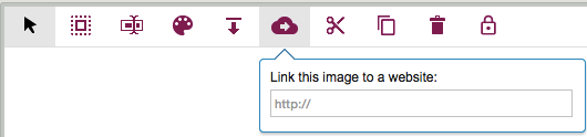
One little-known feature of Kerika’s Whiteboards: if you have an image (picture) on a canvas, you can also add a link to a Website, so that anyone clicking on the picture would be taken straight to that website.
(It’s one of several little-known features that we hope will become well-known, with our recent redesign of the Canvas toolbar; we have built too many really cool features that not enough people are aware of!)
One common use of this feature is to create an external-facing page that includes a logo: you can add the logo’s image to your canvas, and then point that logo to your company’s website.
It’s simple: just select the image, and then click on the “Link to website” button on the Canvas toolbar.
With our latest release we are adding a feature that will make it easier for folks to create, and maintain, very elaborate Whiteboards: any team member can lock a canvas to discourage other team members from making changes.
This isn’t a very complicated function; it has a very simple purpose: if you have been working hard on a particular canvas, which could be a stand-alone Whiteboard, part of a series of nested canvases in a Whiteboard, or attached to a card on a Task Board or Scrum Board, you may become worried that other team members might come by to visit your board and carelessly make changes to your pristine creation.
(After all, we creative types can get really possessive about our beautiful canvases :-)!)
To discourage others from making changes, just click on the lock button that appears to the far end of the Canvas toolbar:
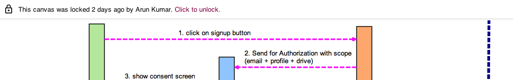
For Team Members, this is a “soft lock”: any canvas that’s locked by one Team Member can be unlocked by any other Team Member, so you are not really shutting out people from making changes, merely discouraging them by signalling that you would like to preserve a canvas in a particular way.
Canvas locked by Team Member
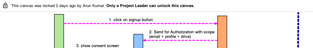
But for Project Leaders, this is a “hard lock”: if a Project Leader locks a canvas, it can be unlocked only by another Project Leader. (Remember: projects can have more than one Project Leader!)
Canvas locked by Project Leader
So, if a canvas gets to a truly pristine state that you want to preserver forever, have the Project Leader lock it, and the rest of the team will be able to view it but not make changes.
And, of course, if canvases are embedded (nested) inside each other, each canvas can be locked or unlocked, as you like, giving you maximum flexibility.
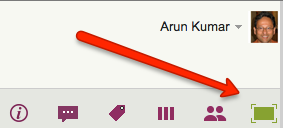
When you have expanded your view of a Kerika board to fill up the browser, using the “Max View” button on the top-right corner of the Kerika app
Max View button
Another button appears on the top-right, to help you quickly switch between all your open project tabs, as well as get to your Home Page:
This button is color coded to help you understand, at a glance, what’s going on in all your open projects:
If any of your open projects has an overdue card, then the button appears in red.
If any of your open projects has updates that you haven’t seen yet, the button appears in orange.
If any of your open projects has new cards that you haven’t seen yet, the button appears in blue.
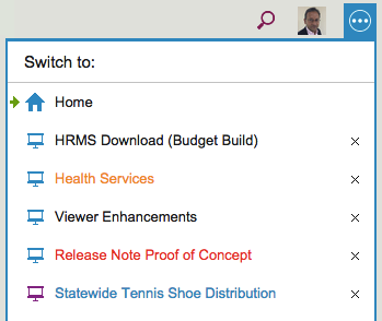
Clicking on the button shows a list of all your open projects, along with your Home Page:
Switching between tabs
The little green arrow (shown above at the top) points to the currently open tab, the one that you are viewing right now.
Projects have a blue icon; templates have a purple icon: in the example above, Statewide Tennis Shoe Distribution is a template, while all the others are projects.
Boards with unread updates have orange titles, like Health Services above.
Boards with overdue cards have red titles, like Release Note Proof of Concept above.
Boards with new (unseen) cards have blue titles, like Statewide Tennis Shoe Distribution above.
You can reorganize your list of open tabs by simply dragging them up or down this list.
(But, the Home Page is always on the top; that can’t be moved.)
You can also close an open project tab that you are no longer interested in by clicking on the “X” to the right edge of the entry.
So, there’s a simple visual consistency in Kerika’s design:
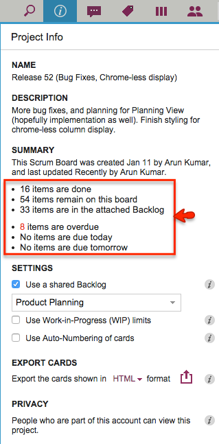
We have made a small layout change to the Project Info dialog to make it easier to read: now the summary data on cards and dates are organized in a bullet list instead of being laid out as a sentence:
Cleaner look to Project Info
This isn’t a big deal, of course, so why are we bothering to blog about it?
Well, for one thing it shows our obsession with details, which is probably a good thing — right? And, for another, it highlights the influence of one of our favorite researchers on Web usability: Jakob Nielsen who has consistently emphasized that on the Web people scan text, not actually read.
We have been working on some designs and ideas for a “Dashboard” feature in Kerika for many months now. Actually, a couple of years now.
Along the way we convinced ourselves many times that we had solved the problem in an ideal way.
At other times, we convinced ourselves that there was no way to solve a particular aspect of the problem, so our obviously ugly solution was the best possible solution.
Looking back on all these iterations, it’s very humbling to think about how easy it is to think something is perfect, until something better comes along — at which point the old thing is suddenly, unbearably ugly.
In other words, the ugliness of each design is obvious, in retrospect.
So everything we are proud of today: we will be ashamed of in a couple of years…
Kerika+Google, our integration with Google Drive, and Kerika+Box, our integration with Box, are very similar in terms of user interface, but the underlying cloud storage platforms are different in some subtle ways.
One of these has to do with the way images that are added to a canvas are named: when you add an image to a canvas, either by using the Upload button or simply by dragging and dropping the image from your desktop onto the canvas, Kerika will show a small thumbnail of the image on your canvas.
The thumbnails provided to Kerika by Google are better than those provided by Box in a couple of ways:
Box’s thumbnails are square, which can result in a cropped view of the image; Google’s thumbnails show the entire image.
Google’s thumbnails can be resized nicely on the Kerika canvas, simply by selecting it and then dragging on one of the corners; Box’s can’t.
If you rename a Google thumbnail and take off the original file extension, e.g. you rename “picture.jpg” to be just “picture”, the thumbnail still renders correctly, but Box’s doesn’t. (Because Box relies on the file extensions to detect the file’s MIME-type.)
There are some other quirks with the way Box and Google work, but most of them are going to be invisible to most Kerika users.
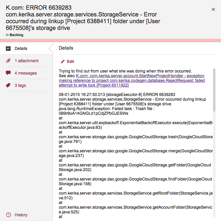
Cards shouldn’t really have very long titles, most of the time, since the details of the task are better described within the card itself, but sometimes having a really long card title is unavoidable.
This is a problem that we have encountered ourselves, for example when we want to track bugs: if our Java-based server software records an exception (error), we need to track at least the top-level of the stack trace that we get from the Java virtual machine that’s running the server software, and this can get pretty long because it includes a bunch of critical information like the time stamp, process ID, etc.
Cards with really long titles
Previously, Kerika’s UI wasn’t super-friendly when it came to long card titles: the entire card title would be displayed when you were viewing a Task Board or Scrum Board, but when you opened the card to view its details, the UI would only show the two lines of card title at a time.
(And this was by design: when we first designed Kerika, we really did think that 2 lines of text would be plenty for most people!)
With our latest release we have eased up on this: when you open a card, you can see the entire title, even if it is pretty long.
(Not that we want to encourage you to write really long cards!)
Google Apps has created a Bizarro World for some of its premium customers, and in the process is doing really bad things to its ecosystem of independent software vendors (ISVs) like Kerika.
Two questions come to mind:
Do they know?
Do they care?
First, an explanation of how this Bizarro World came about…
Google Apps has a lot of free users — anyone with a Gmail or YouTube account, for example — but they also have several million business users who pay around $5 per user, per month, to get “Google Apps for Business” (which is also variously rebranded as Google Apps for Government/Education/Nonprofits…)
It used to be that any Google user could easily try out an app like Kerika that uses a Google ID for sign-in, and Google Drive to store files.
This was a pretty good arrangement, and among other things it encouraged ISVs to integrate with Google Apps — which helped Google in it’s “all your base are belong to us” goal of world domination.
Last year, however, they made a significant change: premium users of Google Apps can now only try out new apps like Kerika if their Google Apps Admin permits it.
In other words, no more experimentation, exploration, discovery…
Instead, we have the quite deliberate creation of a bureaucratic bottleneck (justified by the always useful umbrella excuse of “this is better security”?) where every user in every organization that wants to try out Kerika must first find out who their Google Apps Admin is — which is no easy task, if your organization consists of several tens of thousands of employees! — and then get them to approve the use of Kerika by everyone within the organization.
This is simple enough if your organization is small — you can easily contact your Google Apps Admin — but what happens if, say, you work in a university with 30,000 other people in that Google domain?
We have been finding out the hard way that Bizarro World hurts: the Google Apps Admin at one university has been working for over 6 months to reconcile Google’s demands with the university’s own policies.
Because…
Only the Google Apps Admin can approve use of Kerika.
The university prohibits system administrators from entering into any agreements — all licenses and agreements can be accepted only by the Purchasing Department.
No one in the Purchasing Dept is a Google Apps Admin, since this is an IT function that has nothing to do with purchasing.
Does Google know this is happening? Yes, they know.
It actually affects two large universities right now that are interested in trying out Kerika — each university has a population of about 30,000 people, so, yes, Google does know this is a problem.
And, we have
Does Google care? Apparently not.
The Google Apps Admins at these universities cannot get any kind of help from Google, and we at Kerika have directly brought this to the Google folks and not heard anything either.