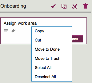
Maybe this isn’t obvious after all… We just realized that a long-time Kerika user (over 3 years of using Kerika on a daily basis!) didn’t know that there is a right-click menu available in Kerika!
If you move your mouse over a card on Task Board or Scrum Board and press the right mouse button, this is what you will see:
Right mouse menu
This menu is handy for selecting all the cards in a column, which you can then grab and drag over to another column or even mark as Done.
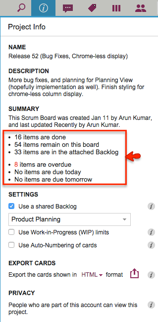
We have made a small layout change to the Project Info dialog to make it easier to read: now the summary data on cards and dates are organized in a bullet list instead of being laid out as a sentence:
Cleaner look to Project Info
This isn’t a big deal, of course, so why are we bothering to blog about it?
Well, for one thing it shows our obsession with details, which is probably a good thing — right? And, for another, it highlights the influence of one of our favorite researchers on Web usability: Jakob Nielsen who has consistently emphasized that on the Web people scan text, not actually read.
Well, the last time we saw Jason, we asked him how the wedding had gone, and he said it went beautifully!
Heather was new to the whole Kanban concept, but Kerika helped her understand all the moving parts that needed to come together just right for a great wedding, and she liked the experience so much that their house chores are now organized and managed online.
In other words, the “Honey Do” list has now gone online!
We have been working on some designs and ideas for a “Dashboard” feature in Kerika for many months now. Actually, a couple of years now.
Along the way we convinced ourselves many times that we had solved the problem in an ideal way.
At other times, we convinced ourselves that there was no way to solve a particular aspect of the problem, so our obviously ugly solution was the best possible solution.
Looking back on all these iterations, it’s very humbling to think about how easy it is to think something is perfect, until something better comes along — at which point the old thing is suddenly, unbearably ugly.
In other words, the ugliness of each design is obvious, in retrospect.
So everything we are proud of today: we will be ashamed of in a couple of years…
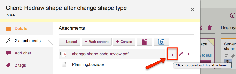
When you add files to your Kerika+Box projects, either as attachments to cards on Task Boards or Scrum Boards, or on canvases and Whiteboards, these get stored in your Box account.
If you have a premium (enterprise) version of Box, you can directly download these attachments, instead of having to go through Box’s preview display first: just hover over an attached file, and you will see a “download” button appear:
Directly downloading files from Box
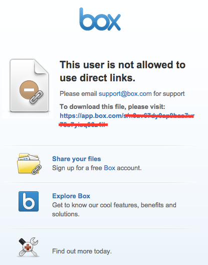
This works fine for enterprise users of Box, but if you are using the free version of Box, you will see a Box error page, like this:
The news that Lenovo pre-installed adware on all consumer laptops sold in the US for the last three months of 2014 (yup, that would be the Thanksgiving through Christmas prime shopping season of the year) is being sadly under-reported by the mainstream press, although the tech press has a better idea of just how much mischief Lenovo did.
The really outrageous point here isn’t that adware came along with the other bloatware that all Windows users suffer from: it’s the fact that this adware was deliberately designed to undermine SSL, which underpins all security on the Internet.
Here’s how SSL is supposed to work: if you connect to Kerika, you are using a secure, encrypted connection to somebody that you genuinely believe is Kerika, Inc. of Issaquah, Washington, United States.
But how do you really know that it’s Kerika on the other end, and not someone pretending to be Kerika?
The only reliable way is to click on the lock icon shown in your browser (whenever you are on a secure SSL connection to any website), and your browser will then tell you who you are connected to, and more importantly, why the browser believes you are actually connected to Kerika and not somebody pretending to be Kerika.
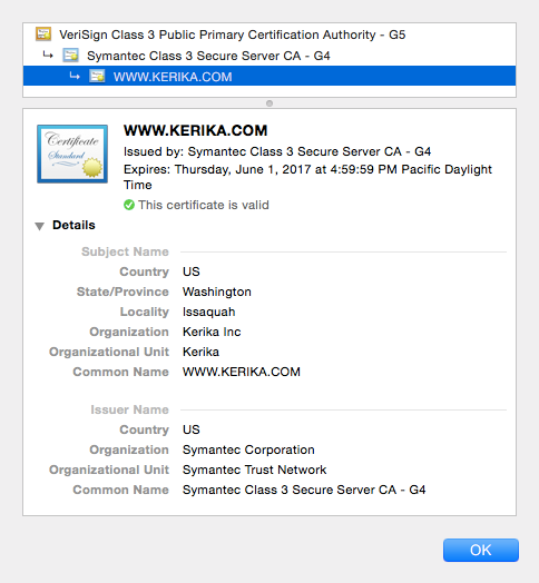
Kerika SSL certificate
The image above is the actual SSL certificate shown when you connect to Kerika, and then click on the lock icon in your browser.
It says, in effect, that a company called Symantec Corporation is the one that vouches for Kerika’s identity: in other words, it is Symantec Corp. that is assuring you that it really is Kerika that you are connected to, and not somebody pretending to be Kerika.
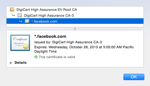
These SSL certificates could be issued by anyone, for example Facebook relies upon a company called DigiCert:
Facebook SSL
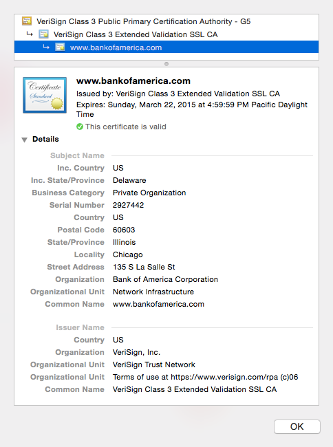
And Bank of America relies upon a company called Verisign:
Bank of America SSL
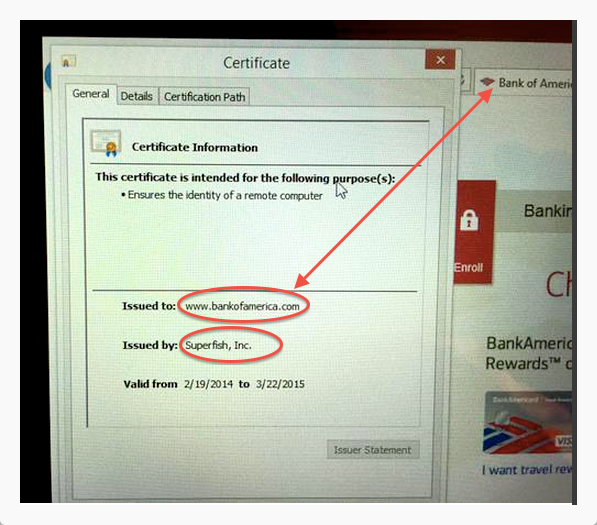
Unless you happen to be using a Lenovo computer that you bought last Christmas, in which case there is a “man-in-the-middle” that you weren’t aware of:
Lennovo’s fake SSL
(Above image captured by security researcher Kenn White, @kennwhite)
On this Lenovo computer, an adware company called “Superfish” is the one that’s vouching for Bank of America, which isn’t right at all!
This is a classic “man-in-the-middle” attack scenario: most people would see the lock appear on the browser when connecting to a secure website, like Bank of America’s, and assume that they are safe. Instead, their communications is actually being intercepted by Superfish before it gets to Bank of America.
(And, by the way, this is pretty much how most Windows PC manufacturers make money: there is so much price competition in the Windows market that they all resort to bloatware and adware to juice up their profit margins…)
And because the same piece of adware was distributed on literally thousands of machines, the same private encryption key is being used on all of these machines, which makes it easy for people to use these bogus SSL certificates to create man-in-the-middle attacks on any number of banks and other secure websites.
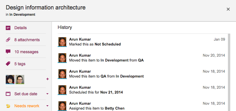
We are starting to realize that a card’s status, e.g. “Ready for Review,” “Needs rework,” etc. is pretty important not just in terms of what they show about a card’s current state, but also in terms of its history.
Previously, we weren’t tracking changes to a card’s status as part of the card’s history; without our latest release, that’s now a feature, so if you are wondering who put a card “On Hold”, you can just open the card’s History and Kerika will tell you:
Here’s a new feature we are adding: when you copy and paste an entire project from one account to another, you can decide whether to take the team as well.
Consider these two scenarios:
Alice makes a copy of a project that she owns and pastes it right back into her own account. (Why? Well, maybe she wanted to make a backup copy, or maybe the actual project was going to split into two parallel efforts and so copying-and-pasting the entire project makes sense.)
Bob makes a copy of a project that Alice owns, and pastes it in his own account. (Of course, to do this Bob would need to have access to Alice’s project in the first place.)
In the first scenario, the duplicated project is showing up in the same account as it was before, so Kerika assumes that the team should be copied as well: in other words, “Project A” and “Copy of Project A” will both have the same team, at least to start with although each version of the board may then change its project teams independently of each other.
In the second scenario, however, it’s a little more murky: did Bob just want to copy the cards and canvases of Alice’s project, or is he trying to actually set up the same project in his own account? It’s hard for Kerika to make a really good guess in this scenario, so the system asks you:
If Bob responds “Yes” to this question, his copy of Alice’s project will also come with all the team members who were originally working on Alice’s project.
Of course, this might mean that Bob is now adding some folks to his account team: people he hadn’t worked with before. These people are added automatically to Bob’s account team if he wants to take the team along with the project.
Kerika+Google, our integration with Google Drive, and Kerika+Box, our integration with Box, are very similar in terms of user interface, but the underlying cloud storage platforms are different in some subtle ways.
One of these has to do with the way images that are added to a canvas are named: when you add an image to a canvas, either by using the Upload button or simply by dragging and dropping the image from your desktop onto the canvas, Kerika will show a small thumbnail of the image on your canvas.
The thumbnails provided to Kerika by Google are better than those provided by Box in a couple of ways:
Box’s thumbnails are square, which can result in a cropped view of the image; Google’s thumbnails show the entire image.
Google’s thumbnails can be resized nicely on the Kerika canvas, simply by selecting it and then dragging on one of the corners; Box’s can’t.
If you rename a Google thumbnail and take off the original file extension, e.g. you rename “picture.jpg” to be just “picture”, the thumbnail still renders correctly, but Box’s doesn’t. (Because Box relies on the file extensions to detect the file’s MIME-type.)
There are some other quirks with the way Box and Google work, but most of them are going to be invisible to most Kerika users.
We have been trying out Google’s new domain management service for the past month, and we are impressed.
(Caveats: this service is in “beta”, whatever that means in Google-speak; it is available only to people in the U.S.; it doesn’t handle every one of the new top-level gLTDs — yet.)
But for all that, Google’s simplicity of UI and the overall user experience is way betterthan what we have seen from Register.com, GoDaddy, NameCheap, and a bunch of others.
In many ways this reminds us of Google in 1999, when it’s very simple search engine was a welcome contrast to the muddled portals offered by companies like HotBot, Lycos, and AltaVista.
Everything extraneous has been stripped out, and the process of transferring and managing domains has been made very clear even for non-technical people.
Folks like GoDaddy have a very short window of time to, literally, clean up their act before Google mows them down.