Tag Archives: Scrum

About the Scrum methodology. See also Agile.

Lock Canvas: a new feature

With our latest release we are adding a feature that will make it easier for folks to create, and maintain, very elaborate Whiteboards: any team member can lock a canvas to discourage other team members from making changes.

This isn’t a very complicated function; it has a very simple purpose: if you have been working hard on a particular canvas, which could be a stand-alone Whiteboard, part of a series of nested canvases in a Whiteboard, or attached to a card on a Task Board or Scrum Board, you may become worried that other team members might come by to visit your board and carelessly make changes to your pristine creation.

(After all, we creative types can get really possessive about our beautiful canvases :-)!)

To discourage others from making changes, just click on the lock button that appears to the far end of the Canvas toolbar:

For Team Members, this is a “soft lock”: any canvas that’s locked by one Team Member can be unlocked by any other Team Member, so you are not really shutting out people from making changes, merely discouraging them by signalling that you would like to preserve a canvas in a particular way.

Canvas locked by Team Member

But for Project Leaders, this is a “hard lock”: if a Project Leader locks a canvas, it can be unlocked only by another Project Leader. (Remember: projects can have more than one Project Leader!)

Canvas locked by Project Leader

So, if a canvas gets to a truly pristine state that you want to preserver forever, have the Project Leader lock it, and the rest of the team will be able to view it but not make changes.

And, of course, if canvases are embedded (nested) inside each other, each canvas can be locked or unlocked, as you like, giving you maximum flexibility.

Switching between open projects

When you have expanded your view of a Kerika board to fill up the browser, using the “Max View” button on the top-right corner of the Kerika app
Max View button
Max View button

Another button appears on the top-right, to help you quickly switch between all your open project tabs, as well as get to your Home Page:
Switching between tabsThis button is color coded to help you understand, at a glance, what’s going on in all your open projects:

  • If any of your open projects has an overdue card, then the button appears in red.
  • If any of your open projects has updates that you haven’t seen yet, the button appears in orange.
  • If any of your open projects has new cards that you haven’t seen yet, the button appears in blue.

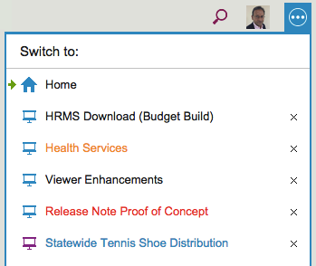
Clicking on the button shows a list of all your open projects, along with your Home Page:

Switching between tabs

The little green arrow (shown above at the top) points to the currently open tab, the one that you are viewing right now.

Projects have a blue icon; templates have a purple icon: in the example above, Statewide Tennis Shoe Distribution is a template, while all the others are projects.

  • Boards with unread updates have orange titles, like Health Services above.
  • Boards with overdue cards have red titles, like Release Note Proof of Concept above.
  • Boards with new (unseen) cards have blue titles, like Statewide Tennis Shoe Distribution above.

You can reorganize your list of open tabs by simply dragging them up or down this list.

(But, the Home Page is always on the top; that can’t be moved.)

You can also close an open project tab that you are no longer interested in by clicking on the “X” to the right edge of the entry.

So, there’s a simple visual consistency in Kerika’s design:

  • Blue = New
  • Orange = Changed
  • Red = Overdue

Change Shape: a new feature

We finally got around to adding a feature to the Canvas that we have wanted for a while, but somehow never got around to building: now, with a single click, you can change a shape on a canvas, whether it is in a Whiteboard project or attached to a card on a Task Board or Scrum Board:

Change Shape
Change Shape

Here’s why you might need this: often when you are first creating a process flow diagram, you might use shapes — rectangles, ellipses, diamonds — in an arbitrary or careless way, which is just fine because at that time you are trying to be creative rather than meticulous.

But, as the canvas takes shape and matures, you might want to go back and standard the use of particular shapes (even if you don’t strictly follow the old conventions for drawing flowcharts, which we don’t either).

This new function makes it easy for you to select a bunch of shapes and change them all to a new shape. Previously, you had to create a new shape and put it in place to replace the old shape, which was pretty inconvenient when you had a bunch of nested canvases and a bunch of curved lines connecting all the shapes.

Easy, now.

Using the right-click menu in Kerika

Maybe this isn’t obvious after all… We just realized that a long-time Kerika user (over 3 years of using Kerika on a daily basis!) didn’t know that there is a right-click menu available in Kerika!

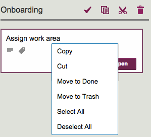
If you move your mouse over a card on Task Board or Scrum Board and press the right mouse button, this is what you will see:

Right mouse menu
Right mouse menu

This menu is handy for selecting all the cards in a column, which you can then grab and drag over to another column or even mark as Done.

Free Box accounts don’t support direct downloading of files

When you add files to your Kerika+Box projects, either as attachments to cards on Task Boards or Scrum Boards, or on canvases and Whiteboards, these get stored in your Box account.

If you have a premium (enterprise) version of Box, you can directly download these attachments, instead of having to go through Box’s preview display first: just hover over an attached file, and you will see a “download” button appear:

Directly downloading files from Box

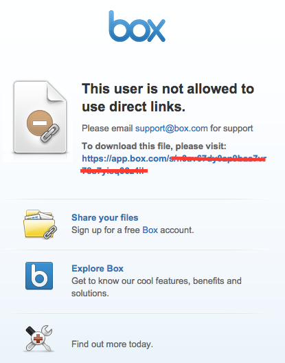
This works fine for enterprise users of Box, but if you are using the free version of Box, you will see a Box error page, like this:

Box download error
Box download error

Keeping track of status changes in Card History

We are starting to realize that a card’s status, e.g. “Ready for Review,” “Needs rework,” etc. is pretty important not just in terms of what they show about a card’s current state, but also in terms of its history.

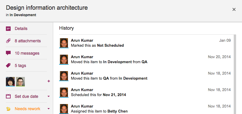
Previously, we weren’t tracking changes to a card’s status as part of the card’s history; without our latest release, that’s now a feature, so if you are wondering who put a card “On Hold”, you can just open the card’s History and Kerika will tell you:

Card status in history


When you copy and paste a project, do you want the team too?

Here’s a new feature we are adding: when you copy and paste an entire project from one account to another, you can decide whether to take the team as well.

Consider these two scenarios:

  • Alice makes a copy of a project that she owns and pastes it right back into her own account. (Why? Well, maybe she wanted to make a backup copy, or maybe the actual project was going to split into two parallel efforts and so copying-and-pasting the entire project makes sense.)
  • Bob makes a copy of a project that Alice owns, and pastes it in his own account. (Of course, to do this Bob would need to have access to Alice’s project in the first place.)

In the first scenario, the duplicated project is showing up in the same account as it was before, so Kerika assumes that the team should be copied as well: in other words, “Project A” and “Copy of Project A” will both have the same team, at least to start with although each version of the board may then change its project teams independently of each other.

In the second scenario, however, it’s a little more murky: did Bob just want to copy the cards and canvases of Alice’s project, or is he trying to actually set up the same project in his own account? It’s hard for Kerika to make a really good guess in this scenario, so the system asks you:

If Bob responds “Yes” to this question, his copy of Alice’s project will also come with all the team members who were originally working on Alice’s project.

Of course, this might mean that Bob is now adding some folks to his account team: people he hadn’t worked with before.  These people are added automatically to Bob’s account team if he wants to take the team along with the project.

Adding images to canvases: differences between Google and Box

Kerika+Google, our integration with Google Drive, and Kerika+Box, our integration with Box, are very similar in terms of user interface, but the underlying cloud storage platforms are different in some subtle ways.

One of these has to do with the way images that are added to a canvas are named: when you add an image to a canvas, either by using the Upload button or simply by dragging and dropping the image from your desktop onto the canvas, Kerika will show a small thumbnail of the image on your canvas.

The thumbnails provided to Kerika by Google are better than those provided by Box in a couple of ways:

  1. Box’s thumbnails are square, which can result in a cropped view of the image; Google’s thumbnails show the entire image.
  2. Google’s thumbnails can be resized nicely on the Kerika canvas, simply by selecting it and then dragging on one of the corners; Box’s can’t.
  3. If you rename a Google thumbnail and take off the original file extension, e.g. you rename “picture.jpg” to be just “picture”, the thumbnail still renders correctly, but Box’s doesn’t. (Because Box relies on the file extensions to detect the file’s MIME-type.)

There are some other quirks with the way Box and Google work, but most of them are going to be invisible to most Kerika users.

Cards with really long titles…

Cards shouldn’t really have very long titles, most of the time, since the details of the task are better described within the card itself, but sometimes having a really long card title is unavoidable.

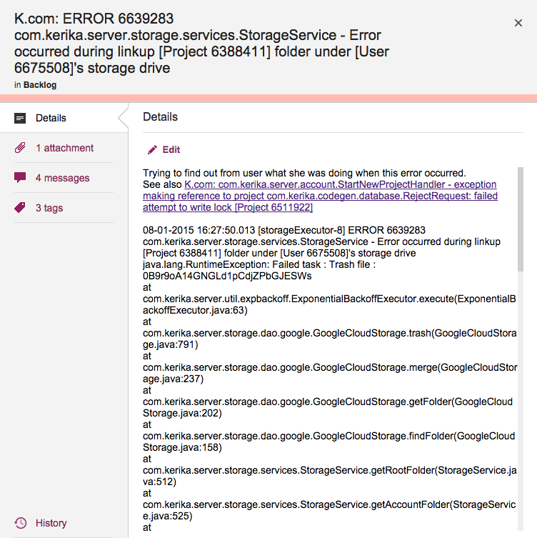
This is a problem that we have encountered ourselves, for example when we want to track bugs: if our Java-based server software records an exception (error), we need to track at least the top-level of the stack trace that we get from the Java virtual machine that’s running the server software, and this can get pretty long because it includes a bunch of critical information like the time stamp, process ID, etc.

Cards with really long titles

Previously, Kerika’s UI wasn’t super-friendly when it came to long card titles: the entire card title would be displayed when you were viewing a Task Board or Scrum Board, but when you opened the card to view its details, the UI would only show the two lines of card title at a time.

(And this was by design: when we first designed Kerika, we really did think that 2 lines of text would be plenty for most people!)

With our latest release we have eased up on this: when you open a card, you can see the entire title, even if it is pretty long.

(Not that we want to encourage you to write really long cards!)

Our smart highlights are now even smarter

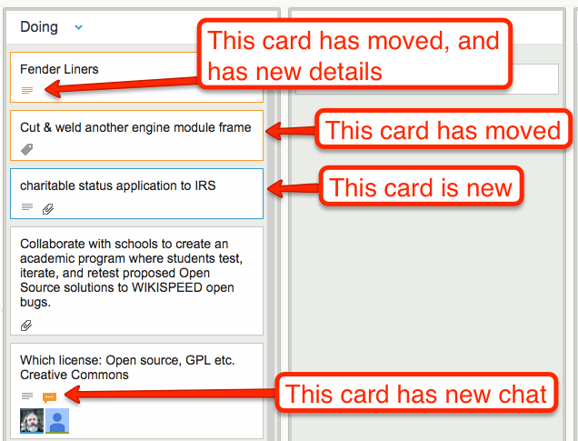
One of the coolest features in Kerika is how well the system alerts you to changes made on your Task Boards and Scrum Boards that you haven’t seen — i.e. because you were working on another board at the time your coworkers made changes, or maybe because you were fast asleep in a different timezone!

Whenever a coworker makes any change to a card that you haven’t seen — moving the card to a different column, changing its description, changing its tags, leaving some chat, etc., the change is highlighted on the card using orange.

Smart highlights
Smart highlights

And when you catch up on that change, e.g. open the card and read the new chat, the orange highlight gets turned off automatically.

(You can also mark a card’s changes as “read”, using the right-mouse-click menu.)

These smart highlights are great for distributed teams, and indeed for any person who is involved with multiple projects because it lets you catch up on what’s changed while you weren’t looking.

Now, these smart higlights are even smarter: if a card has multiple changes to it that you haven’t seen, e.g. it has a new attachment and it has new chat, Kerika keeps track of which changes you have caught up with, and which ones you haven’t.

In this example, if you read the chat, the orange highlight of the chat icon will go away, but the orange highlight of the attachments icon will remain until you catch up on the new attachments as well.

Kerika: getting smarter every day…