Tag Archives: Scrum

About the Scrum methodology. See also Agile.

A new Undo feature for Task Boards

We have added a new Undo feature that you can use to correct any mistaken drag-and-drop actions, or mistaken Move to Trash and Move to Done actions.

When you have moved a card, an Undo button will appear on the top-right of the app (along with a new Zoom button):

Undo works just like you would expect it to.  The Undo button shows for 2 minutes after a task (card) has been moved. (Keeping it there longer would actually be confusing for users who might not remember what exactly will be undone if they click on it.)

A new Zoom feature for Task Boards

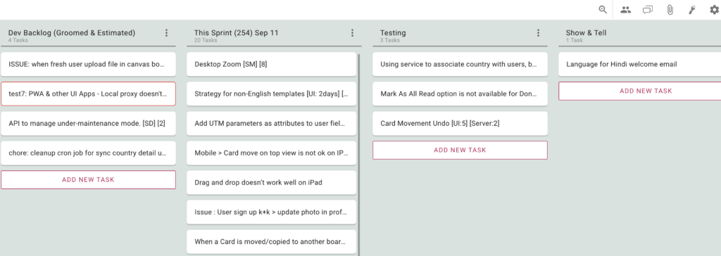
Along with the new Undo feature we have added a Zoom button that appears on the top-right of the app, on laptops, desktops and tablets:

When zoomed out, the board shows all tasks (cards) as a single line, and this is handy if you are dealing with a large board. Here’s what a zoomed-out view looks like:

This feature has existed for a while in our mobile apps; now you can use it on your desktop as well.

We have also improved this feature on mobile to make it possible for you to add new tasks while you are zoomed-out.

Making sure you catch up on all unread updates

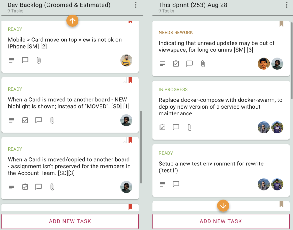
If your board has a lot of tasks (and we know of people whose boards have nearly 2,000 tasks!), you may not notice immediately if a task that’s out of your current view has been updated.  Our latest version makes sure you don’t miss anything:

In the example shown above, the two columns have tasks with unread updates that are out of view because the columns are long (and the viewport is short).  Whenever this happens, Kerika will show you an orange arrow: clicking on the arrow will bring the next unread update into view.

This makes sure you always know when something has changed, even when that isn’t within your view!

At Kerika we are obsessed about usability…

A more detailed view of Task History

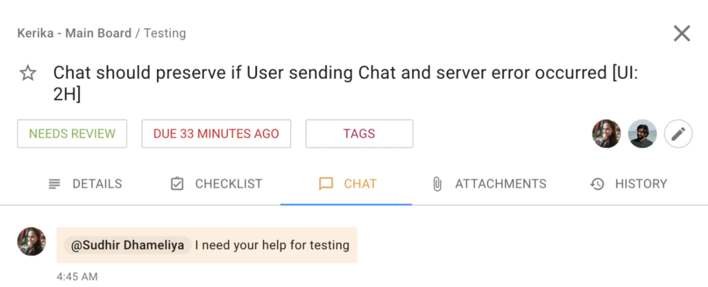
It’s not often you need to look at the detailed history of a task (card) but sometimes you need to know exactly what happened, when, and who did what.

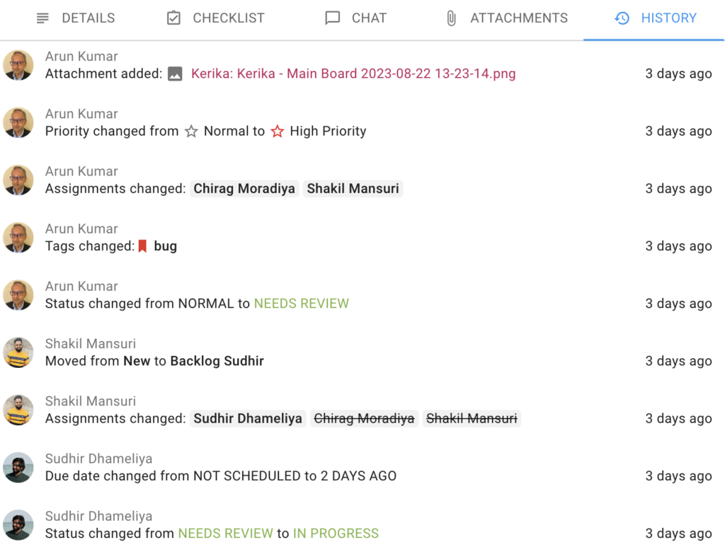
Our latest version has a much improved Task History, as you can see from these examples:

Every change made to a task is logged and the HISTORY tab of the task details dialog shows you not just who made a change and when, but also what the change was.

Where attachments were added, these are shown as links so you can quickly view it by clicking on the link.

Status changes show the old and new values for the status.

Due date changes also show the old and new due dates.

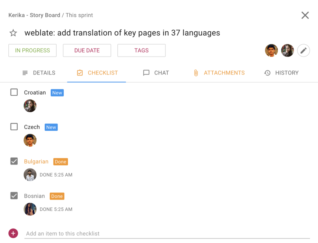
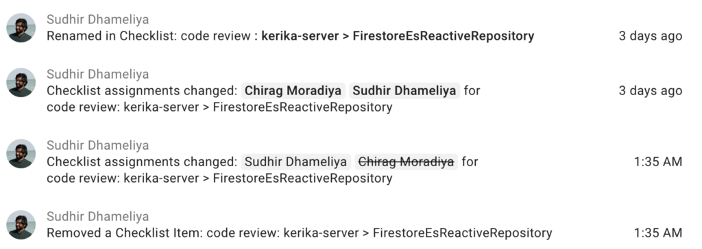
When it comes to sub-tasks (checklist items), the new history view is greatly improved:

You can see every instance of a checklist item changing, including renaming (editing), changing the assignments, and changing the due dates.

Enjoy Kerika!

How to make sure someone sees your Chat

With our latest update we have made it easy for you to ensure that someone on a board team always sees your chat message, even if they are not assigned to that card.

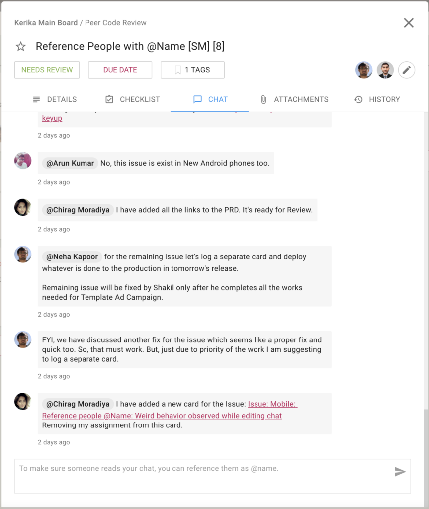
The old rule was that everyone who is currently assigned to a card would get new chat pushed to them as emails.  Now, you can make sure someone gets that email notification right away, even if they aren’t assigned to a particular card:

Screenshot showing examples of directed chat
Directed chat

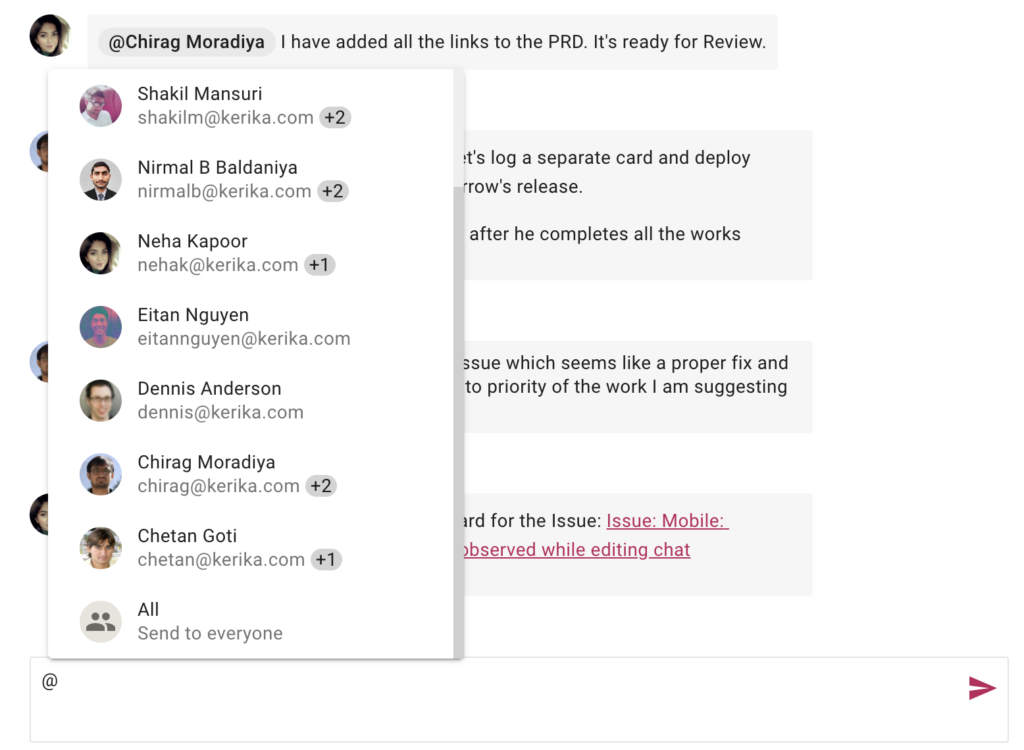
Using this feature is simple: just type the letter “@” anywhere in your chat message and Kerika offers all the matching suggestions:

Screenshot showing example of sending new chat
Sending new chat

“@All” lets you push your chat to every Board Admin and Team Member — something you should do only rarely to avoid annoying people!

Try this feature and let us know if we can improve it.

Some improvements for Task Auto-Numbering

We got feedback from some users after our last big release on how we could improve the user experience for folks who like to use the auto-numbering feature for Task Boards, and we have made these changes:

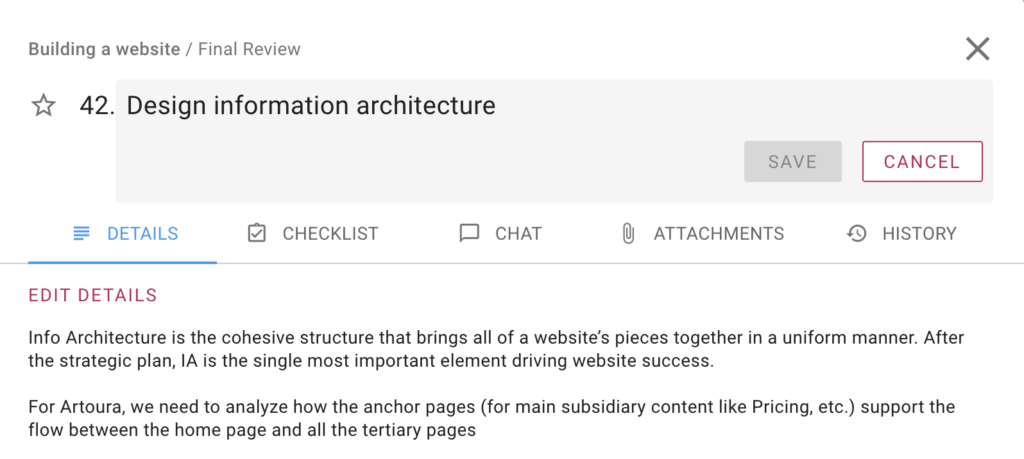
When you open a task, it’s number is shown (but can’t, of course, be edited)

Screenshot showing the Task Details dialog with numbering turned on
Editing a Numbered Task

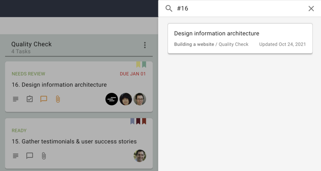
You can now search for a numbered task simply by typing “#number” in the Search box

Screenshot showing how search by task number works
Search by Number

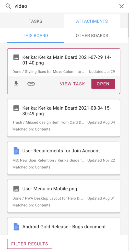
Kerika’s New Search Capabilities

We have completely rebuilt Kerika’s search capabilities, both on the back end and on the user interface, to make it much easier to find tasks (cards) and documents across all your Kerika boards.

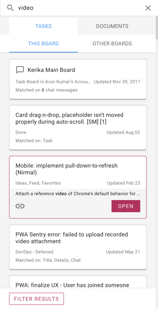
Screenshot showing Task results from Search
Search Task Results

Search results are organized into two tabs at the top: Tasks and Documents.

Within each tab, results are further segmented into two tabs: This Board, and Other Boards.  This makes the most common use of Search even easier: most people want to find something that’s on a large board that they are viewing.

For each search result Kerika shows you what part of the task/card matched the query; in the example above, the search term showed up in 8 Board Chat messages.

Clicking on a search result gives you two action buttons: Open the task/card, or get a link to that task.

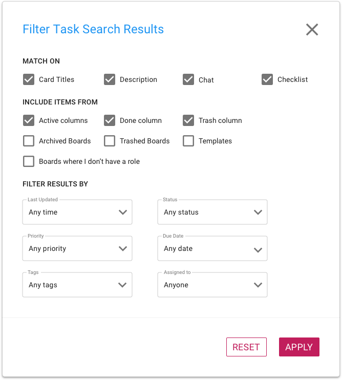
The search results are ranked by relevance; we spent weeks fine-tuning the algorithm based upon real-world usage and we think we have got it right now! But we know there will be times when you really need to narrow your search very specifically, and that’s handled by the Filter Results button which gives you so many options:

Screenshot showing Task Filter options for Search
Task Filter

The Documents tab shows you all the content that matches your search results: we get this from Google, if you signed up using your Google ID or email, or from Box, if you signed up using your Box ID.

Screenshot showing Document Results from Search
Search Results for Documents

Selecting a document result gives you two buttons: OPEN, which will open the document for you in a new browser tab (or in Google Apps or Box on a mobile device), and DOWNLOAD.

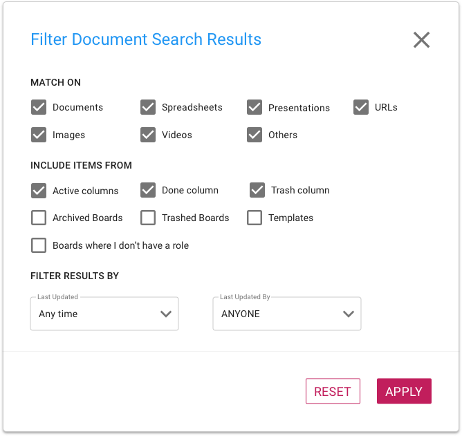
As with Tasks, there are numerous options to filter and narrow your search for documents:

Screenshot showing Documents Filter options for Search
Documents Filter


A more space-efficient layout for Task Boards

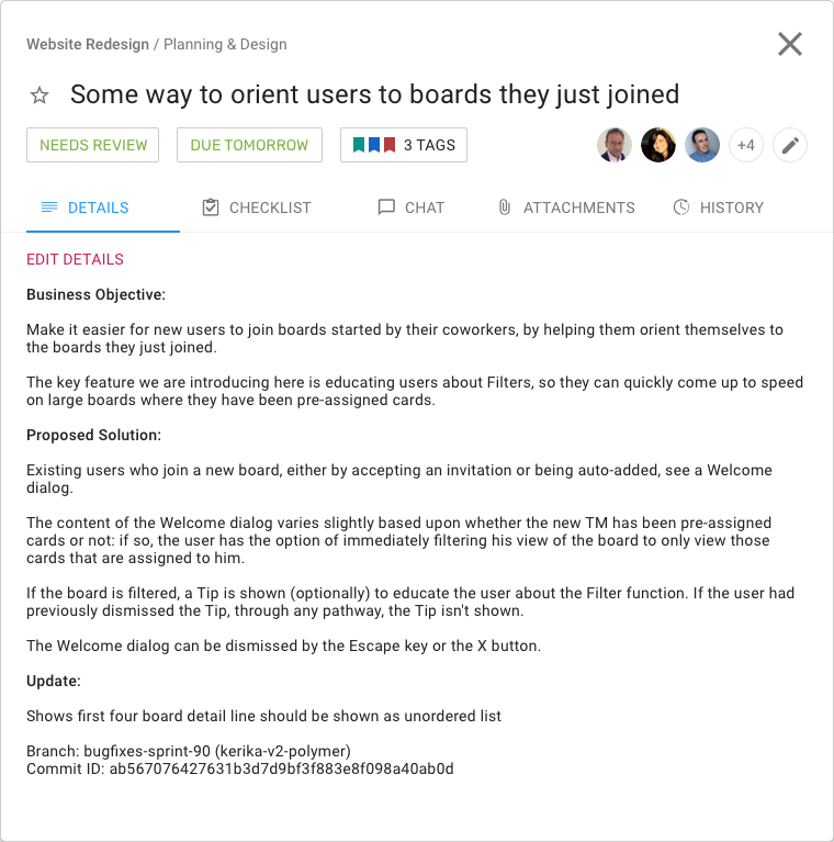
We have redesigned the Task/Card details dialog to provide a more space-efficient layout, so you can see more of what you need without having to scroll:

Screenshot showing the Task Details dialog
Task Details

What used to be vertical tabs for Details, Chat, etc., is now a compact horizontal tab; this frees up a lot of space to see the details of the tags.

The other big change we made is to make the Priority setting separate from other Tags:

Screenshot highlighting position of Task Priority field
Task Priority flag

Clicking on the star will bring up your task priority options:

Screenshot showing possible values for Task Priority
Task Priority

We are moving away from Scrum Boards

We are transitioning our Scrum Board users to Task Boards: the Scrum Boards are used only by a tiny portion of our user base, who overwhelmingly prefer using Task Boards and Whiteboards.

Background

For many years now we have offered both Task Boards and Scrum Boards, but the relative popularity (and implied usefulness) of these two are lopsidedly in favor of Task Boards.

The main difference between Task Boards and Scrum Boards has been the use of a shared Backlog: a column of cards that can be shared by several Scrum Boards at the same time.

In Scrum Boards, the Backlog appeared fixed in the leftmost column of the board, and like Done and Trash, it couldn’t be be moved, renamed or deleted.

The Backlog was “live” all the time in the sense that any change made by one attached Scrum Board to the Backlog was immediately reflected in every other Scrum Board that was attached to the same Backlog. If Scrum Board A added a card to a shared Backlog, it immediately showed up in the Backlog column when viewed by Scrum Board B and Scrum Board C.

The Problem

This wasn’t a good way to implement Scrum Boards, as we found out ourselves during our internal use of these boards. It’s principle weakness was it led to a proliferation of Scrum Boards, since each Sprint required a new Backlog. (Our own development team is currently on Sprint 180 so we experienced this proliferation early on.)

We though the general feature in Kerika that lets accounts archive old boards would help, but this just pushed the proliferation problem to another area; it didn’t really fix it.

The Solution

We are just going to have Task Boards (and Whiteboards) from now on. At some point in the future we may completely rethink, redesign, and rebuild a new kind of scrum boards, but it doesn’t make sense for us to continue offering the current version.

As a consequence, all existing Scrum Boards will be converted into Task Boards. Here’s how that would work:

Consider an existing set of boards that all use the same shared Backlog: Board A, Board B, and Board C.

Right now all three boards see the same Backlog, at the same time: if cards are added or moved away from the shared Backlog by any board, this view is immediately updated for all three boards.

When we transform Scrum Boards to Task Boards, each of Boards A, B, and C will have its own local copy of the Backlog.

From this point on, any changes made by any of these boards to their local copies of the Backlog will not affect the copies that were made for the other boards. Each board, then, becomes independent and can proceed on its own path, without affecting any other board since there is no longer a shared column of cards.

Questions?

We have already been in touch with active users of Scrum Boards and have not heard any concerns from them about this proposed change, so we are confident that we are making the right decision. If you do have any questions, please contact us at support@kerika.com.