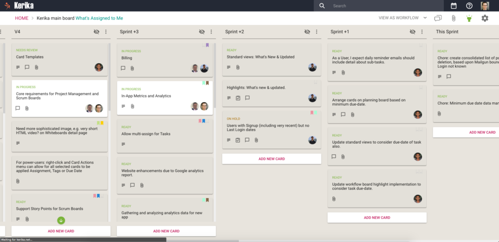
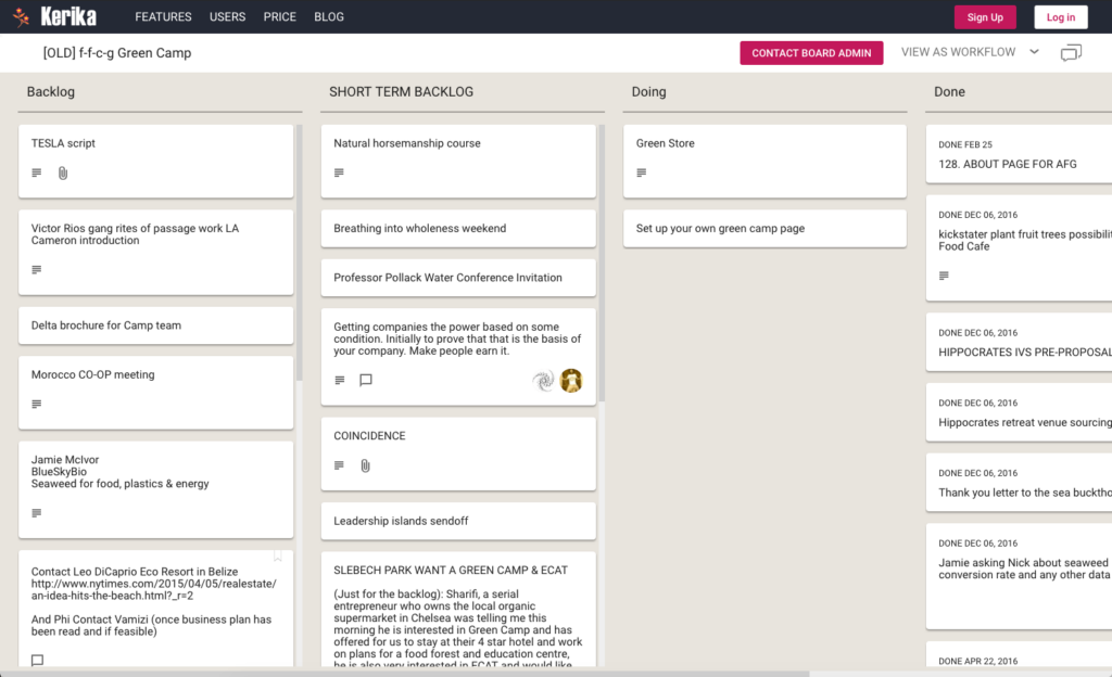
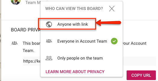
It will come as no surprise to our users that the Kerika team uses the software for every aspect of the company’s internal operations, including, of course, our product development.
(There really isn’t anything better on the market for planning and executing product roadmaps — we know, because we have checked and made sure we are better than everybody :-))
We are sometimes asked about our own internal workflow: how we plan releases and manage our Sprints, and in particular how we have gone without using regular old email for over 4 years now!
Well, here’s a glimpse at our internal workflow:
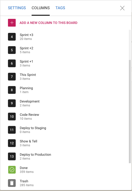
We work in two-week long Sprints; we have found two weeks to be the ideal Sprint length since it provides enough time to produce something — at least some usable part of a new feature — while not being so long that we forget we are supposed to be working as a Scrum team.
Planning
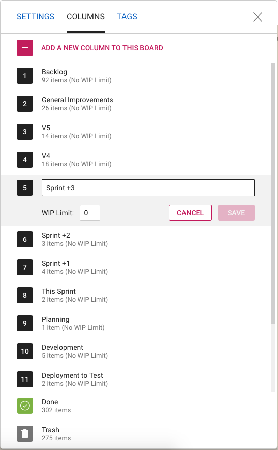
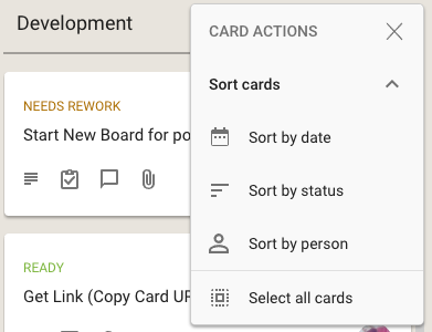
Whenever we plan a new Sprint, we are always also looking forward as well: hence the columns titled “Sprint +1” (i.e. the Sprint that will come after the current Sprint), “Sprint +2” (the Sprint that will come after the next Sprint), etc.
This gives a view into the next several weeks of our product roadmap which makes sure we don’t approach any single work item with tunnel vision.
Now you might notice that “Sprint +3” in the list above is way larger than “Sprint +1” or “Sprint +2”: that doesn’t mean that we expect a sudden spurt in productivity (i.e. increase in team velocity) in 4 weeks time. It just means that as we go further out in our planning there is more uncertainty about priorities and so the Sprints that are well into the future are not well defined — and that’s perfectly OK.
Quality Assurance
Within each Sprint we have a fairly conventional flow: Planning, Development and QA. The QA step actually consists of three separate stages:
- Code Review: we try to make sure we review all the code we are writing in any Sprint, unless it is a really trivial change we are making (e.g. changing the label on a button).
- Deploy to Staging: we have a separate set of servers where we test our new releases. This also happens to be where we have all our real projects running: we believe very much in the idea that “developers should eat their own dogfood”, so we run out entire business on the latest build that went past Code Review.
This can be a little scary or frustrating at times: if there was a bad release to our staging environment, it can bring every project and board to a screeching halt. But, from our perspective, that’s the whole point: make it everyone’s business to ensure that we produce high-quality code, and make it everyone’s priority to fix any problems that come up.
This model of living on the bleeding edge of our product gives us a really good incentive to write good quality code!
- The final QA step is Show & Tell, where the team formally presents the new features or bug fixes to the Product Owner. With each new feature we will have identified a set of test cases, as part of the Planning phase, and these are used to formally check the new feature in a meeting attended by everyone on the team.
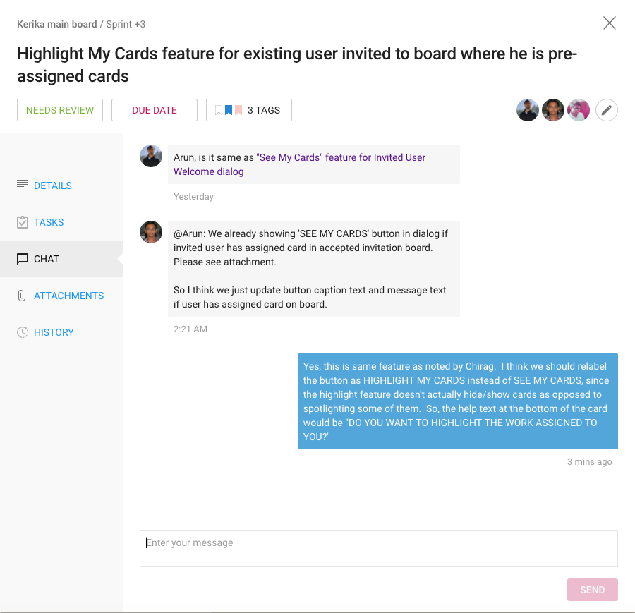
Very occasionally something will get rejected at the Show & Tell stage, in which case the card gets moved back to Planning or Development and flagged as “Needs Rework”. It’s more common for work to get rejected at the Code Review phase, not because it is buggy, but because it might not meet our internal coding standards.
Deployment
Once a feature or bug fix has passed Show & Tell, it is ready for Deployment to Production.
We have a continuous integration process for handling code changes — pulling them from our internal git code repository — but we don’t do continuous deployment. Instead we prefer to deploy on the last day of each 2-week Sprint. We usually time this for Friday morning, Indian Standard Time, so that our developers in India can take one final look at the system working in production.
Documentation
We have an unusually strong emphasis within the team on creating documentation at the same time as we write code. Many small companies skip documentation because they think it will slow them down.
In our own (sometimes bitter) experience, skipping documentation is false savings: if there are problems to be fixed later, or even if a feature simply has to be extended in the future, it’s very hard for even the original developer to recall the logic that she used to write the code in a particular way.
What’s important to note, however, is that we don’t have very big documents: most documents are less than a page long, because they refer to very specific work items. But we have thousands of these small documents, since every feature we have ever produced, and every bug we have fixed, has been documented.
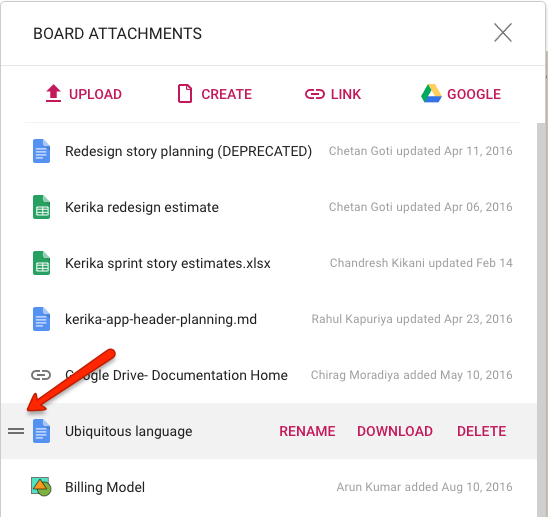
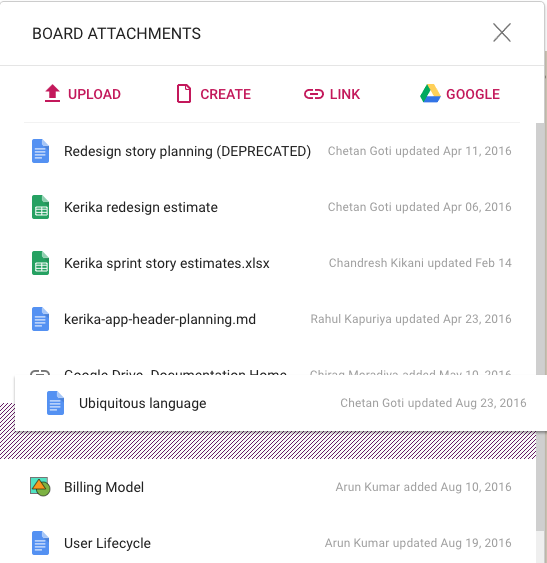
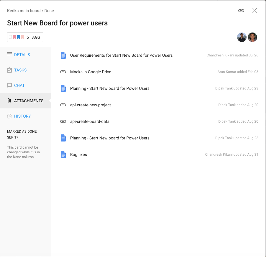
And thanks to Kerika’s very cool integration with Google Docs (we use Kerika+Google), managing these thousands of documents is very easy: just open the relevant card for a specific feature or bug fix and you will find all the relevant documents as well:
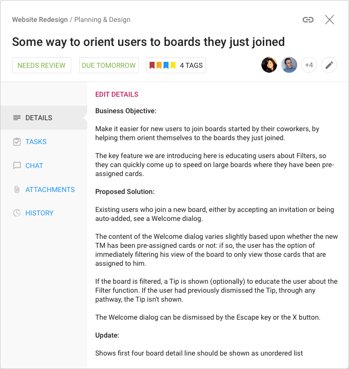
For new features we always have a short Planning Document that identifies any existing modules that will be affected and provides an outline of the new code that will be written. Here’s an example:
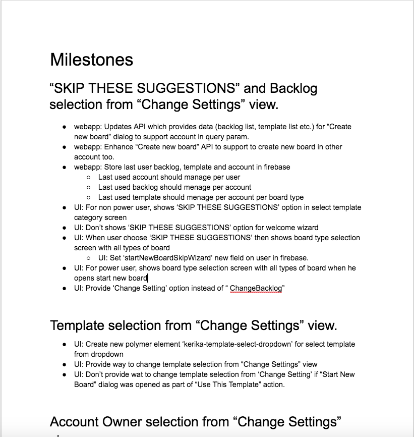
There may be other documents created, depending upon the complexity of the new feature, but even the smallest new feature will have at least one planning-related document that’s written before the code is written.
Bug Fixes
For bug fixes, we have a Repro, Cause & Fix document that methodically analyzes the cause of a bug:
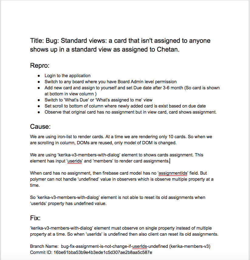
The most important section of this document is the Introduced Since piece, where we trace the origin of the bug back to its source, to understand what new feature or bug fix we were originally working on that resulted in this new bug appearing.
This methodical root cause analysis, which we do for even the most minor bugs, helps us identify patterns in our code writing that we need to improve. Sometimes it can even point to bugs that we haven’t discovered yet: the root cause analysis may identify an assumption that we have applied in other places, all of which need to be looked at to make sure there aren’t other variations of the same bug that haven’t been identified yet.
After the bug has been fixed, the Repro, Cause & Fix document is updated to reference the git branches where the code fix can be found. This completes the circle of careful analysis, careful execution, and methodical review that we strive to adopt (and improve continuously).
The End of Email
We stopped using regular email towards the end of 2013. There was never any formal decision to renounce email; instead there was a formal decision to “eat our own dogfood” in a very serious way.
And as we started to build our entire company using our own product, we found that using Kerika is so much better than using email that there really wasn’t any need for email any more.
So people simply started drifting away from email. There was no explicit decision or formal movement to do so, people just realized, on their own, that email is an exceptionally poor way of managing work within a distributed team.
Conclusion
Considering the size of our team — and entire company, for that matter — you may be surprised by the degree of formalism we have adopted, and the heavy emphasis on analysis and documentation.
We spend at least as much time on analysis and documentation as we do on “pure coding”, and if we add in the Code Reviews and other elements of formal QA, the actual coding time is a relatively small portion of our total expenditure.
But trying to skimp on analysis and documentation really doesn’t pay off, in our experience: if you are building a company and product for the long-run, as we very assuredly are, you need to build it right, not just fast.
