Tag Archives: Usability

About software usability in general.

Two ways of referencing URLs in Kerika

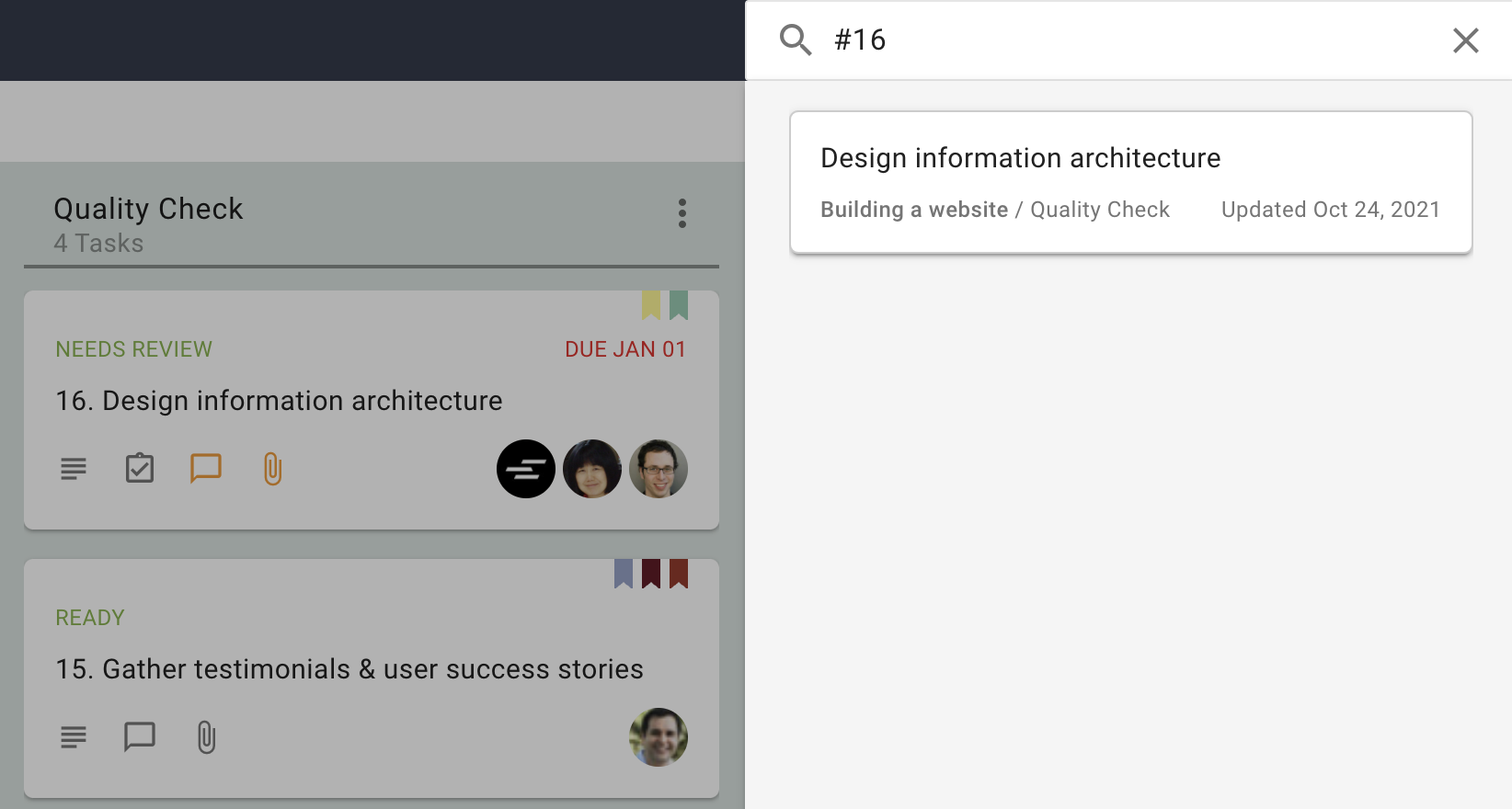
When you include a URL in a task’s details tab or chat, Kerika will look up the URL and then display the title of the page.  This is really useful because the URL may be very long and generally unintelligible, and people find the name of the site to be more useful.

Here’s an example, where the URL for the New York Times website is included in a chat message:

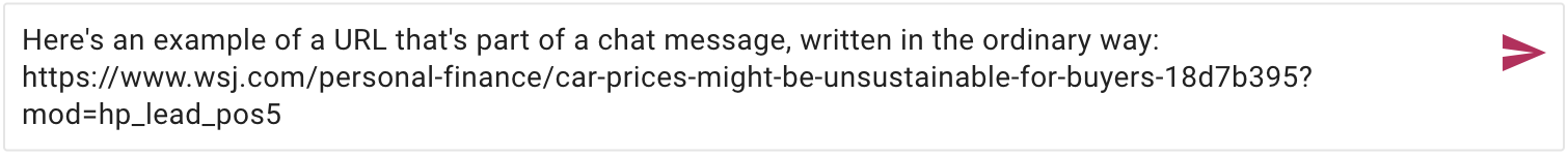
After this chat is sent, Kerika will look up the URL and then use the site’s name when the chat is displayed in Kerika, like this:

This is useful most of the time. The original URL, from the Wall Street Journal was long and contained many characters as a suffix  that most people would not find helpful.

But sometimes you want the URL itself to be clearly visible, and that’s possible in Kerika if you use the special escape character called the tilde “`” which appears on the top-left corner of English keyboards.

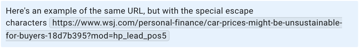
Here’s how you would use the tilde to “escape” the URL you are referencing:

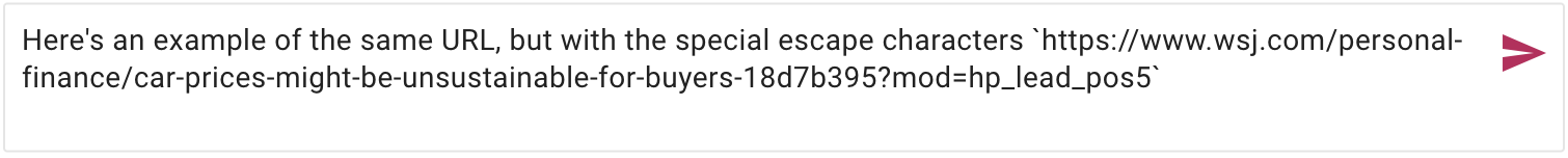
And this is how it would look in the chat stream:

Because you used the tilde character to bracket the URL, Kerika doesn’t try to show the name; instead it shows the URL exactly as it is.

Another useful improvement from Kerika 🙂

Kerika has a Template for Creating a Customer Journey Map

Template for Customer Journey Map
A customer journey map is a visualization of the process that a person goes through in order to accomplish a goal. It’s used for understanding and addressing customer needs and pain points.
To understand this concept better, start with this great article from the Nielsen Norman Group: https://www.nngroup.com/articles/customer-journey-mapping/
We have distilled this down to a Kanban board with all the required steps that can be set up in just seconds using our free template.
How to use this template:
  1. Click on the USE TEMPLATE button and create your own board.
  2. Next, invite your coworkers to join this board. There’s a lot to get done, so hopefully you are not on your own!
    1. If you have stakeholders who need to know what’s going on, add them to this board as Visitors, so they will have a real-time view of progress without messing up anyone’s work.
  3. When you team has joined you, open the tasks one by one, starting at the top of the To Do column.
    1. Assign the task to yourself, or one of your team members. (A task can be assigned to more than one person.)
    2. Mark it as IN PROGRESS so everyone knows the task is underway.
  4. As each task gets worked on, people can contribute their ideas and documents right on the task card itself, so nothing gets lost.
  5. When the task gets completed, mark it as DONE.

How to make sure someone sees your Chat

With our latest update we have made it easy for you to ensure that someone on a board team always sees your chat message, even if they are not assigned to that card.

The old rule was that everyone who is currently assigned to a card would get new chat pushed to them as emails.  Now, you can make sure someone gets that email notification right away, even if they aren’t assigned to a particular card:

Screenshot showing examples of directed chat
Directed chat

Using this feature is simple: just type the letter “@” anywhere in your chat message and Kerika offers all the matching suggestions:

Screenshot showing example of sending new chat
Sending new chat

“@All” lets you push your chat to every Board Admin and Team Member — something you should do only rarely to avoid annoying people!

Try this feature and let us know if we can improve it.

Some improvements for Task Auto-Numbering

We got feedback from some users after our last big release on how we could improve the user experience for folks who like to use the auto-numbering feature for Task Boards, and we have made these changes:

When you open a task, it’s number is shown (but can’t, of course, be edited)

Screenshot showing the Task Details dialog with numbering turned on
Editing a Numbered Task

You can now search for a numbered task simply by typing “#number” in the Search box

Screenshot showing how search by task number works
Search by Number

Kerika’s New Search Capabilities

We have completely rebuilt Kerika’s search capabilities, both on the back end and on the user interface, to make it much easier to find tasks (cards) and documents across all your Kerika boards.

Screenshot showing Task results from Search
Search Task Results

Search results are organized into two tabs at the top: Tasks and Documents.

Within each tab, results are further segmented into two tabs: This Board, and Other Boards.  This makes the most common use of Search even easier: most people want to find something that’s on a large board that they are viewing.

For each search result Kerika shows you what part of the task/card matched the query; in the example above, the search term showed up in 8 Board Chat messages.

Clicking on a search result gives you two action buttons: Open the task/card, or get a link to that task.

The search results are ranked by relevance; we spent weeks fine-tuning the algorithm based upon real-world usage and we think we have got it right now! But we know there will be times when you really need to narrow your search very specifically, and that’s handled by the Filter Results button which gives you so many options:

Screenshot showing Task Filter options for Search
Task Filter

The Documents tab shows you all the content that matches your search results: we get this from Google, if you signed up using your Google ID or email, or from Box, if you signed up using your Box ID.

Screenshot showing Document Results from Search
Search Results for Documents

Selecting a document result gives you two buttons: OPEN, which will open the document for you in a new browser tab (or in Google Apps or Box on a mobile device), and DOWNLOAD.

As with Tasks, there are numerous options to filter and narrow your search for documents:

Screenshot showing Documents Filter options for Search
Documents Filter


A more space-efficient layout for Task Boards

We have redesigned the Task/Card details dialog to provide a more space-efficient layout, so you can see more of what you need without having to scroll:

Screenshot showing the Task Details dialog
Task Details

What used to be vertical tabs for Details, Chat, etc., is now a compact horizontal tab; this frees up a lot of space to see the details of the tags.

The other big change we made is to make the Priority setting separate from other Tags:

Screenshot highlighting position of Task Priority field
Task Priority flag

Clicking on the star will bring up your task priority options:

Screenshot showing possible values for Task Priority
Task Priority

Moving entire columns of tasks (cards)

We have added a new function to let Board Admins and Team Members move an entire column of tasks (cards) with a single action, within a single board or across multiple boards in the same account.

The function can be accessed by from the  menu that appears as a pop-up when you click on the dots on the top of each column, as well as when you use the right-click mouse action on any cards:

Screenshot showing the Task Options menu
Move entire column

If you choose the Move to another column action, a pop-up dialog appears that lets you choose the column you want to move these cards to:

Screenshot showing the Move to Another Column dialog
Move to another column

If you choose the Move to another board action, a new dialog appears that lets you choose the board where you want these tasks to go to:

Screenshot showing moving cards from one board to another
Move to another board

After selecting a destination board, you can then pick the exact location of the column you are moving, relative to the columns that are already on that board.

And, as you can see, from the screenshot, you are also able to move columns from boards in one account to another account where you are also an Account Member.

You can now choose your background colors

A new feature that we recently introduced will let you choose a background color: one for the desktop app, and one for the mobile app. (Oops, did we just talk about the mobile app?)

To select a color: click on your user profile photo, which appears on the top-right of Kerika:

User Preferences dialog on desktop
User Preferences

Select My Preferences for this Account from this dialog, and you will land on a revamped Preferences page that now includes options for selecting a background color:

Choosing color preferences
Color Preferences

We are offering a range of light and dark backgrounds; in our own testing we found that the darker backgrounds look better on the desktop, while the lighter backgrounds look better on phones.  But, of course, that’s just our opinion — try this out and select what you like best!