Efficient project management is the backbone of delivering successful outcomes. Whether you’re designing a website, launching a product, or coordinating a complex development effort, a structured approach ensures that all tasks are aligned, timelines are met, and stakeholders remain informed.
This guide walks you through the essential steps to mastering project management, providing actionable strategies to streamline workflows, foster collaboration, and track progress.
Once you’ve grasped the fundamentals, you’ll see how a visual tool can bring these principles to life, helping your team stay focused and productive.

Click on this image to see how this team has bult a powerful Project Management Board
Essential Steps to Build an Effective Project Management Workflow
A strong project management workflow ensures that tasks are completed efficiently, deadlines are met, and team collaboration runs smoothly.
Here are the key steps to build a reliable project management process:
1. Define Clear Objectives and Goals
Every successful project begins with clear, well-defined objectives. Understanding what you aim to achieve keeps the team focused and aligned throughout the project lifecycle.
Key Actions:
- Conduct stakeholder meetings to align on project goals.
- Break down objectives into measurable deliverables using the SMART framework (Specific, Measurable, Achievable, Relevant, Time-bound).
- Document these objectives in a centralized location to ensure team visibility.
2. Develop a Detailed Project Plan
A comprehensive project plan serves as a roadmap, outlining tasks, timelines, and dependencies. It ensures that every team member understands their role and responsibilities.
Key Actions:
- Use Gantt charts to map out timelines and task dependencies.
- Identify milestones and deadlines to track progress effectively.
- Allocate resources based on task complexity and team expertise.
3. Assign Roles and Responsibilities
Defining roles ensures accountability and eliminates confusion about who is responsible for each task. A RACI matrix (Responsible, Accountable, Consulted, Informed) can be helpful.
Key Actions:
- Assign roles based on individual skills and project needs.
- Communicate responsibilities clearly during team meetings or kickoff sessions.
- Encourage feedback to ensure responsibilities are distributed fairly.
4. Prioritize and Break Down Tasks
Breaking down the project into smaller, manageable tasks ensures that no aspect of the work is overlooked. Prioritization helps focus the team’s efforts on what matters most.
Key Actions:
- Categorize tasks by urgency and importance using prioritization techniques like the Eisenhower Matrix.
- Divide complex tasks into smaller subtasks with clear deadlines.
- Use tools to track task progress and keep everyone updated.
5. Foster Collaboration and Communication
Open and transparent communication is critical for effective project management. It helps teams stay aligned, resolve conflicts, and ensure progress is on track.
Key Actions:
- Set up regular meetings (e.g., daily stand-ups or weekly check-ins) to review progress and address roadblocks.
- Encourage team members to share updates and feedback in real-time.
- Use collaborative tools to centralize communication and document decisions.
6. Monitor Progress and Adjust Plans
Tracking project progress helps identify potential risks and bottlenecks before they escalate. Regular monitoring allows for adjustments to keep the project on course.
Key Actions:
- Use KPIs (Key Performance Indicators) such as project completion percentage, budget adherence, and resource utilization.
- Conduct periodic reviews to reassess goals and timelines.
- Create contingency plans to address unforeseen challenges.
7. Evaluate and Document Learnings
After completing the project, evaluate its success by measuring outcomes against initial goals. Documenting lessons learned helps improve future workflows.
Key Actions:
- Hold a post-project review to discuss what went well and what could be improved.
- Collect feedback from all stakeholders to identify strengths and weaknesses.
- Update standard operating procedures (SOPs) based on findings.
Using the Right Tools to Build a Project Management Workflow
While mastering the essential steps of project management is key, implementing those steps effectively requires the right tools. A reliable task management system can bridge the gap between theory and execution, ensuring that projects are not only well-organized but also actionable.
The right tool streamlines task delegation, prioritization, and collaboration, enabling your team to stay focused and deliver results on time.
Explore How This Demo Project Management Board Works
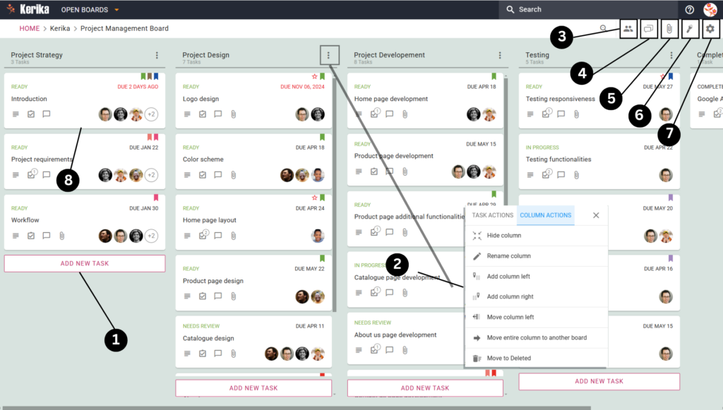
The demo board below exemplifies an efficient project management workflow in action. This board visually represents tasks progressing through stages such as “Project Strategy,” “Project Design,” “Development,” and “Testing,” ensuring nothing falls through the cracks.
By centralizing information, tracking progress at a glance, and identifying bottlenecks, this workspace provides a clear and actionable overview of your project.
Now let’s dive deeper into this demo board and understand how each section works together to create a robust project management system designed for success.
How This Project Board Works
Explore How This Demo Project Management Board Works
You can see in the image above how this team organizes their workflow using a board that simplifies project management. It’s designed to handle every stage of the process.
Let’s take a closer look at this team’s board to understand how each feature contributes to an effective project management system.Here’s how it all comes together.
1. Adding New Tasks to the Board

Every project starts with a list of tasks, and this board makes it incredibly simple to add them. By clicking on the “Add New Task” button (highlighted in the bottom left corner of the board), you can create a new card. Each card represents a specific task, such as “Homepage Design” or “Product Page Development.” This ensures your workflow stays clear and nothing gets left behind.
2. Customizing Columns for Your Workflow
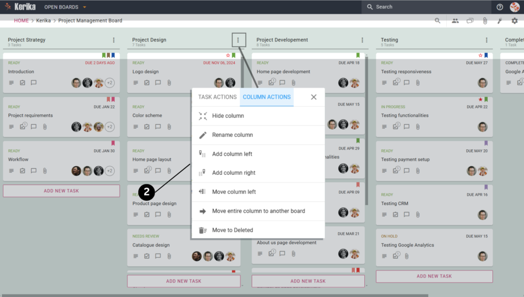
Need to adjust how your board is set up? You can easily rename columns, add new ones, or move existing columns to match your workflow. Simply click on the column menu (three dots) at the top of any column to access these options. For example, if a new phase of your project emerges, you can add a column like “Testing” without disrupting your existing tasks.
3. Managing Team Members and Roles

Effective collaboration starts with the right roles. Use the Team Members menu to add or remove members from the board. Each person can be assigned as an Admin, Member, or Visitor based on their responsibilities. For instance, assign Admin rights to project leads while giving clients Visitor access to view progress.
4. Centralizing Team Communication

Keep all discussions relevant to the board using the Board Chat feature. This allows your team to share updates, ask questions, or address challenges in one central location. For instance, a designer might share feedback on the “Logo Design” task directly in the chat to keep everyone on the same page.
5. Attaching and Sharing Files

Every project involves a fair amount of documentation, and this board handles it beautifully. With the Attachments section, you can upload files, link Google Docs, or even create new documents directly from the board. For instance, attach style guides or client briefs to ensure all necessary materials are accessible to the team.
6. Highlighting Important Tasks

Prioritize what matters with the Highlight feature. This lets you filter tasks based on due dates, priority levels, tags or specific assignments. You can combine these filters to find tasks as well.
For example, You can highlight tasks assigned to a particular teammate, tagged as ‘mockups’, along with their status as ‘Ready’. This saves you a lot of manual work to find what you are looking for.
7. Adjusting Privacy Settings
The Settings Menu is where this team fine-tunes their board for maximum efficiency. Clicking the gear icon in the top-right corner reveals four tabs: Overview, Settings, Columns, and Tags. Each tab plays a specific role in optimizing the workflow. Let’s break them down:
- Overview Tab:

Provides a snapshot of the board’s progress, a description of its purpose, options for exporting tasks in Excel format, and the ability to archive completed boards for future reference.
- Settings Tab:

Controls board privacy and access permissions, letting you choose between team-only access, organizational access, or public sharing via a link. It also manages edit permissions to maintain workflow integrity.
- Columns Tab:

Allows customization of the board structure by adding, renaming, or reordering columns. This helps align the workflow with the team’s specific project requirements.
- Tags Tab:

Facilitates task categorization by creating, managing, and applying tags. Tags make it easier to filter tasks by priority, type, or other custom labels, improving task organization and retrieval.
Now, let’s dive into how the team uses these task cards to break down the entire project management process into manageable steps. We will show you how you can use this feature to break down each tasks into an actionable item.
Break Down Tasks Into Manageable Steps
Task cards serve as the central hub where you and your team can capture and organize all the necessary details for completing a task. Here’s how to use them effectively:
- Add Key Details:

Start by clearly defining the task’s objectives and any steps required for completion. For example, for a homepage design task, outline the layout and content requirements.
- Track Progress:

Update the task’s progress by marking it as “In Progress,” “Needs Review,” or “Completed” so everyone can stay informed about its status.
- Set Deadlines:

Assign a specific due date to each task to ensure that deadlines are met and nothing gets delayed.
- Break Tasks Into Actionable Steps:

Decompose complex tasks into smaller, manageable steps. For example, “Create homepage content” might include subtasks like writing copy, selecting images, and designing the layout.
- Use Tags For Clarity:

Use Tags to categorize tasks. You can prioritize by urgency or group tasks by themes like “Design,” “Development,” or “Testing.”
- Attach Files:

Keep all project resources organized by attaching files directly to the task card. Upload design mockups, reports, or PDFs, create new Google Docs or Kerika Canvases, or link external resources – all in one place. This ensures your team can quickly access everything they need without wasting time searching through emails or folders.
- Maintain Focused Communication:

Use the Chat tab to keep all discussions tied to specific tasks, ensuring that communication is clear and easy to track.
- Assign Team Members:

Assign each task to specific team members, so it’s clear who is responsible for what. This enhances accountability and ensures tasks move forward efficiently.
- Set Task Priority for Clear Focus:

Prioritizing tasks is key to keeping your project on track, and the Set Priority feature makes this effortless. You can assign one of three levels to each task:
- Normal: For routine tasks that can proceed without urgency.
- High Priority: For tasks requiring quick action or increased focus from the team.
- Critical: For time-sensitive or high-impact tasks that demand immediate attention.
By leveraging these features, task cards help your team stay organized, collaborate seamlessly, and ensure no important detail is overlooked. With these steps in place, managing your project becomes easier and more effective.
Set Up Your Kerika Account
Getting started with Kerika is quick, simple, and sets the stage for organizing your project workflow seamlessly. Here’s how you can set up your account and get started on the right foot:
Signing Up is Free and Easy
- Go to kerika.com and click the Sign Up button.

- Choose the account type that works best for you:
- If you use Google Workspace, select the SIGN UP WITH GOOGLE option.
- If you’re an Office 365 user, opt for SIGN UP WITH MICROSOFT.
- You can also choose SIGN UP WITH BOX for file storage integration.
- Follow the prompts, and you’ll be ready to go in moments—no credit card required, and you’ll receive a free 30-day trial for your team.
A Global Workspace for Everyone

Kerika supports 38 languages, so you and your team can work in the language you’re most comfortable with, creating a truly inclusive experience.
Create Your First Board
Once you’ve signed up, it’s time to create your first board and bring your project management workflow to life. Here’s how:
- Click “Create New Board”: From the Kerika dashboard, select the option to create a new board.
- Choose the Board Type: For project management, select the Task Board template. This comes preloaded with columns like “To Do,” “Doing,” and “Completed.”

- Name Your Board: Give your board a name that reflects your project, such as “Website Redesign” or “Marketing Plan.”
- Customize Your Workspace: Add or rename columns to suit your workflow, and start adding tasks to keep your team aligned.
You now have a fully functional, visual workspace ready to help you track progress, manage tasks, and foster collaboration within your team.

Wrapping Up: Your Blueprint for Project Success
Mastering project management isn’t just about completing tasks; it’s about creating a system that keeps your team on the same page, fosters collaboration, and ensures every milestone is met. With a detailed workflow and the right tools, you can stay organized, productive, and focused on achieving your goals.
This board demonstrates how every aspect of your project can be broken into actionable steps. By prioritizing tasks, tracking progress, and using features like task cards to manage details, you’ll ensure nothing gets overlooked.Kerika isn’t just a tool; it’s a framework to streamline teamwork, maintain accountability, and bring your project vision to life. Ready to take the next step? Start building your board, organize your tasks, and watch your projects succeed with Kerika!


