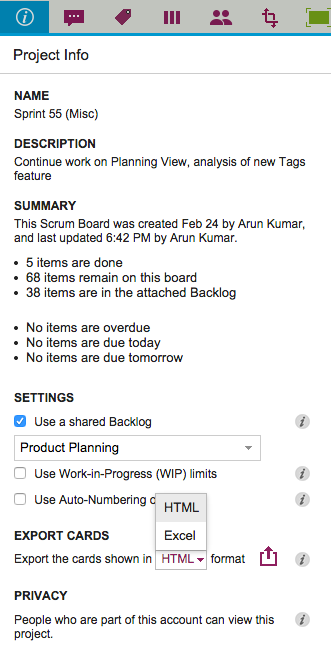
We used to have Export as HTML and Export as CSV as options for our Task Boards and Scrum Boards, and with our latest version we are tweaking the Export as CSV to become Export as Excel instead.
There are a couple of reasons we did this:
We now include chat and document links in the export: this was done specifically to help our many government users who need to respond quickly to Freedom Of Information Act (FOIA) requests.
(See our separate post on how Kerika makes FOIA-compliance one-click easy.)
Everyone who uses the CSV export wants the data to end up in an Excel file anyway, so why not put it in that format to start with? (After all, it’s easy to go the other way as well, from Excel to CSV…)
We are delighted to introduce Planning Views, a very innovative, very unique way to view your Kerika Task Boards and Scrum Boards! (Yes, it goes way beyond what simple calendar views, like those you might get from other tools, work :-))
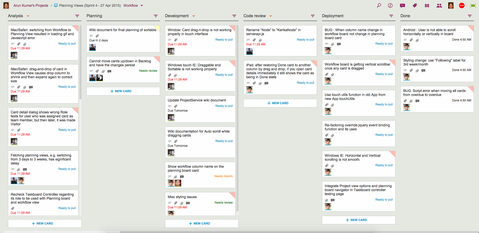
Let’s start with your familiar view of a Kerika Task Board or Scrum Board, which we will start calling the Workflow View from now on:
Example of Workflow View
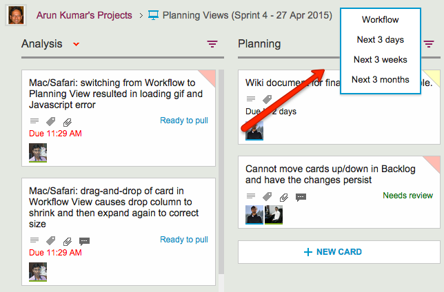
There’s now a simple drop-down that appears on the breadcrumbs, letting you switch to one of the Planning Views:
Selecting a View
Your new viewing choices include:
Next 3 days: this will show you everything that’s Due Today, Due Tomorrow, Due the Day After, and beyond
Next 3 weeks: everything that’s Due This Week, Due Next Week, Due the Following Week, and beyond.
Next 3 Months: everything that’s Due This Month, Due Next Month, Due the Following Month, and beyond.
Planning Views provide a date-oriented view of your Task Boards and Scrum Boards: a Planning View takes your cards and rearranges into time-oriented columns.
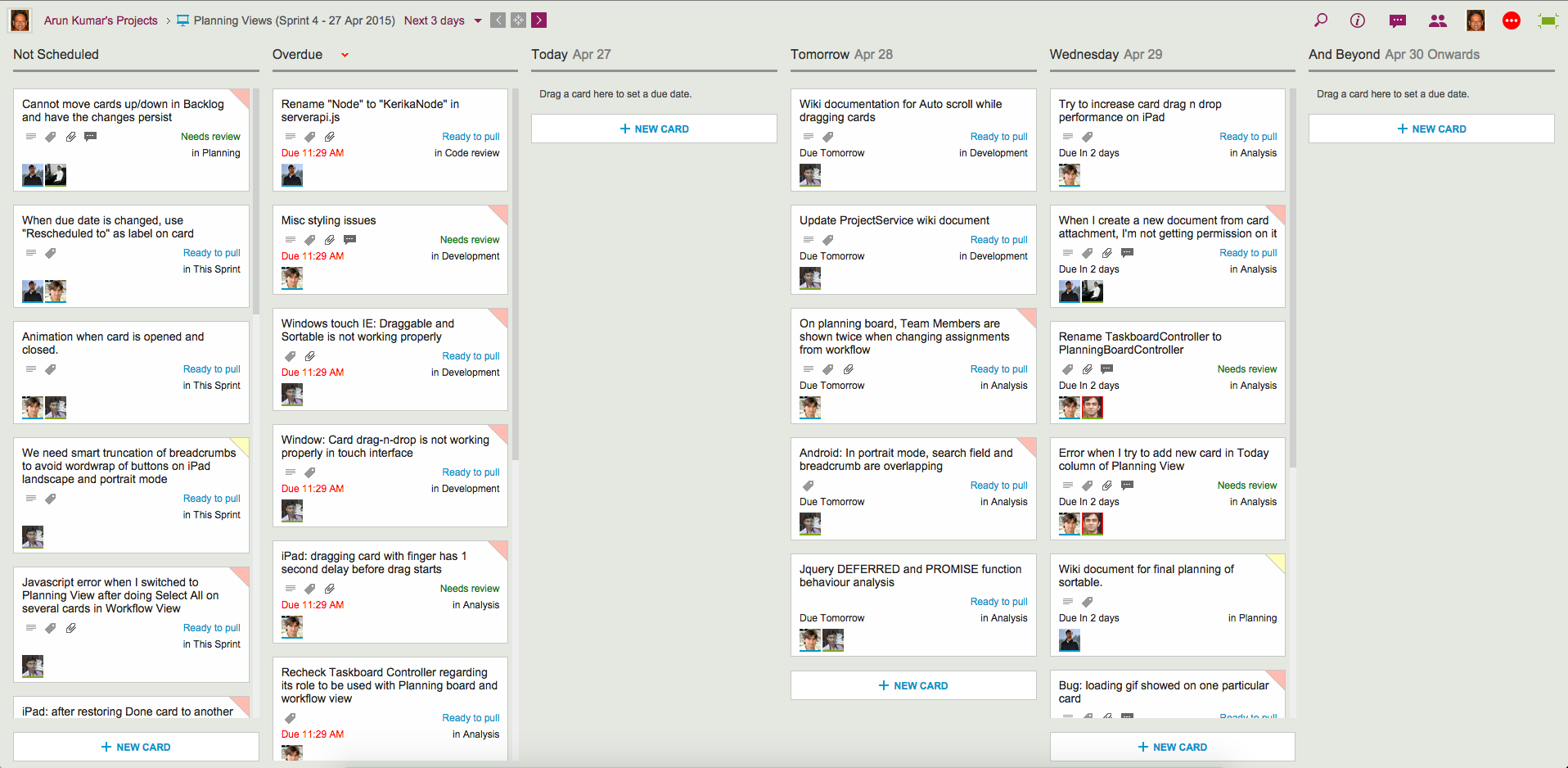
Here’s an example of a Next 3 days view:
Example of 3-day View
Our Workflow view got neatly (and quickly!) pivoted to arrange all the cards in terms of when they are due:
All cards without any due date are shown first, in the Not Scheduled column.
Next, any Overdue cards are always shown in a special column by themselves, so they can be easily rescheduled.
Beyond this are columns for Today, Tomorrow and the Day After.
And finally, there is the And Beyond column, which summarizes all the cards that have due dates beyond the day after tomorrow.
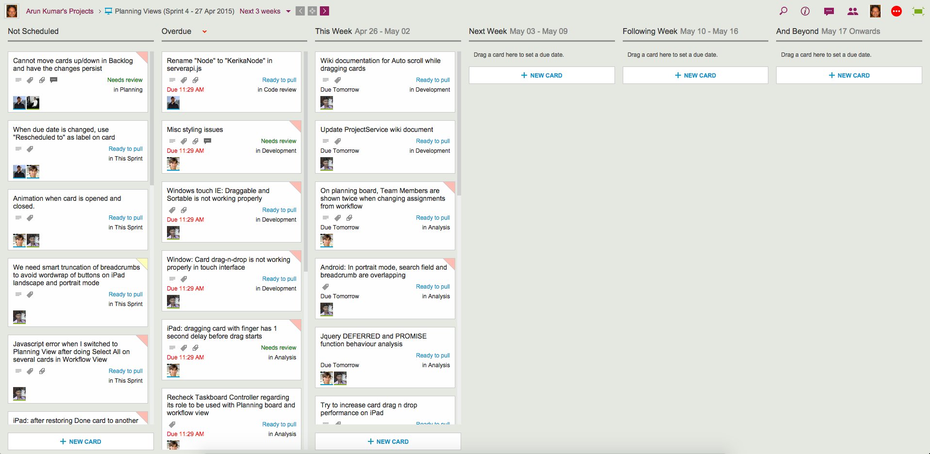
Here’s the same board, but viewed in terms of the Next 3 weeks:
Example of 3-week View
Switching between these views is super-fast, and these views update in real-time: if a due date for any card is changed by anyone on your project team, no matter where they are located, this change is instantly reflected in your view.
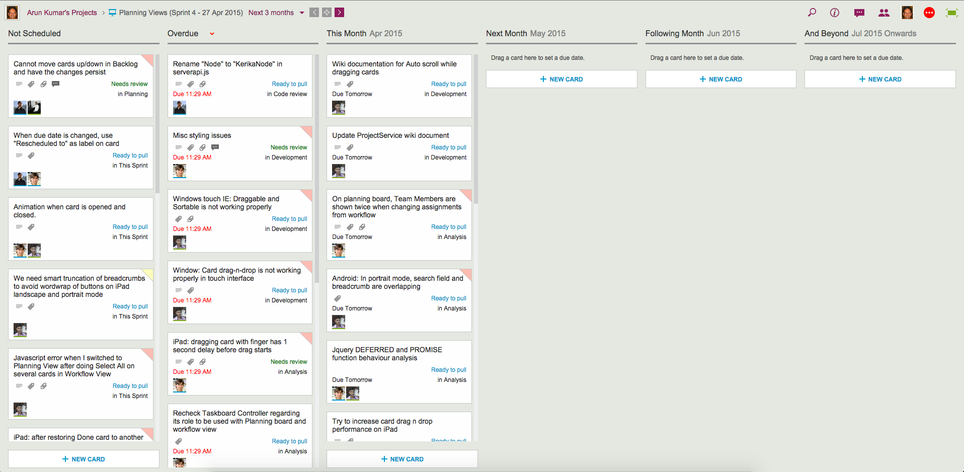
The Next 3-months view is an even higher-level view of the board:
Example of 3-month View
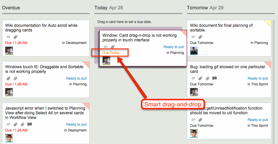
All these views support smart drag-and-drop of cards: if you drag a card across, or up/down a column, the Due Date is automatically changed to reflect the new date. As you move the card, the new date is shown in orange so you know exactly what will happen next:
Smart drag and drop
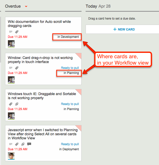
Since your Planning Views aggregate cards that may be in different columns on your Workflow View, we made it really easy for you to see at a glance where each card is in terms of your workflow:
Where cards are in your Workflow view
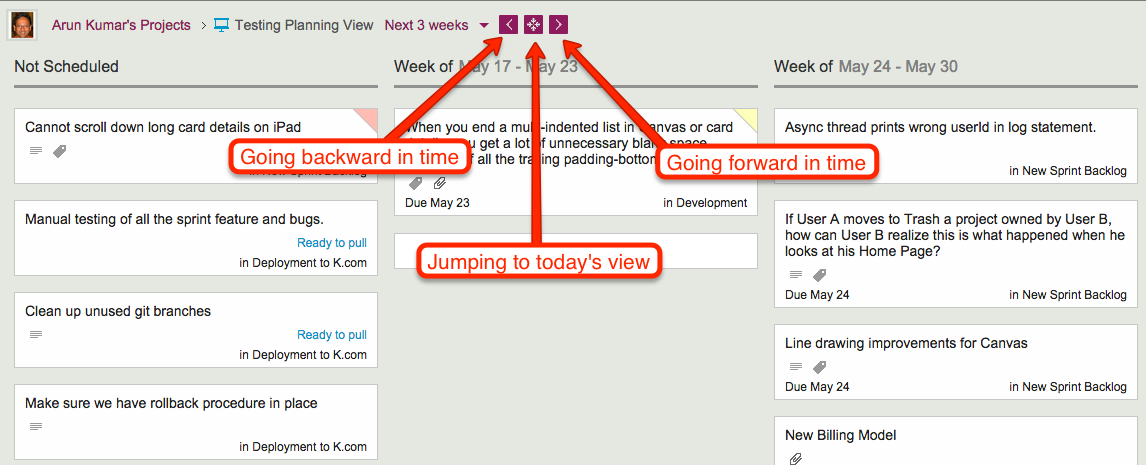
Navigating forward and backward in time is also easy, as is jumping to “today’s view” if you have navigated too far into the future:
Navigating the Planning Views
As you navigate forwards or backwards, the “And Beyond” column magically adjusts to show you just what’s out of your current view!
Planning Views work just as well with Task Boards (if you are using Kanban) and Scrum Boards (if you are using Agile).
Check out Planning Views — it’s exactly the kind of great design and innovation that you have come to expect from Kerika…
We are often asked how the Kerika team itself uses Kerika, and we freely share this through demos we have done in person for potential customers and at various events. For those who we haven’t met in person, here’s a blog post instead..
1. Kerika runs on Kerika.
Pretty much everything we do, from the smallest, tangential effort to our main product development is done using the Kerika software.
(It shouldn’t surprise you to hear that, given that we are a distributed team ourselves — spread out between Seattle and India.)
2. No email, limited phone calls
In fact, we gave up using internal email back in Dec 2013. (Email sucks, and Kerika is the smarter alternative to spam.)
Because our team is spread out over 10,000 miles, we do occasional phone calls, using Skype or Google Hangouts, to discuss product strategy, but we don’t have daily phone calls as a matter of routine.
We have a phone call only when there is something substantial to discuss, never to catch up on routine status. In other words, all our phone conferences are about interesting topics, like “What do you think about this idea…?” or “I met a customer today who brought up this problem…”; never about “Where are you with Task X?”.
Kerika keeps us in perfect sync across these 10,000 miles on all matters of routine status and project management, so our phone calls are all strategic in nature.
3. Scrum for Product Development
We work with a 2-week Sprint Cycle for the most part, although we have occasionally deviated from this — never with great results, so sticking to the cycle is usually a good idea!
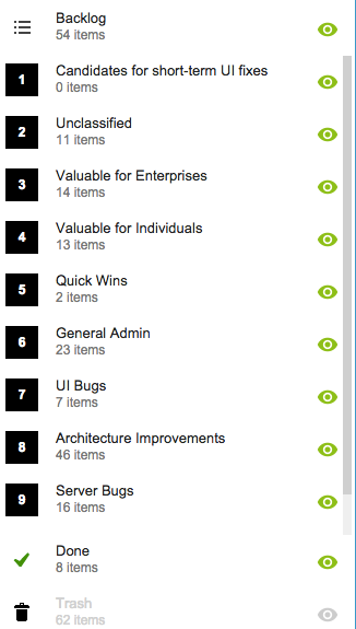
We capture all of our product ideas and feature requests in one large Scrum Board, which we call, simply, Product Planning.
This board organizes our ideas into various buckets, like Valuable for Enterprises and Valuable for Individuals:
Product Planning buckets
You might notice that the Backlog column is relatively small: only 54 items. That’s because not everything in the other buckets is ready to go into the Backlog, either because a feature isn’t well defined enough, or it isn’t considered important enough to deal with in the short-term.
(We have a lot of ideas that sit and gestate for months, even years!)
It’s also worth noting that the Trash contains 62 items: this means we reject as many ideas as we pursue!
4. A Shared Backlog
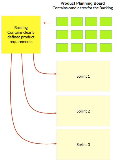
As ideas for various features get prioritized — and, more importantly, defined clearly enough to be analyzed in detail by our developers — they get moved to the Backlog.
This backlog is shared by all the individual product development Scrum Boards:
Product Planning process
(And, by the way, the screenshot above is from a Kerika Whiteboard that we use to map out our product planning process.)
Each Sprint is organized as a separate Scrum Board, pulling items from the common Backlog.
As items get done (or not, as the case may be), the Backlog slowly shrinks over time.
But, as ideas for new features gets firmed up on the Product Planning board, this keeps feeding more stuff into the Backlog. So, the net result is that our Backlog has remained the same size for years: about 50-60 items.
We have been doing this for a while now, and are currently wrapping up Sprint 55, with each Sprint taking at least 2 weeks, and several taking 1 month to complete.
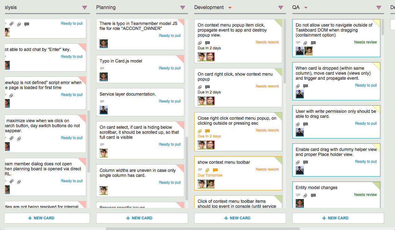
Here’s an example of one of our Scrum Boards:
Scrum Board
5. Kerika’s Smart Notifications
So, if we are a distributed team that doesn’t use email, and not that much phone either, how do we keep up with what’s happening? The answer is: Kerika’s smart notifications help each of us easily keep track of changes taking place across literally hundreds of cards each day.
Here’s an example:
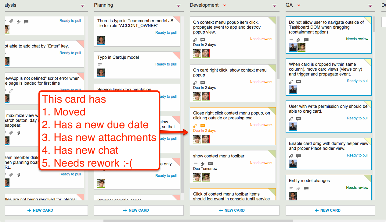
Smart notifications
At a glance we can tell that this card has
Moved
Has a new due date
Has new attachments
Has new (unread) chat messages
And, unfortunately, needs rework :-(
These smart notifications replace dumb email with a much more efficient mechanism for keeping everyone on the same page.
6. The Development Process
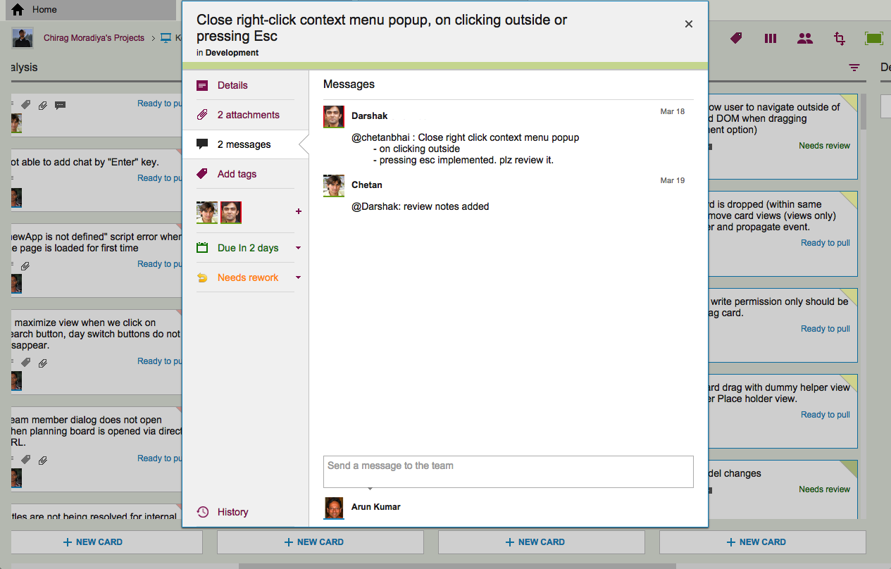
If we open up one of these cards, we can get a glimpse of the Kerika development process. Let’s start with the chat thread on this card:
Example of new chat
This chat shows a typical interaction between a junior developer and a technical lead: after writing the code for a particular feature, the developer has passed it on to the tech lead for code review.
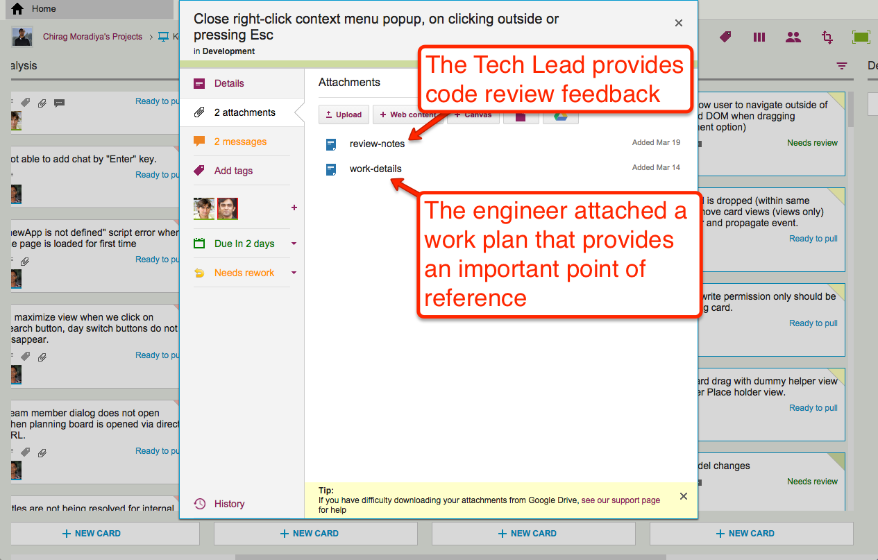
The code review itself is attached to the card, as an attachment:
Adding code review to a card
For each feature we develop, our engineers create a small work plan that outlines their design thinking.
This design/work plan is a critical artifact for good software development: it ensures that people can review the work more easily and effectively, and it also provides a reference for the future — if ever a bug is found in this particular feature, we can go back to the work plan to see where the design flaw may have originated.
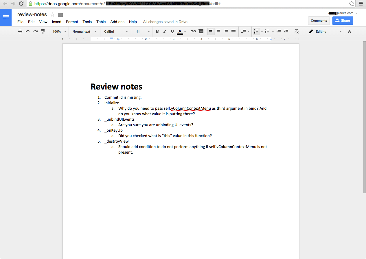
The code review is typically very short, and attached (in this case) as a Google Doc:
Example of code review
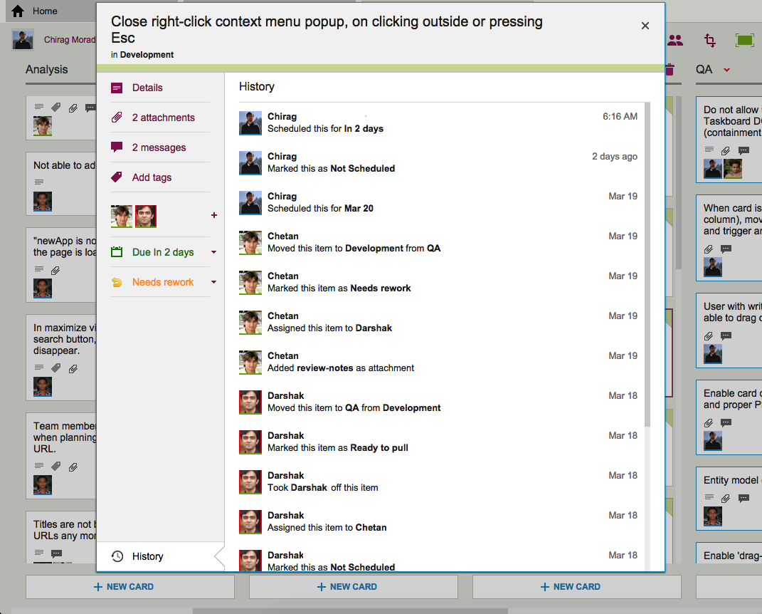
7. Card History
Each card in Kerika keeps track of its own history, which makes it easy for a distributed team to keep track of everything that happened. Frequently, a number of changes may have taken place on a single card during a workday, and someone who is 10,000 miles away is also about 13 hours away in terms of timezones, so the history feature is useful for understanding all the changes that took place when you weren’t looking.
History of the work
So, that’s a typical card, on a typical board. And, in a typical 2-week Sprint Cycle, our development team handles 175-200 cards!
We love Kerika, not just because we have built it, but because it makes our distributed team so very effective!
And who are the “right people”? Well, anyone who is assigned to that card will get the chat sent as email, and Project Leaders can optionally get chat pushed to them as email as well. Everyone else can catch up with the chat when they visit their board.
When chat messages get pushed to you as email, you can reply to them just like regular email (all you need to do is a simply “Reply”, not a “Reply All”).
But, don’t go crazy with emoticons! Most smileys work OK, but not every emoticon will get encoded correctly (using UTF-8).
So, it’s natural to be happy when you are using Kerika, and it’s OK to smile while you work, but don’t use too many strange emoticons in your email replies!
Right now, the Kerika user interface is entirely in English, but we have users worldwide and many of them use Kerika with other languages, e.g. Greek, Japanese, Korean, etc.
When you export data from a Task Board or Scrum Board that includes non-English characters, the foreign characters are actually preserved correctly as part of the exported data, but if you need to then import data into some other program, like Microsoft Word or Excel, you need to make sure the other program correctly correctly interprets the text as being in UTF-8 format.
WHY UTF-8?
UTF-8 is a coding standard that can handle all possible characters, so it works with languages like Greek, Japanese, etc. which don’t use the Roman alphabet.
For a long time now, UTF-8 has been the only global standard that works across all languages, because of its inherent flexibility in handling different character sets.
When you do an export of data from a Kerika Task Board or Scrum Board, we create the CSV files in UTF-8 format, and include what’s called the Byte Order Mark (BOM) in the first octect of the exported file.
Including a BOM is the best way to let all kinds of third-party programs know that the file is encoding in UTF-8: it’s a standard way of saying to other programs, “Hey, guys! This text may contain non-English characters.”
And for the most part, including a BOM works just fine with CSV exports from Kerika: Google Spreadsheets interprets that correctly, Microsoft Excel on Windows interprets that correctly, but not…
EXCEL ON MACS
Many version of Excel for Macs, going back to Office 2007 at least, have a bug that doesn’t correctly process the BOM character. Why this bug persisted for so long is a mystery, but there we are…
The effect of this bug is that an exported file from Kerika, containing non-English characters, will not display correctly inside Excel on Mac, although it will display correctly with other Mac programs, like the simple Text Edit.
There’s not much we can do about this bug, unfortunately.
THE TECHNICAL BACKGROUND TO ALL THIS:
BOMs are used signify what’s called the “endianess” of the file.
Endianess is a really ancient concept: in fact, most software developers who learned programming in the last couple of decades have no idea what this is about. You can learn about endianess from Wikipedia; the short summary is that when 8-bit bytes are combined to make words, e.g. for 32-bit or 64-bit microprocessors, different manufacturers had adopted one of two conventions for organizing these bytes.
For Big-Endian systems the most significant byte was in the smallest address space, for Little-Endian systems the most significant byte was in the largest address space.
(If you have a number like 12345, for example, the “1” is the most significant digit and the “5” is the least significant. In a Big-Endian system this would be stored as “1 2 3 4 5”; in a Little-Endian system it would be stored as “5 4 3 2 1”. So, when you get presented with any number, you really need to know which of the two systems you are using, because the interpretation of the same digits would be wildly different.)
(About a dozen years ago Joel Spolsky, former PM for Excel, wrote a great article on the origins and use of BOM, for those who want to learn more about the technical details.)
Why this affects Kerika at all? Because when you do an export of cards from Kerika, the export job is run on a virtual machine running on Amazon Web Services.
We have no idea what kind of physical hardware is being used by AWS, and we are not supposed to care either: we shouldn’t have to worry about whether we are generating the CSV file using a little- or big-endian machine, and whether the user is going to open that file with a little- or big-endian machine.
That’s the whole point of using UTF-8 and a BOM: to make it possible for files to be more universally shared.
When you have expanded your view of a Kerika board to fill up the browser, using the “Max View” button on the top-right corner of the Kerika app
Max View button
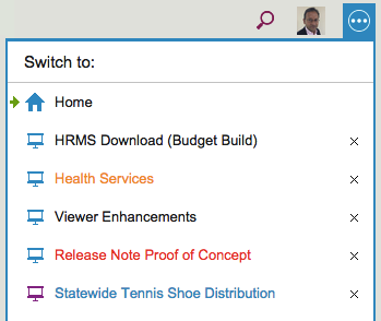
Another button appears on the top-right, to help you quickly switch between all your open project tabs, as well as get to your Home Page:
This button is color coded to help you understand, at a glance, what’s going on in all your open projects:
If any of your open projects has an overdue card, then the button appears in red.
If any of your open projects has updates that you haven’t seen yet, the button appears in orange.
If any of your open projects has new cards that you haven’t seen yet, the button appears in blue.
Clicking on the button shows a list of all your open projects, along with your Home Page:
Switching between tabs
The little green arrow (shown above at the top) points to the currently open tab, the one that you are viewing right now.
Projects have a blue icon; templates have a purple icon: in the example above, Statewide Tennis Shoe Distribution is a template, while all the others are projects.
Boards with unread updates have orange titles, like Health Services above.
Boards with overdue cards have red titles, like Release Note Proof of Concept above.
Boards with new (unseen) cards have blue titles, like Statewide Tennis Shoe Distribution above.
You can reorganize your list of open tabs by simply dragging them up or down this list.
(But, the Home Page is always on the top; that can’t be moved.)
You can also close an open project tab that you are no longer interested in by clicking on the “X” to the right edge of the entry.
So, there’s a simple visual consistency in Kerika’s design:
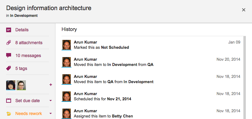
We are starting to realize that a card’s status, e.g. “Ready for Review,” “Needs rework,” etc. is pretty important not just in terms of what they show about a card’s current state, but also in terms of its history.
Previously, we weren’t tracking changes to a card’s status as part of the card’s history; without our latest release, that’s now a feature, so if you are wondering who put a card “On Hold”, you can just open the card’s History and Kerika will tell you:
Here’s a new feature we are adding: when you copy and paste an entire project from one account to another, you can decide whether to take the team as well.
Consider these two scenarios:
Alice makes a copy of a project that she owns and pastes it right back into her own account. (Why? Well, maybe she wanted to make a backup copy, or maybe the actual project was going to split into two parallel efforts and so copying-and-pasting the entire project makes sense.)
Bob makes a copy of a project that Alice owns, and pastes it in his own account. (Of course, to do this Bob would need to have access to Alice’s project in the first place.)
In the first scenario, the duplicated project is showing up in the same account as it was before, so Kerika assumes that the team should be copied as well: in other words, “Project A” and “Copy of Project A” will both have the same team, at least to start with although each version of the board may then change its project teams independently of each other.
In the second scenario, however, it’s a little more murky: did Bob just want to copy the cards and canvases of Alice’s project, or is he trying to actually set up the same project in his own account? It’s hard for Kerika to make a really good guess in this scenario, so the system asks you:
If Bob responds “Yes” to this question, his copy of Alice’s project will also come with all the team members who were originally working on Alice’s project.
Of course, this might mean that Bob is now adding some folks to his account team: people he hadn’t worked with before. These people are added automatically to Bob’s account team if he wants to take the team along with the project.
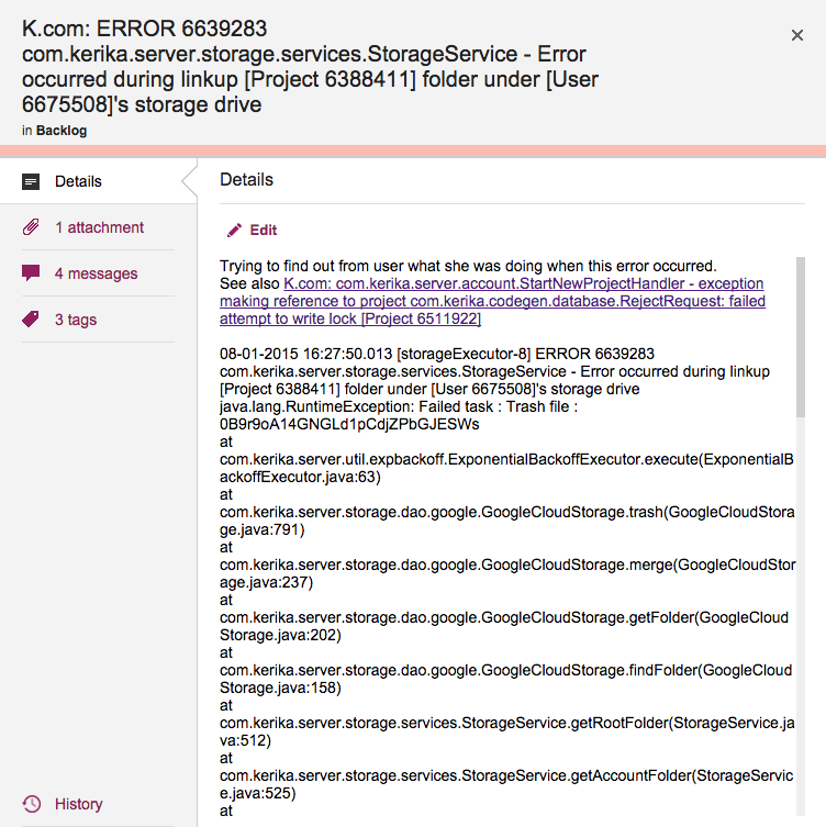
Cards shouldn’t really have very long titles, most of the time, since the details of the task are better described within the card itself, but sometimes having a really long card title is unavoidable.
This is a problem that we have encountered ourselves, for example when we want to track bugs: if our Java-based server software records an exception (error), we need to track at least the top-level of the stack trace that we get from the Java virtual machine that’s running the server software, and this can get pretty long because it includes a bunch of critical information like the time stamp, process ID, etc.
Cards with really long titles
Previously, Kerika’s UI wasn’t super-friendly when it came to long card titles: the entire card title would be displayed when you were viewing a Task Board or Scrum Board, but when you opened the card to view its details, the UI would only show the two lines of card title at a time.
(And this was by design: when we first designed Kerika, we really did think that 2 lines of text would be plenty for most people!)
With our latest release we have eased up on this: when you open a card, you can see the entire title, even if it is pretty long.
(Not that we want to encourage you to write really long cards!)
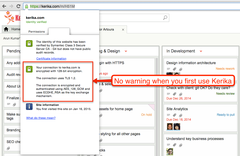
When you first use Kerika, your browser has a reassuring sign that your connection to our servers is being encrypted:
No warning when you first use Kerika
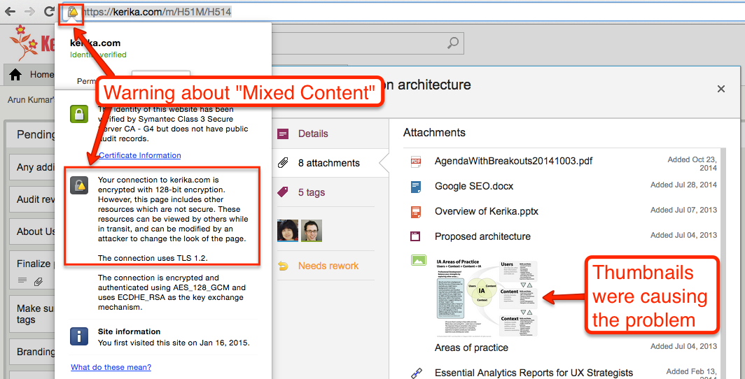
But as soon as you open a card that contains any attachments, e.g. files stored in your Box account if you are using Kerika+Box, this reassurance would disappear, and instead you would see a warning about “Mixed Content”, which basically means that some of the data shown on your Kerika page was coming from a source that wasn’t using HTTPS.
Why there is a mixed content warning
This was because of a small bug in how we were dealing with the thumbnails we got for files stored in your Google or Box account: for faster performance we were caching these on our own Amazon S3 cloud storage (so we wouldn’t have to keep getting them from Google/Box every time you open the same card.)
It turns out that we weren’t fetching the thumbnails from S3 using HTTPS, which meant that as soon as you switched to the Attachment view of a card, your browser’s address bar would show the “mixed content” warning.
There was no real vulnerability resulting from this, but it did interfere with the user experience for that minority of users who like to keep a sharp eye on their browser’s address bar so we have fixed that with our latest release.
Now you should always have the warm reassurance of seeing the green secure site symbol on your browser when you open a card!