Tag Archives: Trash

About the Trash (and Restore) function in Kerika.

What’s New and Updated: a new Kerika View

Views are unique to Kerika: no other work management system provides such an easy way to see what matters, across all the boards you are working on.

These Views make it easy for organizations to really scale up their use of Kerika across multiple projects and many ongoing projects at the same time.

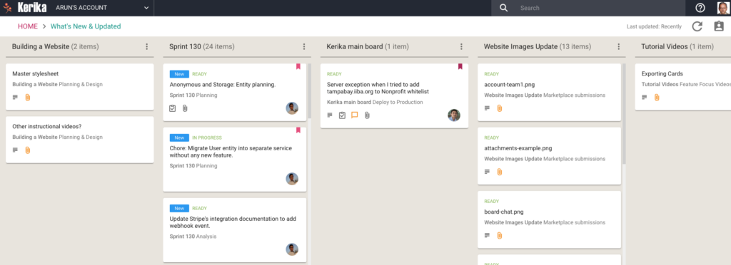
We have now added a very useful new View: What’s New and Updated.  As you might guess from the name, this View lets you catch up on everything that’s new and changed, across all the boards you are working on — as a Board Admin, Team Member or Visitor.
What's New and Updated
What’s New and Updated (click for a larger image)

This View can work very effectively as a Dashboard for managers who need to keep track of many different boards, all working at the same time: instead of constantly revisiting each board one-by-one, this View is a simple, comprehensive way to see everything that’s changing across all your boards.

The updates are shown in Kerika’s unique “heads-up” notification style: the blue New tags highlight cards that have been newly added to your boards (that you haven’t opened yet), and the orange highlights show you precisely what’s changed on your old cards.

The new and changed cards are sorted into columns, with each column containing all the new and changed items within a particular board.  The newest changes appear at the top of a column, and if a board has nothing new to report, the corresponding column is not shown (so your View doesn’t get cluttered up.)

(Cards that are moved to the Done or Trash columns on a board are not included in the View, to help avoid getting the View cluttered.)

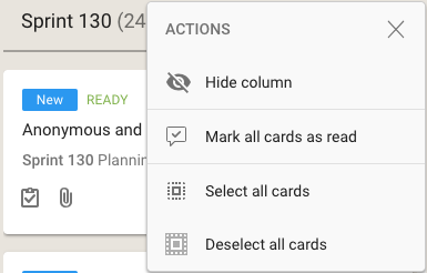
As with all Views, it’s easy to operate on all the cards within a column, by selecting the Column Actions button that appears on the top of each column:
View options
View options

The Mark All Cards As Read action is useful if you want to ignore everything that’s going on in a particular board, e.g. when you have just returned from a status meeting where you got fully briefed on what’s happening on a particular board.

Another way to temporarily ignore individual boards is to Hide Column: this collapses the column from the View, and let’s you focus more intently on the handful of boards you care most about.

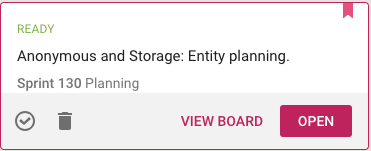
Selecting a card in this View lets you open the card within the View itself, or to open it on the board where the card actually sits:
View card
View card

(Sometimes it’s easy to deal with cards just by themselves; sometimes the View Board action is more helpful, if you want to be sure you understand the full context in which a card changed.)

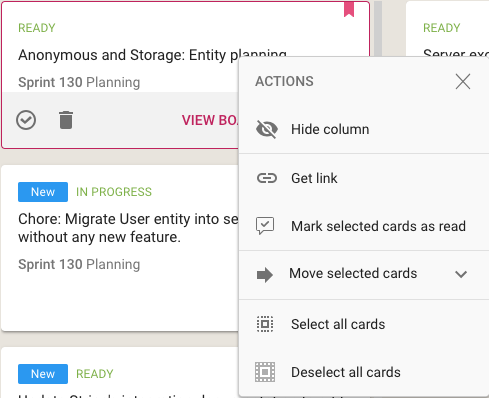
Using your mouse’s right-click action will also bring up a bunch of useful actions for that card:
Mouse actions
Mouse actions

In addition to all the other actions you can perform on cards, you also have the option to get the URL (address) of card using the Get Link action.  Every cards, every canvas and every board in Kerika has a unique address, and using these URLs anywhere on a board, e.g. in the board’s details or chat, will automatically set up a link between the two cards.

When you mark a card as “read” on this View, it remains on the View until you click on the Refresh button (shown at the top-right corner of the View).

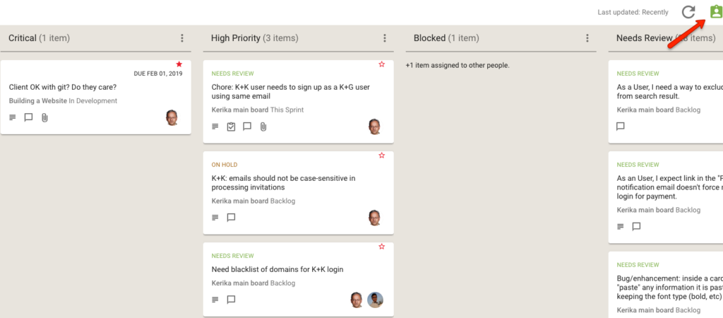
And, as with all Views in Kerika, the What’s New and Updated View includes the “For Me” toggle button on the top-right corner: clicking this will quickly filter the View to show you just those items that are personally assigned to you.
For Me toggle
For Me toggle (click for larger image)

This feature is available to all our users, just like every other feature in Kerika: it doesn’t matter whether you are still in your 30-day free trial, you are working on the free Individual Plan, or are benefiting from Kerika’s free Academic and Nonprofits Accounts. Everyone always get the same Kerika goodies 🙂

Some minor bug fixes

We did an update yesterday that included a bunch of minor bug fixes and usability tweaks. (It also included a ton of behind-the-scenes improvements to our architecture and product development processes, but if we did our job well you shouldn’t see any of that change…)

  1. When the Kerika server is being updated (to a newer version), your browser will no longer keep trying to reconnect while this is underway.

    We have some code in place to help fix broken network connections: if your browser can detect that it’s connection to the Kerika server is broken for any reason (usually a network error), the browser will automatically attempt to reconnect.

    This doesn’t make sense if the server is down for planned maintenance.
  2. If you are working in multiple accounts and you decide to switch between them, we offer your choices in a more logical way: all the account owners you are connected to are listed alphabetically, and then each account owned is listed alphabetically.

    Our previous display was kind of random making it hard to scroll through a long list of accounts. This affected only a very small number of users who were working on many different accounts, but still…
  3. Now that we are encouraging our customers to converge around service accounts, we are trying to make sure these service accounts don’t get too crowded from the perspective of any single user.

    We have always had the ability to “favorite” some boards (and templates) so you can have your own personal, curated list of boards that you care about — and so you can ignore the rest — but now we have made it easier for Board Admins to move their boards to the trash or archive (or to restore them later) so they can help keep the commonly-shared service account in a more useful and relevant state for all the users within that account.
  4. A really small thing, but we decided to change the Sort by Status feature on our Task Boards and Scrum Boards so that On Hold cards appear at the bottom of the column, below all the others.
  5. Bug fix: if you changed the name of a board using the Board Settings dialog (assuming you are one of the Board Admins), the new name is now reflected immediately in the breadcrumbs.
  6. If someone who is currently a Team Member on your Task Board or Scrum Board is made a Visitor, he/she will not be removed from the current card assignments.  This makes it easier to change your mind if you decide you want that person to be a Team Member after all: just change this person’s role in the Board Team dialog, back to Team Member, and all the old card assignments will be there.


Views across all your boards

At long last, we have built Views — one of the most commonly requested features, and something that we had been obsessively designing and redesigning over years, trying to figure out the best way to handle this need.

We have done it now. Views has been built, and is automatically available across all your Task Boards and Scrum Boards, whether they are owned by you or shared with you.

We are starting off with four standard Views, and we will built more in the future, and add a way for you to build your own Views as well.

The Views we have built are:

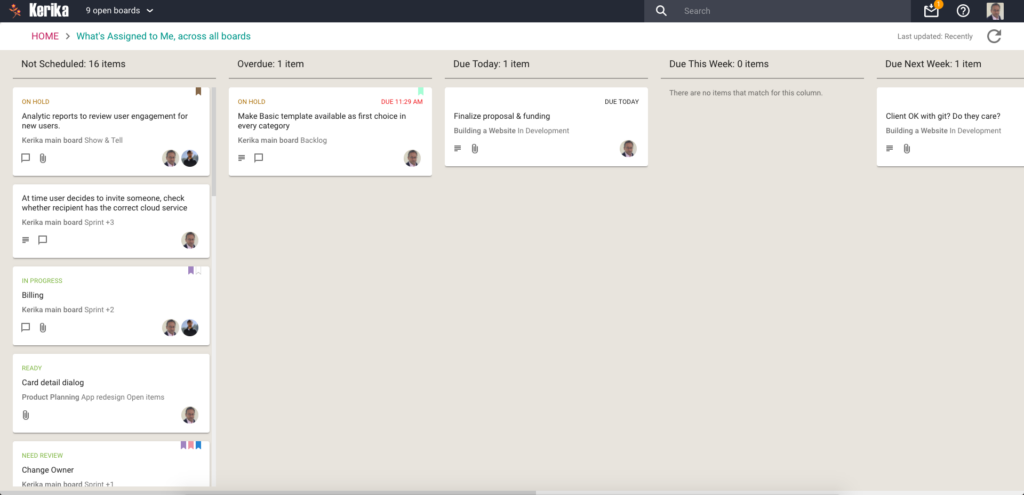
What’s Assigned To Me

The most commonly asked for feature by people who are working on several projects — and, hence, several boards — at the same time.  This is what it looks like:

What's Assigned To Me
What’s Assigned To Me

Everything that’s currently assigned to, on all boards except for those that are in the Trash or Archive, are collected for you into a single View, where cards are organized as follows:

  • Not Scheduled
  • Overdue
  • Due Today
  • Due This Week (excluding what’s already included in Due Today)
  • Due Next Week
  • Due This Month (excluding what’s already included in Due Today and Due This Week)
  • Due This Quarter
  • Due Next Quarter

It is a comprehensive summary of everything you need to get done, and it will be invaluable for managers and anyone else who has to work on multiple projects at the same time.

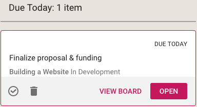
If you select a card in a View, like this

Selecting card from a View

You get quick access to key actions:

  • Move to Done
  • Move to Trash
  • View Board
  • Open

Open opens the card right there, inside the View itself.  View Board, on the other hand, opens the card in the board in which it is located.

Both are useful, depending upon the card and what you want to do: in some cases you just need to update a particular card — e.g. reschedule it, add a comment or file — and opening the card in the View itself, which is very fast, is enough.

In other situations you might want to be sure you are understanding the context of the card, and it is better to see where it is on the board that contains it.  This can be helpful for cards that you are not quite sure about.

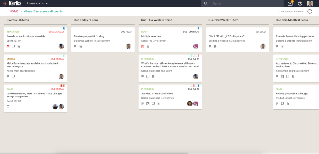
What’s Due

This View will be particularly helpful to managers (Board Admins): it summarizes everything that’s due, on all boards where you are one of the Board Admins:

What's Due
What’s Due

This basically brings to life everything that you can also (optionally) get in your 6AM Task Summary email.

Cards are organized for you as follows:

  • Overdue
  • Due Today
  • Due This Week (excluding what’s already shown as Due Today)
  • Due Next Week
  • Due This Month
  • Due Next Month

For this View, as with the What’s Assigned to Me View, we try to be smart about not showing duplicate cards: if something is due today, for example, it will show up in the Due Today column, but not get duplicated in the Due This Week or Due This Month column.

This makes it easier for you to plan your schedule: you can see what needs to get right away, and what needs to get done later.

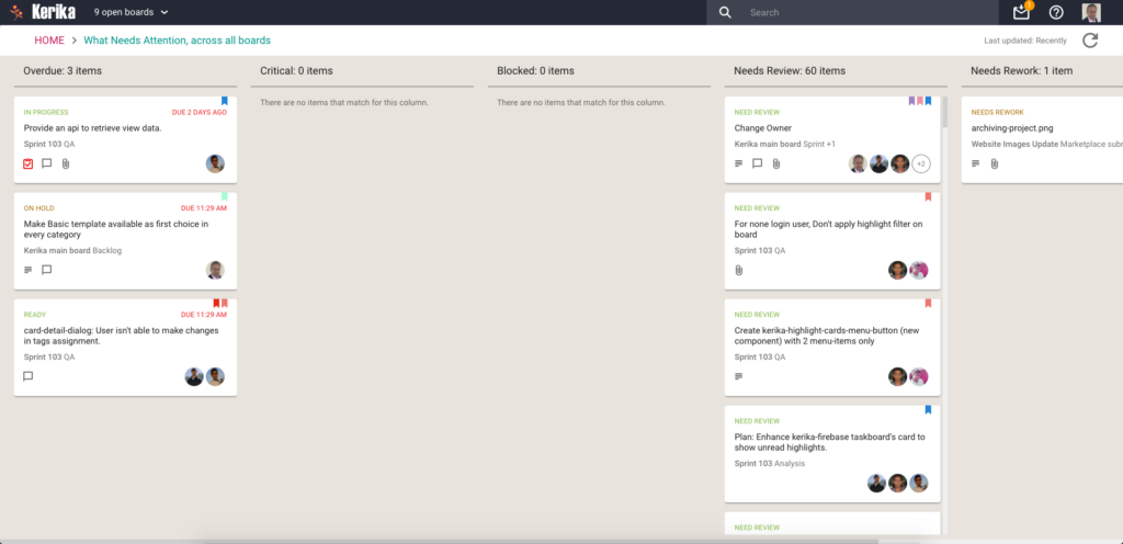
What Needs Attention

Again, a View that will be of particular interest to managers concerned with several ongoing boards:

What Needs Attention

Here, Kerika tries to show everything that needs a little extra attention: things that are

  • Overdue
  • Flagged as Critical
  • Flagged as Blocked
  • Flagged as Needs Review
  • Flagged as Needs Rework
  • Flagged as being On Hold

These items typically represent your risk profile across all your boards, and Kerika brings it all together in a single View.

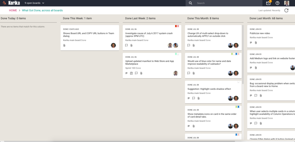
What Got Done

Great for anyone who needs to produce a status report, or any manager who needs to monitor progress across many different projects:

What Got Done
What Got Done

Across all boards where you are a Board Admin, this View summarizes

  • What got done Today
  • What got done This Week (excluding items shown in This Week)
  • What got done Last Week
  • What got done This Month (again, excluding items shown for Today and This Week)
  • What got done Last Month
  • What got done This Quarter

Accessing Views:

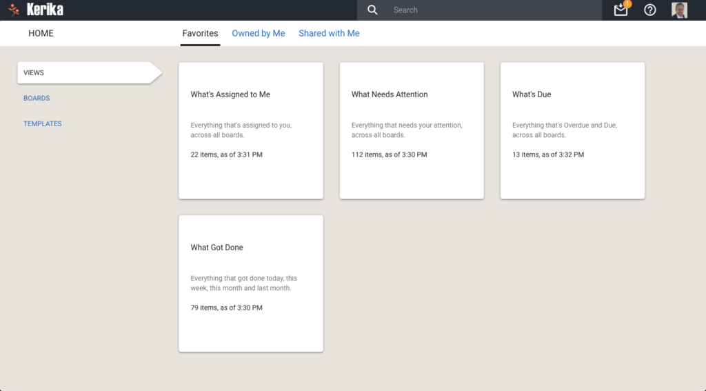
All your Views can be accessed from a new tab called Views (naturally) on your Home Page:

All your Views
All your Views

On each View card, Kerika shows how many items are included in that View, and as of when.  The Views are automatically refreshed when you open them, but in-between they are not updated because we do not expect the information shown to change on a second-by-second basis.

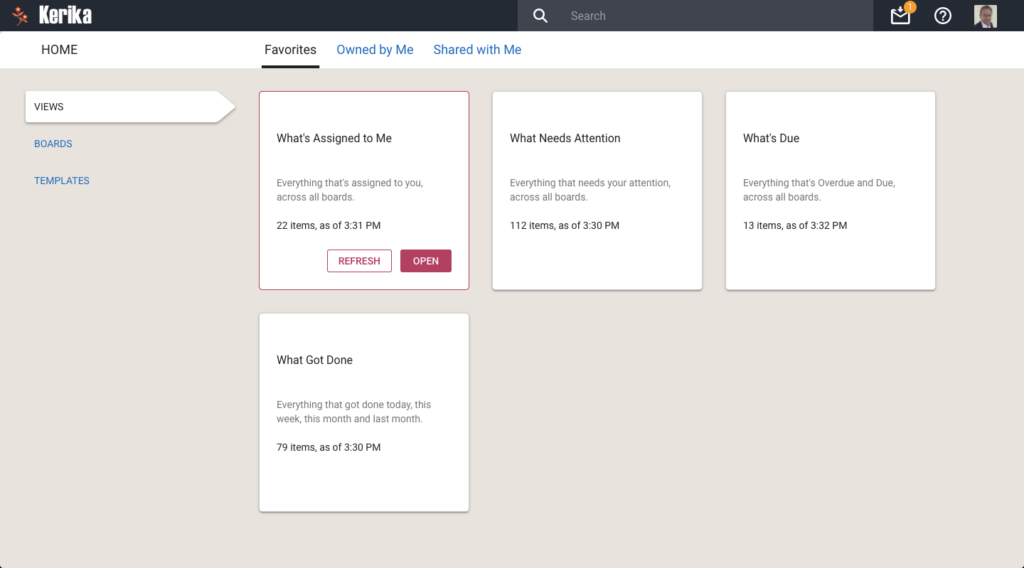
If you are worried that your View is out of date, you can update it by selecting it on your Home Page:

Refreshing a View
Refreshing a View

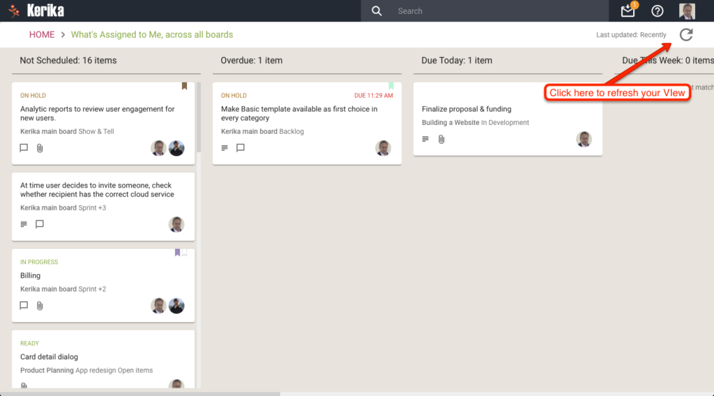
You can also update any View that you currently have open, by clicking on the Refresh button shown on the top-right of the View:

Refreshing a View
Refreshing a View

We will let you go crazy with these Views, for now. In the future we will add more (we already have some ideas on that front, but would love to hear from you as well!) and also add a Custom View capability.

Meanwhile, enjoy.

Column Actions: a simpler way for Board Admins to customize Task Boards and Scrum Boards

We have added a new feature to our Kerika Task Boards and Scrum Boards, to make it easier for Board Admins to customize the layout of their boards (i.e. to customize the workflow of their projects).

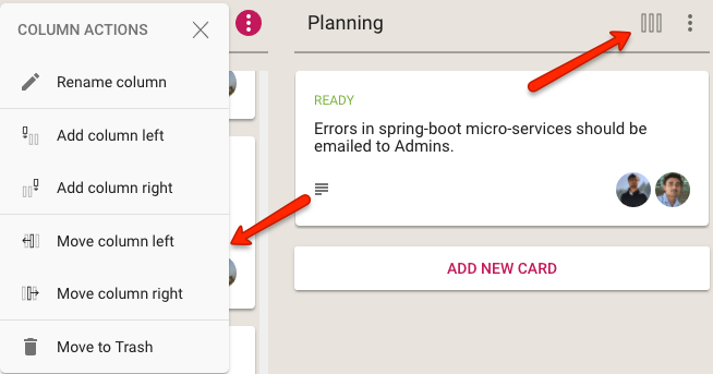
This Column Actions menu appears the top of each column, as shown below:

Column Actions menu
Column Actions menu

When clicked, the button shows the following actions that can be performed on the column:

  • Rename the column
  • Add a new column, to the left
  • Add a new column, to the right
  • Move the column one position over to the left
  • Move the column one position over to the right
  • Delete the column, which means move all its contents to the Trash

This new button and menu makes it easy to access the most common actions that Board Admins need to organize their project’s workflow.

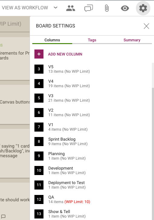
The Board Settings dialog will continue to support this feature, as well as handle more advanced scenarios such as boards that use Work-In-Progress limits on columns:

Column Operations
Column Operations

Note: only Board Admins can customize the columns on a board; not Team Members or Visitors.

Trying to be less obscure: why we show the Trash column now

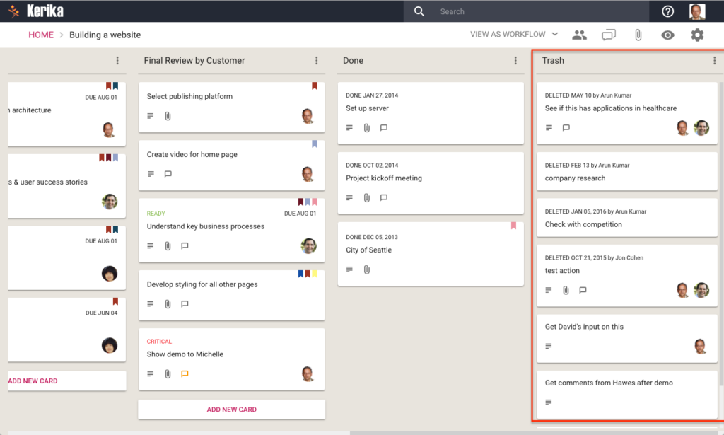
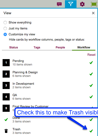
With our latest release we have made a change to all Task Boards and Scrum Boards: the Trash column will now show automatically if it contains anything:

Showing the Trash column

We made this change because the old design was too subtle: most of our users never even discovered the Trash feature, which was a really pity.

Now, the Trash column will automatically display whenever it has anything in it.  We are using lazy loading for the Trash, so performance is not affected for people who have very large Trashes. (Some people, who have been using the same board for years, have hundreds or even thousands of items in their Trash.)

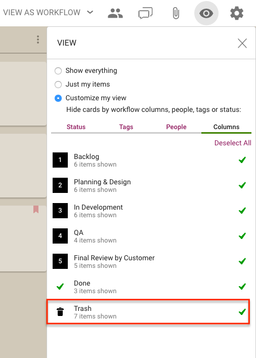
If you don’t want to see the Trash, you can hide it using the Filter button that appears on the top right of each board:

Hiding Trash
Hiding Trash


Bug, fixed: now the Board Summary excludes cards in Trash

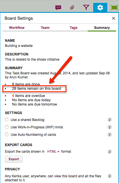
Thanks to one of our users from Washington State’s Administrative Office of the Courts for pointing this out: it turned out that the count of “remaining” cards in the Board Summary was including items that were in the Trash, which was misleading.

This has now been fixed: the count shown in the Board Summary gives you a better idea of what work remains.

To access the Board Summary on any Task Board or Scrum Board, click on the Board Summary button shown on the top-right of the Kerika app:

Board Settings is highlighted

Clicking on this button will show a summary of the board, like in this example:

Remaining work
Remaining work

In the example above, the count of “28 items remain” now properly excludes any items that are in the board’s Trash.

Easier to tell who moved a card to your board’s Trash

When a Team Member deletes a card, it just gets moved to the board’s Trash; it doesn’t get immediately deleted from Kerika’s database even though it disappears from your view right away.

That’s because the “delete” action in Kerika is really a “move to Trash” action: you are removing something from view, but not necessarily getting rid of it for good.

Any Team Member can delete a card, but only a Project Leader can completely and permanently get rid of it — in other words, “taking out the trash” is one of the privileges reserved for Project Leaders (and Account Owners).

The Trash column is normally not shown on your Task Board or Scrum Board, but you can bring it view easily by clicking on the Filter button:

Making Trash visible


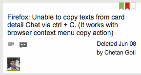
With our latest version, it’s easy to see who moved the card to the Trash: we show this right on the card itself.

Seeing who deleted a card

Deleting canvases attached to cards

You can attach as many canvases as you like to cards on Task Boards or Scrum Boards, and if you don’t need them anymore, you can delete the canvases.

Here’s how you add a canvas to a card:

Adding a canvas to a card

By default, the new canvas is simply called “Canvas”, but like with any other attachments on a card, you can easily rename it by clicking on the pencil icon that appears to the right when you hover your mouse over it:

Renaming a canvas
Renaming a canvas

Clicking on the “x” button at the far end will let you delete a canvas that you no longer need:

Deleting a canvas
Deleting a canvas

If the canvas is empty — which means that there is nothing visible on the canvas, and nothing in the canvas’ Trash either — you see a simple confirmation message asking if you are sure you want to delete it:

Deleting an empty canvas (confirmation)

But, if the canvas is not empty, you see a Restore option instead:

Restoring a deleted canvas

If it seems puzzling why a canvas that appears empty isn’t really empty, make sure you open the canvas and take a look at the Trash: there may be items there that you had previously removed from the canvas:

A canvas that looks empty but isn't
A canvas that looks empty but isn’t

In this example, above, the canvas looks empty but isn’t really: there are items in the Trash.

In situations like this, Kerika is careful to avoid losing all your work: until you empty the Trash on a canvas, the canvas isn’t considered to be truly empty, and until a canvas is truly empty, it cannot be removed from a card.

So, in this example, you see the Restore option rather than the Delete option:

Restoring a deleted canvas