Tag Archives: Usability

About software usability in general.

We made it easier to sync your Kerika Due Dates with your Calendar

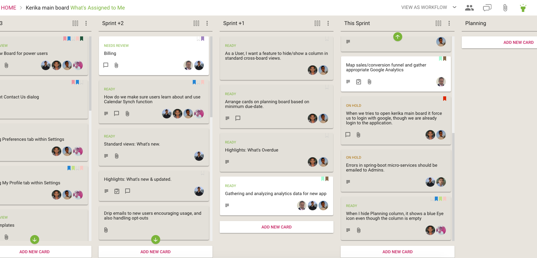
We made some user interface tweaks to make sure people are aware of a really great feature in Kerika that’s existed for a while, but was buried in a Preferences screen that not everyone paid attention to: you can have your Kerika Due Dates automatically show up on your Google, Microsoft or Apple Calendar.

Well, that’s buried no more: we have added a Calendar Synch button in a more prominent place on the top-right of the Kerika app:

Calendar button
Calendar button

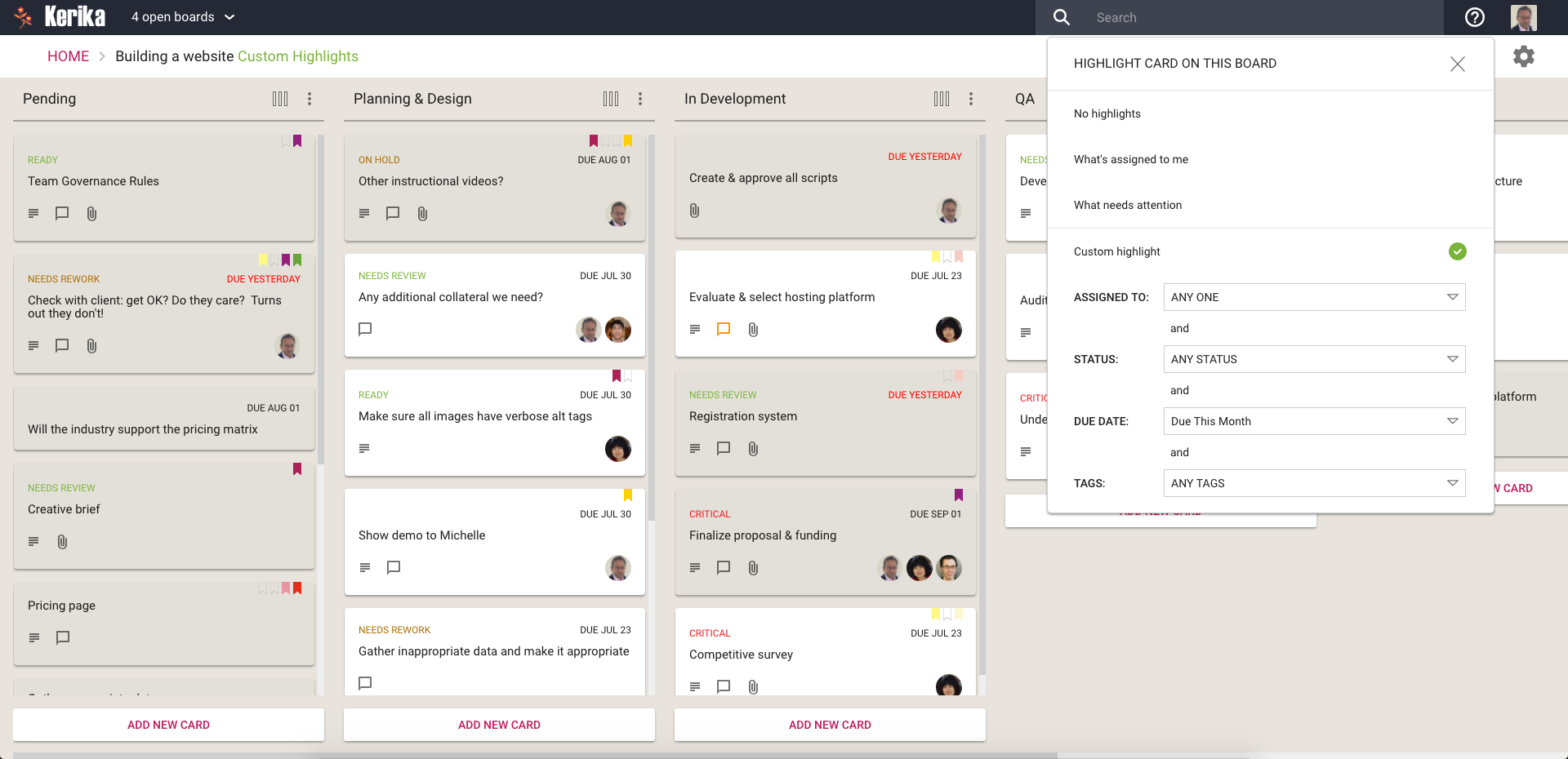
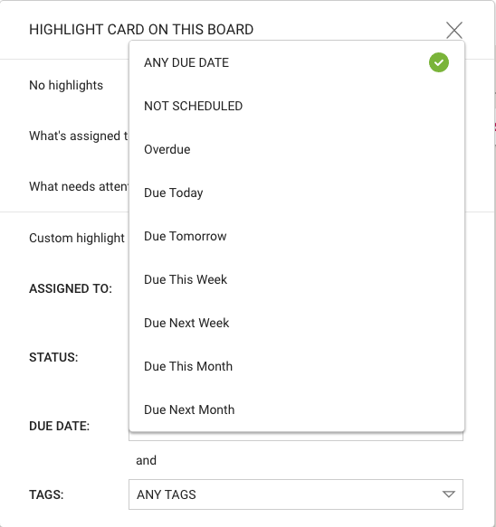
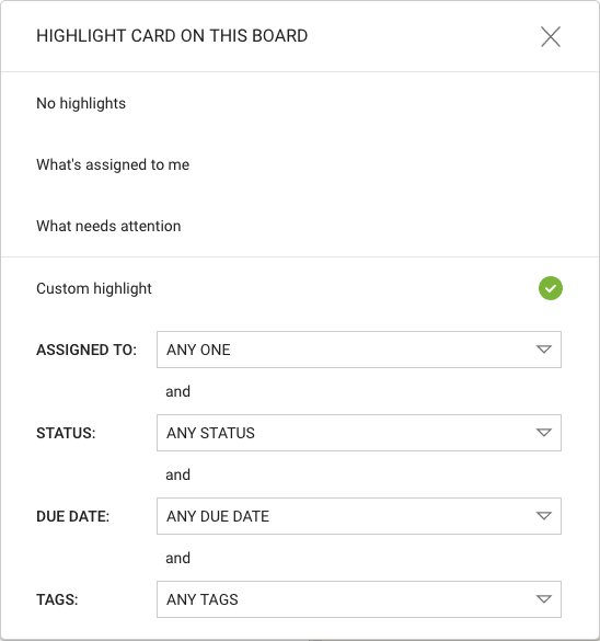
Clicking on this button will let you choose the type of calendar you want to synch with:

Calendar choices
Calendar choices

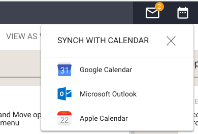
(Hint: you can have your Kerika Due Dates synch with more than one calendar, if you like.)

Pick your favorite calendar type, and you will see detailed instructions on how to set up syncing of your Kerika Due Dates. Here’s an example of syncing with Apple Calendars:

Calendar instructions

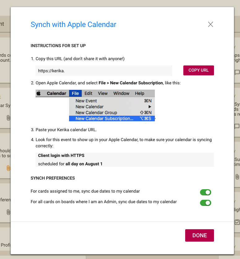
The URL is personal, and should be kept confidential. (That’s why we aren’t showing it in the illustration above.)

The URL is long and random so it will be impossible for others to guess, but it’s not a good idea to share it with others unless you really want them to know all your Kerika Due Dates, e.g. if you have an assistant or delegate that helps manage your daily schedule.


We aren’t going to support Highlights in the Planning Views (at least for now)

Most of the time, users are in what we call the Workflow View of their Task Boards and Scrum Boards:

Workflow View
Workflow View

It’s in the Workflow View that our new Highlights feature proves really useful:

Highlights in Workflow View

In the Planning Views, however, Highlights are not as important since we expect the Planning Views to be used primarily for quick scheduling:

Planning View
Planning View

(The Planning Views, by the way, are what we refer to as the views that Kerika provides over the next few days, next few weeks and next few months.)

Is this a good assumption on our part? If not, let us know and we will add Highlights to the Planning Views as well.

A bunch of bug fixes and usability improvements for Tasks

We have done a bunch of small bug fixes and usability tweaks to the Tasks feature we introduced a few weeks ago:

  • When a user’s last Task within a card is marked as Done, the user’s name is removed from the list of people shown as being assigned to that card. (Previously you had to do this cleanup manually.)
  • When a Task that was previously marked as Done is changed to be “undone” (open/remaining), the user who had previously been assigned to that Task is added back to the list of people shown assigned to the card.
  • Bug fix: If someone is assigned to a Task, and this person had previously completed a Done Task, this user wasn’t getting added automatically to the list of people shown on the card. This has been fixed.


Detecting if third-party cookies are disabled

If you have signed up directly with Kerika, we use the Box Platform to store your files for you — Box is a secure, reliable cloud service and we have been a partner with them for several years.

But we do all this for you: efficiently, quietly and behind the scenes.

Which means you may never notice (and, really, you shouldn’t have to…)

However, we found that some users automatically block third-party cookies (this is a browser setting available in all types of browsers).

This was causing problems for the preview function for these users: when a user clicks on a file attached to a card or canvas, that’s getting stored in Box by Kerika for that user, we use Box’s Preview function in the form of an IFRAME.

Using an IFRAME enables us to add some Kerika-specific features, like automatic version tracking, to the standard Box Preview function.

This, however, requires users to allow Box.com to set a cookie, and this can fail if the user has never permitted Box.com to set cookies, or is automatically blocking all third-party cookies in their browser: when you are using Kerika.com, Box.com is effectively a third-party to the connection.

We want to make sure people understand this can be a problem, so we have added some smarts to Kerika to detect when people who have signed up directly are blocking Box.com.

If this is the case, a pop-up dialog box will appear explaining why the Preview function won’t work correctly without allowing Box.com’s cookies to be stored in the browser.

Including Overdue Tasks in Due This Week

In the recently added Highlights feature, we let you create your own custom highlights:

Smart choices for Due Dates

We fixed a problem where “This Week”, “Next Week”, etc. wasn’t including Overdue Tasks and cards, which could give users a somewhat misleading impression of what they needed to get done in a particular week or month.


After all, if something is already overdue, you will need to get that done this week along with anything that’s scheduled for this week!

Bug, fixed: Custom Highlights were getting carried over from one board to another

We fixed a bug that was kind of annoying: if you had a Custom Highlight defined for one board, and then switched to another open board, the Custom Highlight was getting applied automatically to the second board as well.

This happened only if people used the Board Switcher button that appears on the top left of the Kerika app:

Board Switcher
Board Switcher

The Board Switcher keeps track of all your open boards and is a fast way to switch between them if you are working on several different projects at the same time — you don’t have to go back to the Home page to find your boards again and again.

Every of your open boards can have Highlights set, or not, as you like. This bug fix makes that a smoother process.

Tweaking the styling of Tasks inside Cards

We really like the Tasks feature that we introduced recently: this has significantly cut down on the number of cards that we have to track on boards, since many items can be easily captured, assigned and scheduled as tasks rather than independent tasks.

This means we have a better, epic-oriented view of our boards; we don’t get lost in the weeds.

However, the first implementation of the styling could do with some improvement, so that’s what we did:

Improved styling for tasks

This makes it easier to see the names of people assigned to cards, and the due dates, more easily.

By the way, it took a surprising amount of experimentation before we settled on these colors: in Kerika’s design every color is supposed to have a particular meaning, so that colors appear in a consistent context in every instance.

For example, if we use blue to indicate a clickable link — like we do on the card details left tab, to let you switch between Tasks, Attachments, Chat, etc. — we can’t use blue anywhere else where it wouldn’t be clickable.

So, if blue is clickable in one place, it must always be clickable everywhere else.

This is easy enough, but we also have rules about using colors consistently across actions or displays that seem related, again to minimize the learning effort needed by new users.

Our green is used for Highlights in a consistent way:

What's Assigned to Me
What’s Assigned to Me

The breadcrumbs includes the suffix “What’s Assigned to Me” in green, the Highlights button is green to indicate that it is in use, and a green button is used to indicate that items matching the highlight are out of view.

If we are rigorous about this, there is an internal consistency about the Kerika user experience that makes it easier to learn.  But it takes a lot of discipline.

So if consistency applies a bunch of constraints in our choice of colors, so do legibility and color-blindness: we have to be careful to avoid using color combinations like red and green that are difficult for some people to distinguish.   (About 8 percent of males, and 0.6 percent of females, are red-green color blind in some way or another, whether it is one color, a color combination, or another mutation.)

All of this means that it isn’t easy to pick a new color when we design!

What's Assigned to Me

Highlights, a better alternative to old-fashioned Filters

We have replaced the old Filters feature for our Task Boards and Scrum Boards with a new Highlights feature that we think is better in every way!

Click on the Flashlight icon on the top right corner of the Kerika app:

Highlights button
Highlights button

And you will see this menu of actions:

Highlight options
Highlight options

The default is No highlights. We have a couple of built-in highlights that we know you will find useful right away:

  • What’s assigned to me: very useful if you are working on a large board, or with a large team, and you focus on just what you need to get done.
  • What needs attention: this highlights all the cards on the board that we think need to pay attention too — items that are overdue, on hold, or flagged as needing review.

Here’s how the Highlights work:

What's Assigned to Me
What’s Assigned to Me

A shadow effect helps spotlight all the cards that match the highlight, making them literally pop out of the screen!

If you are working on a board with a lot of columns, there’s always a chance that something that is being highlighted is currently out of view — if, for example, it is near the bottom of a long column.

Kerika takes care of that as well: if a card that matches your highlight choice is currently out of view, a green button appears at the top or bottom, as needed, of each column to indicate that there are cards out of view that match your highlight.

Matched cards are below the scroll
When matched cards are below the scroll

The green arrow acts as more than just an indication that you need to scroll: it is also a button that will scroll the column to show you the next card that you need to see.

(Pretty cool, huh?)

We will be adding more smart highlights in the coming weeks, but in the meantime you can also create your own custom highlights:

Custom Highlights
Custom Highlights

A Custom Highlight can include any combination of people assigned to cards, status, due dates and tags.

For the due dates, we have offered several smart options that are a lot easier to use than standard date pickers:

Smart choices for Due Dates

These ways of specifying due dates — like “Due Next Week” or “Next Month” — make it even easier to set up a custom highlight.

Enjoy.

Expanding our use of Lazy Loading

Our introduction of lazy loading, as part of our recent redesign, was originally limited to just three columns: Backlog (for Scrum Boards), Done, and Trash.

We figured that these columns were most likely to be very long, and would therefore benefit the most from implementing lazy loading.

This worked well; so well, in fact, that we have expanded our use of lazy loading to work with all columns, across all Task Boards and Scrum Boards.

The practical effect of this should be to reduce the time needed by the browser to load large boards, for all users, on all kinds of computers.

Enjoy.