We have a new feature in Kerika: a simple way to add numbers to your cards, for both Task Boards and Scrum Boards.
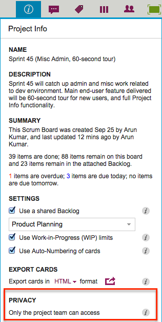
Project Leaders (and, of course, the Account Owner) can access this feature by clicking on the Project Info button, which appears on the top-right area of a Kerika board:
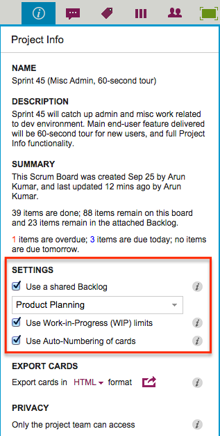
Auto-Numbering can be turned ON or OFF at any time.
It is a simple feature, intended primarily to help manage large numbers of cards on a single board, e.g. a Help Desk team using Kerika as a ticket management system.
In ticket management or asset tracking scenarios, the titles of many cards may be similar, e.g. “User has trouble logging in”.
A more useful way of distinguishing between cards might be through the card’s numbers, e.g. “104 User has trouble logging in” and “242 User has trouble logging in.”
When Auto-Numbering is turned ON, Kerika will automatically insert a number as a prefix to new cards that are added to that board.
- Numbers are sequential: for example, the first card would have “1” added as a prefix, the second card would have “2” added as a prefix, etc.
- Auto-Numbering can be stopped at any time, and then new cards added to the board won’t have numbers added to the card titles.
- Auto-Numbering can be resumed after a pause, the numbering will intelligently figure out how many cards are on the board by excluding the Backlog and the Trash, as well as looking at the last number used.
- The numbers are simple text, added as a prefix: they can be edited by any Team Member, and even removed.