(Thanks to our users in the Washington Professional Educator Standards Board for helping us find this bug.)
We recently discovered a rather quirky bug that was causing some chat, when replied to as emails by the recipient, to not get sent properly.
Here’s what is supposed to happen, and what went wrong:
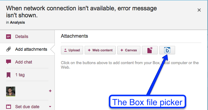
- If you are assigned a card, on a Task Board or Scrum Board, you will get email pushed to you whenever any other Team Member (or Board Admin) chats on that card. This helps you stay in the loop on the most important items on a project board: the ones you are currently assigned to do.
(Board Admins have the option of getting all chat, on all cards on the board that they manage, pushed to them as emails, if they want to really be in the loop with every conversation that is going on in the board.)
- When chat gets pushed to you as email, it shows up looking just like regular email, and you can reply to it wherever you are dealing with your email: your desktop, laptop or mobile device.
- When you click on the “Reply” button in your email client, Kerika automatically changes the address for that reply to be the URL that points to the specific card (or canvas) that’s being referenced in the chat.
Here’s an example of chat email:
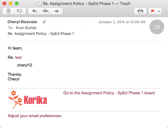
Chat example And what clicking on the Reply button does:
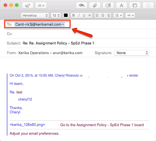
Replying to Chat Email In the above example, although the chat email came from Cheryl, the reply is being sent to a special address:
“Card-nj3j@kerikamail.com>” - This email is received by a server that listens only to chat replies. When a chat reply is received by the server, it checks to see who the reply came from.
- Since only Team Members and Board Admins are allowed to participate in the chat on a particular board, the Kerika chat server tries to make sure the email is coming from someone who is authorized to comment on that particular card or canvas.
(This helps reduce the possibility of spam email appearing inside your Kerika conversations.)
The problem we found is that some email clients, e.g. the native Mac Mail client, handled the “From:” and “Sender:” fields differently from other email clients like Gmail.
In the case of Gmail, Google places fills in both the From and Sender fields, but in the case of Mac Mail, only the From field is filled in.
For now, a temporary fix is to have the server look for both the From and Sender fields, but longer-term, as part of a server re-architecture that we are planning, this problem will get solved differently that further reduces the possibility of spam.


