Tag Archives: Usability

About software usability in general.

A simpler menu for cards and columns on your Task Boards and Scrum Boards

We used to have separate button, and associated menus, for actions related to cards and for actions related to columns:

Separate card and column actions

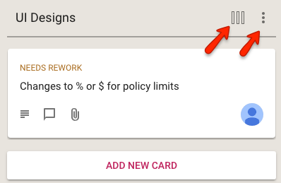
This reflected the history of the Kerika product: we first designed and built the card actions, and much later added the column actions.

In retrospect, however, we concluded that separating these into two separate menus was not a good idea: it was confusing for our users to remember which menu supported which action. (Even the Kerika team, which uses Kerika for everything that the company does, was having trouble remembering the differences between the two buttons and menus.)

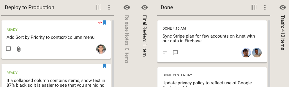
We have fixed that usability problem with our latest release: a single button is shown, and the popup menu that appears includes both card actions and column actions:

Combined Card and Column Actions Menu

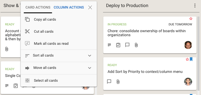
Clicking on the Sort and Move actions brings up all the sorting and moving options you have; the Sort menu now has a much richer set of actions:

Sort options
Sort options

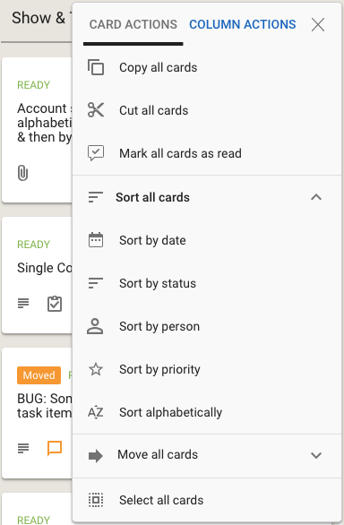
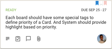
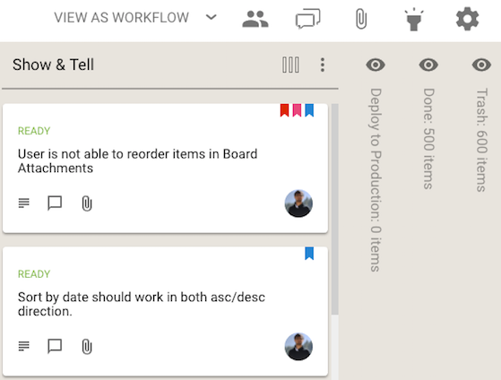
We have also done some small tweaks to the sorting action: Sort by Status now puts the On Hold cards at the bottom of the column, below all the ones flagged as Normal.

Seeing at a glance what’s hidden

If you hide a column from your view of a Task Board or Scrum Board, Kerika now makes it clear whether this column has any cards or not:

Hidden columns
Hidden columns

In the example shown above, the Release Notes column is empty, so it is shown in a light shade of grey, while the Final Review column has at least one card, and it is shown in black.

Kerika also helps you see, at a glance, whether the columns you are hiding have any updates you haven’t caught up on, or cards that are overdue:

Hidden columns with updates and overdue dates

The orange icon in the example above shows that the This Sprint column contains cards with updates on them that you haven’t caught up on yet, and the red icon shows that the Planning column contains overdue cards.

A style refresh for our Blog

Hope you like it — we finally got around to customizing the WordPress TwentyThirteen theme we have been using for this blog.

Nothing fancy; just making sure the colors and font (especially the fonts!) are consistent with our website and app.  We use Roboto everywhere now: we find this to be a really easy to read font for most screens, and think that Google did a great job in coming up to an alternative to the traditional Arial/Helvetica.

We are also trying to clean up the Categories and Tags we use to help you find older blogs: there were too many overlapping categories/tags that had accumulated over the years so we got rid of a bunch of them.

Let us know what you think…

We have added support for Google Team Drive

We have long had a deep, excellent integration with Google Apps: you can sign up with your Google ID and have all your Kerika-related files stored in your own Google Drive, where you can access them independently of the Kerika app.

We are now taking that one step forward, with seamless integration with Google Team Drive.

Google Team Drives are shared spaces where teams can easily store, search, and access their files anywhere, from any device.

Unlike files in My Drive, files in Team Drive belong to the team instead of an individual. Even if members leave, the files stay exactly where they are so your team can continue to share information and get work done.

Team Drives is available on G Suite Enterprise, G Suite Business, or G Suite for Education editions.

You don’t need to do anything different: the integration is built-in with the latest version of Kerika (and, since we are software-as-a-service, everyone always uses the latest version of our product!) and the integration is seamless.

Managing multiple versions of files just got a lot easier

With our latest update we have made it much easier to manage different versions of files, across all your Task Boards, Scrum Boards and Whiteboards.

(This was inspired by our recent fix to a bug that didn’t properly download the latest version of a file attached to a card or canvas; while fixing this we started thinking deeper about how to make file management even easier for our users.)

Here’s how file management works now: when you hover your mouse over a file attachment, a new action called +NEW VERSION is available:

Uploading new version of document

Clicking on the +NEW VERSION button will let you pick any file from your computer that’s of the same type, and Kerika will add that and track the file as a new version of your old attachment.

This is possible even if the new file has a different name altogether, as long as the two files are of the same type.

For example, a filed called Budget.xlsx can get a new version that’s called Plans.xlsx — both are tracked as different versions of the same file, even though they had different names.

This makes it even easier to manage all your files using Kerika!

We made it easier to have more complicated tasks inside cards

When we first added the ability for you to add a list of tasks to a card on a Task Board or Scrum Board, our expectation was that these tasks would be short and to the point: maybe just a few words long.

And to make the display of tasks neat and tidy inside a card’s details view, we truncated long tasks to show just two lines worth.  We figured this was a reasonable restriction that would make the layout look better, and wouldn’t actually inconvenience anyone since we really didn’t expect people to create very complex tasks, that might take more than one sentence to spell out.

Well, that turned out to be a bad assumption: the tasks feature turned out to be far more popular than we expected, and we soon started getting complaints from people that didn’t like seeing their tasks get truncated to two lines.

We have fixed that with our latest update to Kerika: now, all tasks will show fully, no matter how long they are. Here’s an example:

Example of long task

In the example shown above, the first task is long enough to spill out over three lines, and all three lines are shown.

So, there you go: tasks became a little more flexible!

Bug, fixed: signing up for Kerika from “.software” domains

With the proliferation of top-level domains we have had to update some of our old code that tried to make sure people were signing up with properly-specified emails.

In the old days, of “.com” and “.org” and other short domain extentsions, this was easy to check at the time someone entered an email address: if it wasn’t properly formatted we could alert the user right away so they didn’t go down a dead-end path.

We can’t do that anymore: new top-level domains are being launched on a regular basis by registry companies and the list of potential domain extensions is no longer finite or easily matched by regular expressions.

We thought we had done these updates a while back, but clearly something slipped through the cracks: people from “.software” domains were unable to sign up as new users.

That’s fixed now.

Managing multiple Due Dates became easier

We have made it easier for teams to manage multiple Due Dates within the same project, especially when a single work item (as represented by a Task Board or Scrum Board card) contains many different sub-tasks, each of which could have a different Due Date.

Where a card has multiple tasks, each with different Due Dates, the range of dates is shown on cards to make it easier to understand the “time footprint” of the work item as a whole.

Here’s an example of a card with two open/remaining tasks, one of which is due today and the other tomorrow:

Tasks with different due dates

When viewed on a Task Board or Scrum Board, Kerika will show the range of dates involved for this card:

Tasks with a range of Due Dates

This provides better context, better usability for users who work with due dates: at a glance you can see the overall “time footprint” of a work item that involves several sub-tasks.

The What’s Assigned to Me and What’s Due Views are now smarter about handling multiple due dates for the same card: if just one task within a card is overdue, even though the card as a whole isn’t yet overdue, this is shown in the Overdue column in these Views.

Your 6AM summary email (which you can turn on optionally) now lists the due dates on individual tasks within cards, as these become overdue or due this week or next week.


We made it easier to see what you are hiding

We have made a tweak to the Hide Column feature that’s available on every Task Board and Scrum Board, for all Board Admins, Team Members and Visitors.

Previously, when you hid a column Kerika would show that like this:

Hiding columns (before)

The name of the column that was being hidden was shown vertically, to make it easier to retain the overall context of the board.

We have improved this so hidden columns now look like this:

Hiding columns (now)

The subtle (but important) distinction is that Kerika now shows you how many cards are in the hidden columns, not just the name of the column.  We think this will make this feature more useful, to more people, more of the time.