With our latest version, a task within a card (on a Task Board or Scrum Board) can now be assigned to multiple people, just like the card itself.
This makes it easier to handle more complex work items that contain a large number of tasks, each of which may require more than one person to handle.
To make this work, we have also updated the What’s Assigned to Me and What’s Due Views to make sure everyone who is assigned to a task, where tasks have multiple people responsible for them, sees this clearly.
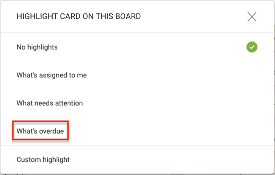
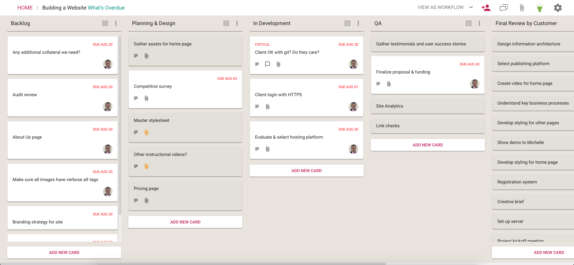
This option lets you quickly spot all the cards on a board that are overdue, and it does so in a smart way:
If a card’s overall due date has passed, this card will be highlighted.
More importantly, if a task within a card is overdue, even though the card as a whole isn’t overdue, this card will also be highlighted.
This smart highlight makes sure that you are aware of everything that’s overdue, even it is just one task that’s buried within a card on a large board.
All Kerika users have the option of getting an email sent to them at 6AM everyday, in their local time, that summarizes all the cards that are overdue, due this week, and due next week.
(Actually, we have two options for this email: you can get these cards summarized by due date, or by board. Or both.)
We have improved this email to include Tasks as well as cards.
This required some smarts in the code to handle scenarios where a Task’s Due Date is different from the Card’s Due Date, but we managed to do this nicely.
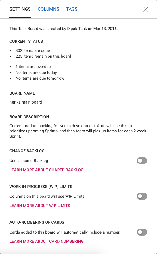
One final (?) bit of restyling, to make all of Kerika consistent with our new look-and-feel, has been updating the Board Settings dialogs.
Board Settings
The functionality is essentially the same, but the appearance is cleaner, lighter and more in keeping with the Material Design standards we have (mostly) adopted.
(We say “mostly”, because there are some elements of Material Design that we find unattractive. For example, for the on/off toggle switches we prefer the iOS style buttons.)
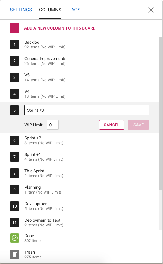
Column Settings
The Column Settings dialog has also been restyled, and looks nicer and cleaner. The example above shows a board that uses Work-In-Progress Limits.
Tag Settings
And the same with Tag Settings: we have a restyled color picker, and better messages for warnings when tag names or colors might clash.
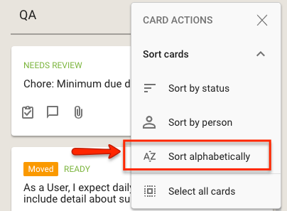
This is most useful if combined with the Auto-Numbering feature in Kerika, that can automatically insert a number at the beginning of each new card: the alpha sort will sort all the cards in the column by their number.
We have improved the sorting feature for cards on Task Boards and Scrum Boards to allow for partial sorting: if you select some cards within a column and then do a sort, the sorting action will apply only for the selected cards.
Sort options
This will make it easier to organize very large boards, e.g. where a single column may contain a hundred cards or more.
Every card (and every canvas) on a Task Board or Scrum Board in Kerika has a unique URL, but most of the time you might not notice the URL shown in your browser’s address bar is changing as you open one card after another.
(And if you are using Safari on Macs, you definitely won’t notice this since Safari hides most of the URL anyway.)
These URLs can be helpful in many ways: Kerika recognizes them as pointing to other cards or canvases, and makes these links an easy way to connect up different work items.
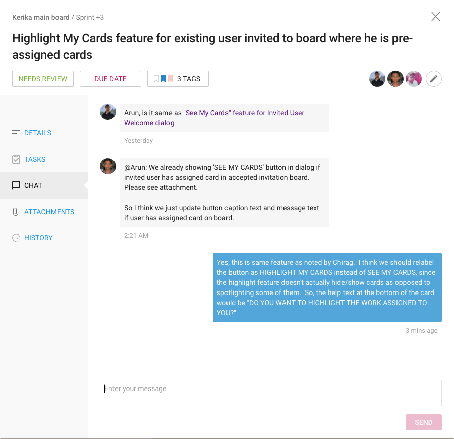
Here’s an example of a card URL that’s referenced in a chat message:
Referencing Card URL in Chat
Any URLs that are included as part of the chat or details of a card, that reference other cards, canvases or boards within Kerika, are automatically recognized and presented as useful links as you can see from the first chat message shown in the above example.
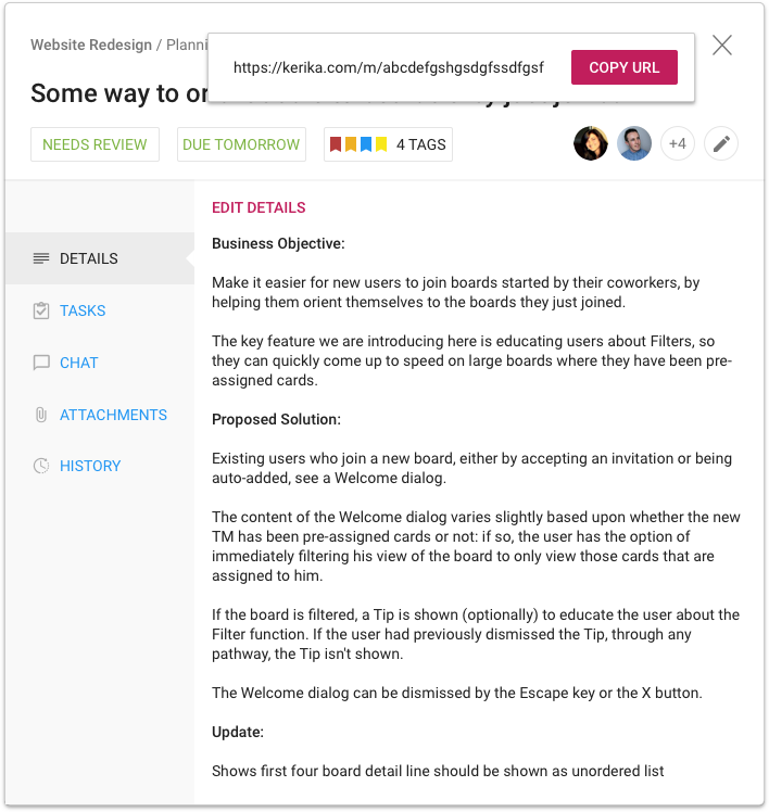
To make it easier to get these card URLs (and to help you notice that they are important in the first place), we have made it possible to grab any card’s URL with a single click:
Card URL button
Clicking on the new Card URL button that appears on the top-right of each card’s detail view makes it possible to see, and copy, the card’s URL with a simple click:
Getting Card URL
We have made it easier to grab the URL of an entire board as well, from your Home Page:
Board URL
Try this way of creating links between related work items, across all your Kerika boards.
As one of our users pointed out, Kerika’s Views — What’s Assigned to Me, What Got Done, etc. — shouldn’t include any cards from templates, just regular boards.
People who use templates on a regular basis often pre-assign cards in the template: for example, an employee on-boarding template that involves HR tasks may be preassigned to a specific HR employee.
Our initial implementation of Views included cards from Templates as well, which led to a misleading impression of the amount of work, particularly unscheduled work, that was waiting for a particular person.
That’s fixed now: Views will automatically exclude cards from Templates.